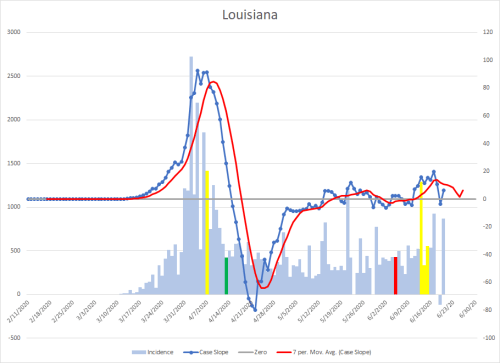
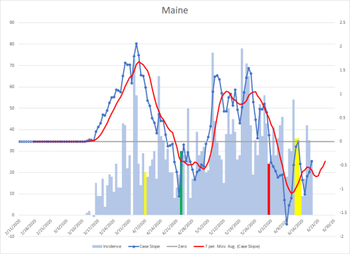
Right click to expand graphs.
These are the same methodology as I previously described, but there are some additional new elements.
First, the yellow bars represent my projected impact dates from major social mixing events. The left one is when I expected to start seeing St. Patrick’s Day show up in the data, the three clustered on the right are when I expected Memorial Day weekend to show up in the data.
The other item to note the the red tail to the trend line that extends beyond the graph. That is predictive data for where each geographical location will be going.
Also, in states that have had relatively low case counts, I have forced the scale on the right to range from -5 to +5 so as not to overemphasize trend changes. As with any graph, pay attention to scales.
The states that are highlighted red are ones that never had statewide stay at home orders, although some implemented them regionally.