It’s very disheartening to watch mask mandates and other controls be eased just as the US is moving into what likely will become a surge of BA.2. Some have made the argument that because it is so similar to BA.1, that should reduce risk. That may be true to some extent, but it is also likely that because of the messaging that seems to have grabbed hold of much of the US population that the pandemic is over, masks and distancing have been tossed aside. I suspect that will have a greater impact. In addition, the boosters that many have had were given months ago, so that protection is likely waning as well.
I will also add that what I say about each country is just my thinking which could admittedly be wrong. It’s difficult to really know without complete data as well as more information about other factors that could be influencing spread, but right now I’m mostly concerned about the role of BA.2.
The biggest surges are currently occurring in SE Asia and Europe. It would be helpful to have a visual of cases as they relate to both covariants and to vaccination. Unfortunately, no educational or government institution has done so publicly but I have pulled that data together to do so.
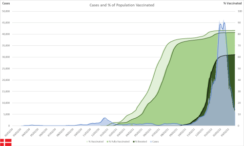
First, if you haven’t seen my work before, I’ll quickly describe the two graph types. Both have the number of new cases plotted on the left y-axis over time on the x-axis. This is known as an epidemic curve. The one with vaccines is the percentage of the population over time that has had one, two or three doses, is plotted on the right y-axis, and should be relatively easy to interpret.
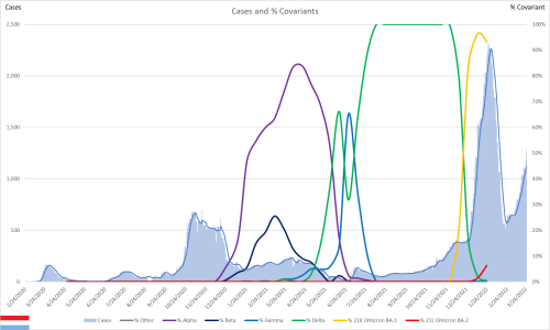
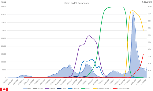
The other plots the epidemic curve against the variants or covariants. Only the major ones get their own line, the rest are lumped together as “other.” These lines represent the samples that have been taken for genetic sequencing and provides and graphs the percentage of each sequenced sample as a percentage of all sequenced samples over time. That percentage is on the right y-axis.
One thing that I am seeing consistently is that both BA.1 and BA.2 seem to drive case climbs about two months after each particular subvariant starts becoming more dominant. I am generally excluding countries that don’t have variant or hospitalization data. The combination of both was my initial criteria for tracking a country more closely, but I have added a few that did not meet that for various reasons.
Africa
South Africa is a little puzzling although the wide, tapered base is likely some of the impact of BA.2 It is entirely possible that the high number of BA.1 cases provided some protection, but it is difficult to know.


Asia
India has been very puzzling all along. Given their population density, one would expect an even bigger catastrophe. I think that the first wave was mitigated by the hard control measures that were put into place. The second and third waves (delta and omicron) however fall at roughly the same time of the year and during the dry season. I have argued since before the pandemic that humidity plays a role of transmission of respiratory viruses. My argument is that in dry air, some of the aerosols have small enough droplets that desiccate, leaving the virus particle suspended, hence pushing transmission further to the airborne end of the transmission continuum and further from the droplet transmission end. Those two surges lend support to that.
What remains to be seen is the interaction between BA.1 and BA.2 I would argue that with both emerging at the same time and BA.2 becoming dominant quickly, that this might be the only surge that India sees with this particular subvariant.


Indonesia appears to be a little bit behind the US. There is an obvious surge from BA.1 which looks to be slowing. The question remains around what will happen there with BA.2. They would be wise to watch other countries that have gone through both.


Israel will also be interesting because of their high uptake of vaccine. Cases are just starting to climb there as well.


Japan also has relatively high vaccination rates. What I note in their epidemic curve is how much wider it is related to omicron. I’m attributing this to what I had said earlier about a two month lag for each variant. The initial climb is what is expected, but the widening at about the 70,000 case mark aligns well with a BA.2 surge while BA.1 was falling.


Malaysia shows a similar pattern to Japan, but BA.2 started climbing earlier, thus pushing that widening closer to the peak of when the BA.1 trend was heading downward.


Singapore further supports this two month argument. In this case though, the BA.2 surge started DURING the BA.1 surge, hence the entire curve is widened at the outset.


South Korea has been hit particularly hard after doing so well through the pandemic. That is a testament to just how easily the omicron variants are spread. Again, using the same two month assumption, I interpret this as the BA.2 surge starting just as the BA.1 surge was nearing its peak. The question is if BA.2 has peaked or if there is more climb ahead (or at least a slowed decline) since it is a much smaller percentage of sequenced cases so far.


Europe
With the rationale I’ve laid out in the Asia section, I think it will be very easy to see the same patterns in European countries and in Oceania. I’m only going to post images for countries with the worst spread right now and will only comment on anything exceptional.

Austria


Belgium


Czechia


Denmark surge on surge on surge?


Estonia


Finland has a very clear delta wave followed by BA.1 and BA.2 widening it.


France


Germany


Greece is particularly interesting because there is a bulge in the BA.1 wave that seems to coincide with a brief uptick in delta percentage rates.


Iceland doesn’t report variant data anymore, but the waveform of the epidemic curve since the beginning of the year suggests that they have had both their BA.1 and BA.2 wave, with BA.2 starting just as BA.1 was starting to recede.


Ireland


Italy might look like an exception to the pattern, but given that there wasn’t a curve to the proportion of BA.1 but shot up suddenly, this may be due to insufficient testing.


Latvia


Liechtenstein


Luxembourg


Netherlands


Portugal


Slovakia


Slovenia


Switzerland


Oceania
Australia


New Zealand


North America
Canada is just about to start the BA.2 surge, right on schedule.


United States


Summary
As I got about halfway through copying these, I realized that a good test of my two month premise would be if I could look strictly at the vaccination graph and estimate about when each omicron subvariant would have started climbing when I pulled up the covariant graph. The assumption held.
I have spent all of my free time the last couple of weeks working on coding to automatically get the graphs posted. However, I think I stumbled across a bug in the service I’m using that prevents an automatic upload. In total, there about 1400 different charts posted on the site. I could go through manual updates, but I’m going to see if the company can figure out how to fix it.
My next step is to post the case/covariant graphs for each US state. I will do that as soon as I see the next covariant data update where I pull that data. I’m hoping that is tomorrow.

