The CDC used to have a good reputation until the pandemic. Now, I find myself often wondering if information that is provided is skewed because of political appointees, particularly RFK Jr.
This isn’t a new problem. The first public facing change was in 2022, when CDC change the colors on their risk levels map. The old map is on the left, the new one is on the right using the revised methodology. This was what I considered their first attempt to minimize the pandemic. The old one was more of a measure of transmission (cases and positivity), the one on the right is more of a measure of severity (hospitalization and hospital capacity).
There have been two changes to CDC categorization of wastewater data since that time.
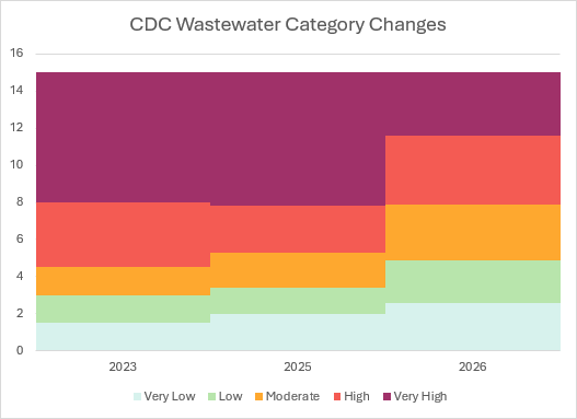
In 2025, they changed their baseline criteria. The biggest change was using a baseline of the past 24 months. That greatly skewed the categorization because if the prior 24 months had been excessively high, the current reading of what might have been high in the past would be considered normal. Categories of risk were also changed at this time.
Original categories
Minimal: < 1.5
Low: 1.5 to ≤ 3
Moderate: > 3 to ≤ 4.5
High: > 4.5 to ≤ 8
Very High: > 8
2025 categories
Very Low: < 2
Low: > 2 to ≤ 3.4
Moderate: > 3.4 to ≤ 5.3
High: > 5.3 to ≤ 7.8
Very High: > 7.8
2026 categories
Very Low: ≤ 2.6
Low: >2.6 to 4.9
Moderate: >4.9 to 7.9
High: >7.9 to 11.6
Very High: > 11.6
Here’s how that looks graphically. You can really see how this completely changes the public perception of risk.
That makes minimization on a dashboard really easy to do.
Here’s what the map would be prior to those changes. Most of the public doesn’t have a clue how bad COVID is right now. A big part of that is due to lower hospitalizations.
I find it shameful that there is better information coming from a handful of us trying to protect the public than from the agencies who should be doing that work. It’s even worse when the health leadership in this administration further wants to derail the public health train.
Trigger warning: If you are prone to anxiety, you may want to skip this one.
“Many people dismiss any talk of collapse as akin to the street-corner prophet warning that the end is nigh. In the past couple of centuries, humanity has innovated its way past so many predicted plagues, famines and wars – from Malthus to Dr Strangelove – that anyone who takes such ideas seriously tends to be labeled a doom-monger.” – Debora Mackenzie, 2008.
COVID is not the cause of collapse; it is the accelerant that exposed pre‑existing systemic fragility
Introduction
I wrote variations on the themes below much earlier in the pandemic, but these were the easiest to find. The others were likely in individual conversations with people or on Facebook, which is incredibly hard to search. My point hasn’t changed though. the worst lies ahead.
Personal Background
It might be worth explaining why I have a very unique perspective on what is to follow. I’m an infectious disease epidemiologist by training and went immediately into healthcare infection prevention. I describe the role of an infection preventionist is acting as the public health department for a health system or hospital.
Oddly enough, during grad school I had started my thesis work on bioterrorism preparedness planning in healthcare settings. I had teachers and classmates wondering why I would work on such a remote risk. That was in 2000. September 11th happened, and the volume of pertinent research became a tsunami. It was obvious that what I was working on would be impossible to keep current and would be more of a dissertation, so I changed focus. However, I had learned enough through literature searches and FOIA requests that I still stuck closely to that area of interest through my career.
H5N1 first emerged in 1996 when it made the zoonotic disease jump into humans. It surged again in 2003 and spread outside of Asia for the first time. I had been monitoring it closely and was asked to speak at a conference about it. That eventually led to me speaking at conferences, universities, grand rounds, and community groups around the world on that topic and others with public health implications, such as other emerging diseases, antibiotic resistance, and emergency preparedness. Shortly after that I also became involved in a federal disaster medicine team. The photo in my social media profiles is an award I received from the deputy secretary of HHS related to COVID work.
I was approached by a Fortune 10 company about working in their resilience and business continuity planning. It sounded like an interesting change and I eventually was writing and facilitating disaster scenarios for primarily their clinical and pharmaceutical teams around the world, but other groups as well.
There really are only four categories of loss that can interrupt business operations: human resources, vendors, facilities, and information technology. I had to not only become an expert in these areas since I was going to be dealing with experts, but also had to get creative and think ahead with problems to test them that others hadn’t considered.
For example, for an area that developed prescription contact lenses and glasses, I wrote a scenario where a disgruntled IT employee embedded some code in the eyeglass lens manufacturing software. It slightly altered prescriptions, only on one lens, and only sporadically. It obviously would take some time for them to get enough data from retail locations to even identify the problem. They also had to figure out how to manage damage to the brand reputation.
I became good enough at this to where some of the scenarios I was writing unfolded in the real world sometimes a couple of years later.
My interests were a little bigger though, such as some of the major data hubs around the world having a breech, suboceanic fiberoptic cables being cut, a repeat of the Carrington Event, and so one. Traditionally, people who worked in this arena did the usual tornado, snowstorm, earthquake, and other simple scenarios. The responses from the team didn’t change much with what I was writing, but it stretched their thinking and mine.
I’m explaining all of that to give some idea that I’m not just pulling things randomly out of the air. I actually have a wealth of knowledge about how quickly things can go wrong in complex systems.
Climate Change
In 2019, I was fortunate enough to take the Climate Reality Leadership Course from former VP Al Gore. I snuck this photo from my seat.
My plan for that winter had been to write a conference presentation on the health impacts of climate change. COVID hit, and given how much work I had done on pandemics, I knew that would be placed on the back burner for some time.
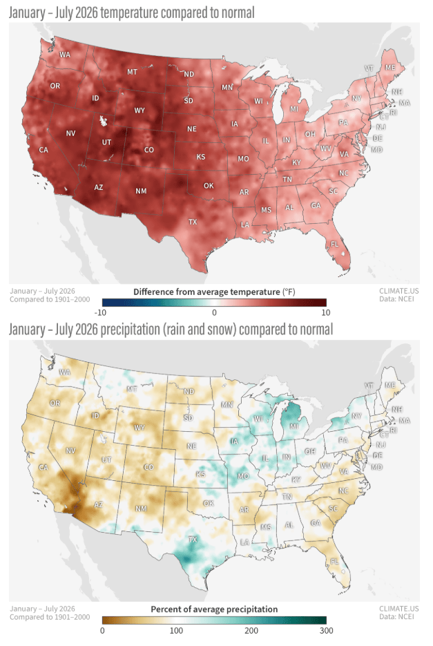
One of the strangest things is how people can deny what is happening. Look at both temperature and precipitation variances in the US this year from the mean.
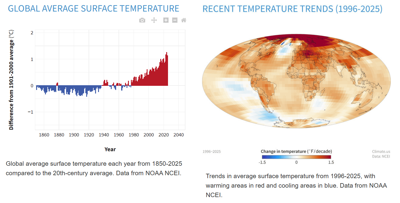
This is a global problem and we are ignoring it just like we are with COVID.
It amazes me how with a flood of both anecdotal evidence and data that there are still people who are in denial about the reality of where this is going. How can people not care about the volumes of floods, heat waves, wildfires, intense storms, or even the landslide in Nepal likely triggered by climate?
One impact from climate change that many people don’t consider is how it drives humans into wild areas or animals from wild areas into human areas. It’s estimated that there are over 600,000 unknown pathogens that could act as zoonotic diseases. In addition, who knows what lies dormant in the permafrost.
As an example, a few decades ago in Minnesota, a new county road was being built in a rural area that was going to cut through farmland. A farmer came out and watched the road crew and was noticed to be frequently shaking his head and mumbling “wouldn’t do that,” or words to that effect when they were doing the surveying. Later, when the earth moving equipment came out, he was out there again. Finally, someone had the intelligence to ask him why he was doing that every day. He told them that where they were digging to put the road is where they buried the carcasses of cows that had anthrax.
Federal Administrative Cuts and Actions
Foreign public health was one of the largest beneficiaries of USAID. It was responsible for helping contain disease outbreaks like Ebola, diminishing the burden of HIV, maternal and child health programs, as well as vaccination programs. They also were responsible for field research in infectious disease.
Take Ebola for example. The current outbreak has identified over 6,000 cases. Each infection increases the risk of a mutation that turns this into an airborne disease. How do we know that is possible? It’s already happened with Ebola Reston, which fortunately didn’t infect humans. Airborne transmission has been thought to play a role in some human infections.
As a quick sidebar on airborne transmission, I remember early in my career questioning why we required respirators for tuberculosis but only surgical masks for influenza. I was questioning the categorization of droplet and airborne transmission very early on. This eventually led to my thinking that there really wasn’t a distinction, but it was more of a probability function of whether respiratory disease was spread primarily by droplet nuclei or aerosols. Further, I argued that in extremely dry conditions, and indoors (think winter), some of the droplets would quickly evaporate leaving the nuclei suspended, thus becoming airborne. I realized that a good analogy from chemistry has to do with atomic orbitals, which describe the probability of finding an electron in a particular spot relative to the nucleus of the atom, as shown below.
USAID was also part of famine monitoring and food distribution and helped support US farmers through the purchase and distribution of food. It’s also estimated that the work done through the program supported about 200,000 jobs in the US. It had operational and logistical plans in place for disaster response. The impacts from abruptly unplugging USAID were massive, both domestically and abroad.
The cuts to funding of scientific research are one of the most short-sighted policies in recent history. Many research projects can’t just shut down and restart. Once they are gone, they are gone. This will have a negative impact on science and medicine for decades.
When this administration cannot correctly handle measles, cryptosporidiosis, and other epidemics and foodborne outbreaks, I have massive concerns about how they would handle another pandemic or biological weapons attack, particularly after closing the US Office for Pandemic Policy.
Food Insecurity
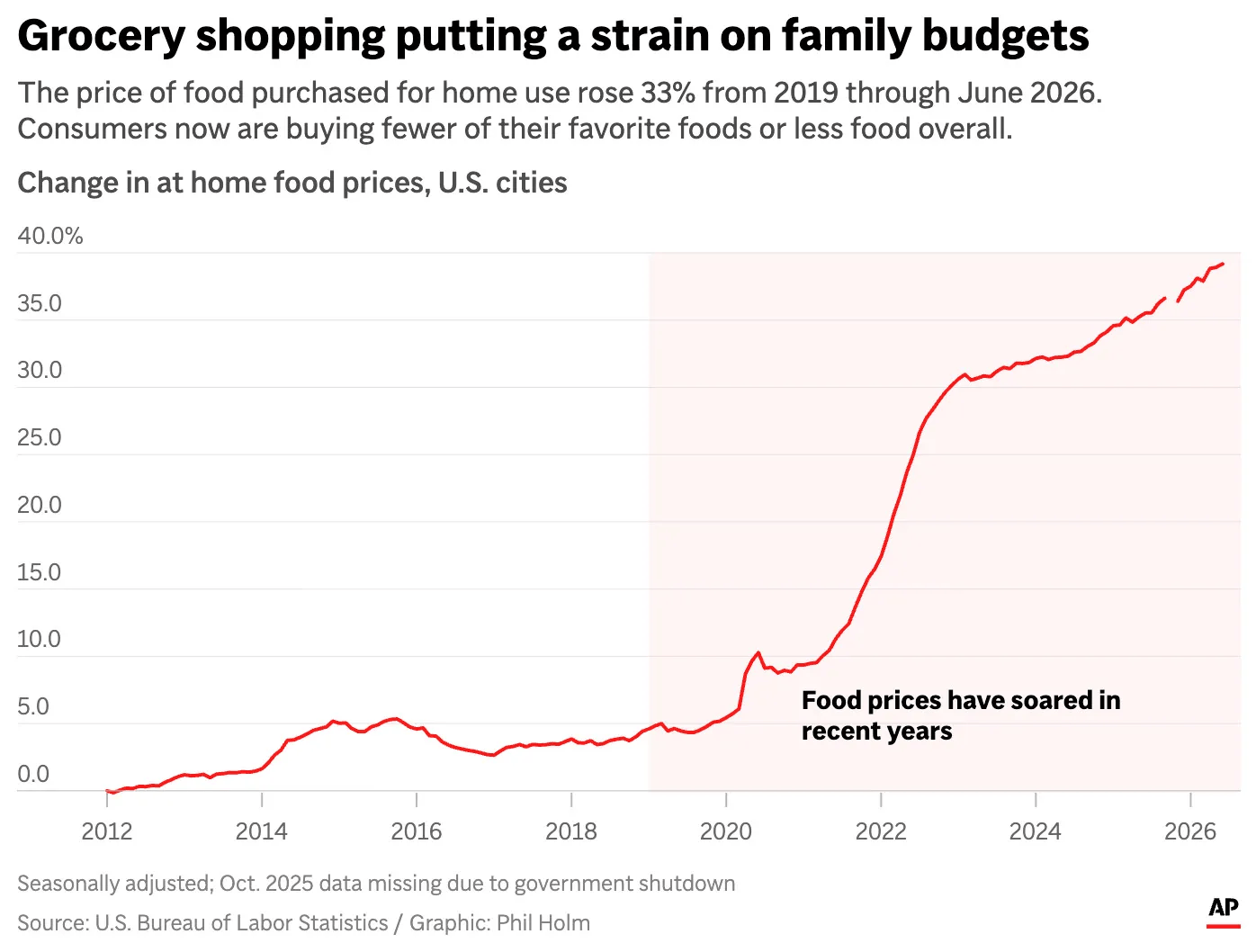
Climate change is an obvious driver of food insecurity as are many other factors. I’ve recently written about this, so I won’t dive into it deeply here. Suffice to say though that aggression increases when people are hungry and desperate. However, it’s worth noting that this tends to affect people who live on the margins more and try to get by check-to-check. There simply isn’t enough room in many budgets to easily absorb these food costs.
Supply Chains
One would think that as a species we would have learned more about supply chain issues early in the pandemic. A mix of demand and true choke points in supply chain can quickly limit availability to consumers. Toilet paper and the blockage of the Suez Canal by the Ever Given were perfect examples, as were the shelves that were empty of over-the-counter medications. Now energy and fertilizer supplies are blocked due to both the wars in the Strait of Hormuz and Ukraine.
One concerning trend in supply chains can be found in the trucking industry. Over the past 10 years, the turnover rate of truckers has ranged from 95-112%. In the book The Secret Life of Groceries: The Dark Miracle of the American Supermarket, Benjamin Lorr continues “What appears to be happening is that the industry has figured out not only how to make humans replaceable but also how to make money off their replacement. The labor shortage is profitable. Recruiting rapaciously and dishonestly, convincing recruits to take out lines of credit for the opportunity, and then paying those new recruits the lowest possible wages for the labor—they call these “training rates”—all work synergistically. I am told by various industry observers that the trucking industry earns its highest profits on student drivers.”
I had honestly forgotten that trucking was an example in the article associated with the quote at the top of this page. She writes, “When a strike blocked petrol deliveries from the UK’s oil refineries for 10 days in 2000, nearly a third of motorists ran out of fuel, some train and bus services were cancelled, shops began to run out of food, hospitals were reduced to running minimal services, hazardous waste piled up, and bodies went unburied.”
It should really be concerning that this industry has so many inexperienced people on the highways. I’ve been run off of the freeway onto the shoulder by semis that were changing lanes twice. One time, I had a semi directly in front of me lose its load of telephone poles on the freeway. My only option to avoid a collision was to rapidly go into the grass along the freeway while doing over 70 mph. I am still shocked that I was able to maintain control and get back onto the roadway. It could have gone considerably worse.
That also brings up the point that I’ve been repeatedly making about the neurological impairment that comes from COVID infections. It seems like a perfect storm to have inexperienced drivers who are impaired due to the virus which will create further hazards on the roadways.
Think about this same issue in other industries that require attention to detail and expertise. What happens when those who have experience are forced out of the workforce from death or long COVID? When I mentored grad students, one question I would often ask them is where they think that the best ideas are. They often had a number of good answers, but the point I wanted to drive home with them is to act on those ideas. My answer to the question is that most of the best ideas are six feet underground. We are on a path where the same can be said for the best solutions to problems.
COVID: The Straw that Is Breaking the Healthcare Camel’s Back
We are already facing healthcare challenges in the US as the Baby Boom generation is getting older and needing more care.
U.S. Population Pyramid (Decennial Census Data)
1900
Male
Female
Baby Boomers
This is not the only additional strain on the demand side of the healthcare system. The damage from COVID effectively ages people and is a trigger for many chronic diseases due to the tissue damage from infection. I make the argument that we don’t see that in younger and younger age groups because they still have adequate healthy tissue to take on the extra burden from the damaged tissue. As that tissue ages though, it will not have the capacity to do so, leading to chronic disease. In addition, focal tissue death occurs when the smallest of capillaries are occluded due to COVID resulting in the death of cells where that capillary provides oxygen and nutrients. There is also evidence that cells that have been infected sustain telomere damage, which limits the number of times it can divide, known as cellular senescence, whereby they keep functioning but eventually die and cannot be replaced. This impact grows with age or with each repeated infection.
The healthcare worker (HCW) supply side is in even worse shape. One of the drivers is simple burnout, as seen in the graph below from the paper by Mohr et. al. This has HCWs looking to leave the workforce. A 2023 survey of SEIU HCWs indicated that “Forty-nine percent of healthcare workers say they are likely to leave the healthcare profession in the next few years (24% very likely, 25% somewhat likely), while only 19% say they are not at all likely. Not only does this look dark from the supply side, but it also has the same problem of losing expertise gained by experience alluded to earlier.
Most people likely think of that in terms of hospital care, but it is a primary care and long-term care facility issue as well. This is a map from HRSA indicating where the shortages are the worst (darkest green areas). Use the link to zoom in closer and see other related maps. If you think wait times to get care now are bad, this may soon seem like the “good old days.”
How Could We Have Known?
The quote at the beginning of the article by Debora Mackenzie is from an article she wrote in The New Scientist. I almost always referenced it when I spoke on pandemics, wrote pandemic plans, or facilitated pandemic exercises and encouraged people to read it.
She continues, “In a severe pandemic, the disease might only be the start of our problems…It’s not only absentee truck drivers that could cripple the transport system; new drivers can be drafted in and trained fairly quickly, after all. Trucks need fuel, too. What if staff at the refineries that produce it don’t show up for work?…Refineries make diesel fuel not only for trucks but also for the trains that deliver coal to electricity generators, which now usually have only 20 days’ reserve supply…The coal mines need electricity to keep working. Pumping oil through pipelines and water through mains also requires electricity. Making electricity depends largely on coal; getting coal depends on electricity; they all need refineries and key people; the people need transport, food and clean water…[don’t even get me started on the threat of AI both on controlling systems but also impacts on clean water supplies]
…With no electricity, shops will be unable to keep food refrigerated even if they get deliveries. Their tills won’t work either. Many consumers won’t be able to cook what food they do have. With no chlorine, water-borne diseases could strike just as it becomes hard to boil water. Communications could start to break down as radio and TV broadcasters, phone systems and the internet fall victim to power cuts and absent staff. This could cripple the global financial system, right down to local cash machines, and will greatly complicate attempts to maintain order and get systems up and running again.“
This simply all shows that we are incredibly vulnerable, and most people don’t understand the scale and how quickly things can go south. When one part of the whole fails, other parts become more prone to fail as well. This is why I’m so concerned about the collapse of healthcare and worry that lies somewhere in the 2030s in the US.
Exponential growth of a disease is difficult for most people to understand. As we saw with the delta and original omicron waves, things can seem like they are under control and then seem to explode almost overnight. I’ve made this animation to illustrate the process. The code simply simulates two people within an entire population (represented by the circle) infected with a disease. When they come in contact with each other, a new person in the population becomes infected. I have the coding set so you will see the rapid change in under two minutes time. They will pause when essentially full for 5 seconds and then will reset and start again.
Now think about how long it took for those two people to create a problem. Now reframe that to think instead of individuals, replace them with entire sectors (food, water, transportation, healthcare, electricity, etc.). I’ve mentioned many of these above. Below is the exact same simulation, but in this instance it starts with what would have been 10 infected individual, but remember now we are talking about 10 different sectors that are failing. Watch just how much more quickly this becomes a problem and starts causing other sectors to face failure and collapse.
1177 B.C.: The Year Civilization Collapsed
I finished this book a few days ago. It was the impetus to write my concerns much more directly. At the very onset of the pandemic, I’ve been constantly thinking about these issues, but waited to write about it because I knew it would generate a lot of claims that I was fear mongering. When I finally wrote a bit about it in May, 2021, particularly when I wrote about quaternary impacts, I still held back some for the same reason. I simply didn’t think that the public was quite ready to hear it.
Cline’s book finally gave me some historical precedent to put this all together. “In our current view, as we shall see below, the Sea Peoples may well have been responsible for some of the destruction that occurred at the end of the Late Bronze Age, but it is much more likely that a concatenation of events, both human and natural—including climate change leading to drought and famine, seismic disasters known as earthquake storms, internal rebellions, and “systems collapse”—coalesced to create a perfect storm that brought this age to an end.” This is exactly where we are at in the world, and particularly in the US, right now. The US is just a likely tipping point for the world economy and sociopolitical norms.
That is where I think we are at. It’s very possible that we have already crossed that tipping point because of COVID. If we haven’t, any of the things I’ve mentioned, and many others, could play the tipping point role.
This is why I’m so angry at grifters, minimizers, and antivaxxers. IT DIDN’T HAVE TO BE THIS WAY. It’s even more infuriating that I put myself on the front line at the start of February 2020 dealing directly with the quarantine of the evacuees from China to try to prevent this only to be given the figurative collective finger by a large proportion of the population as I continued to encourage respiratory protection, social distancing, and vaccines when they became available.
What can be done? The answer is simple. It’s pretty much the opposite of everything the current administration is doing. They are accelerating collapse. Vote this November.
My insomnia isn’t driven by COVID the disease. My insomnia is driven by COVID the social impactor.
I refuse to live in a feudal society.
Addendum:
9/8/26 I just happened to listen to a podcast today about the Black Death. There are many parallels related to multiple systems failing.
This strays a little from my usual disease topics, but it’s of a public health concern. I wrote a major disaster exercise scenario about these problems a few years ago.
First, it’s probably useful to define food insecurity. This comes directly from HHS.
Food insecurity is defined as a household-level economic and social condition of limited or uncertain access to adequate food. In 2020, 13.8 million households were food insecure at some time during the year. Food insecurity does not necessarily cause hunger, but hunger is a possible outcome of food insecurity.
The United States Department of Agriculture (USDA) divides food insecurity into the following 2 categories:
Low food security: “Reports of reduced quality, variety, or desirability of diet. Little or no indication of reduced food intake.”
Very low food security: “Reports of multiple indications of disrupted eating patterns and reduced food intake.”
It’s a much bigger problem in the US than most people realize and affects people in every jurisdiction. Use this link to drill down further.
The Colorado River Basin
Most people don’t realize how critical the Colorado River basin is to agriculture in the southwest US and how it even feeds into agriculture in southern California, including how many desert cities depend on it for fresh water. About 60% of the agricultural water is used for animal feed crops.
Lake Mead was created by the Hoover Dam. The dam produces power for about 1.3 million people in the region. Per Newsweek, “Recent forecasts suggest levels could drop near or below 1,035 feet above sea level by next spring, a key threshold for hydropower operations. At that point, only a subset of the dam’s turbines can operate efficiently, sharply reducing electricity generation.”
That means that the power demand in the region will require the importation from other areas at a higher cost. This could drive up electricity prices across the US, leading to further erosion of family budgets for food as more needs to be spent on energy.
The Scale of the California Water Problem
The winter snowpack acts as a reservoir for both agriculture and hydroelectric energy through the year. This year has the potential to be very eye opening related to the impact of climate change.
The Sierra Nevada provides about 60% of the water in California which also generates about 15% of the electricity in the state. That and the Colorado River then provide a large proportion of the water for agriculture. 40% of all water in California—and 80% of consumed water—is used by irrigated agriculture. California produces two-thirds of the winter vegetables consumed in the US and half of the vegetables consumed year-around.
The Ogallala Aquifer
The Ogallala Aquifer is vital to agriculture in the central us, but it is rapidly getting depleted. Some regions draw water out at a rate of up to two feet per year, while natural seepage only replenishes about half an inch per year.
90% of the water from the aquifer is used for agriculture, it provides about 30% of the groundwater in the US and produces about 20% of the wheat and corn in the US. The southern part is expected to be depleted within 20-30 years.
Undocumented Immigrant Contribution to Food Security
Of course there is much more to crop production, whether it is for human or livestock production, than just water. Good soil and fertilizer are needed. The US is highly dependent on foreign materials for fertilizer. 90% of imported potassium in the US originates in Canada. Canada and Russia are both major suppliers of nitrogen as well. A trade war with Canada does nothing but hurt Americans.
Oddly enough, the northward spread of the Lone Star tick might reduce demand. A bite from the tick can lead to an allergy called Alpha-gal syndrome, which can lead to severe anaphylaxis 2-6 hours after consuming meat.
This lies completely in the hands of Trump and Musk after DOGE cut funding for monitoring and abatement, with additional cuts to USAID, which did the surveillance of cattle crossing the border.
H5N1
Even if H5N1 doesn’t make the jump to humans, it’s still circulating and evolving. People have probably already forgotten about its impact on the price of eggs.
The price of poultry has also taken a big hit and hasn’t rebounded.
African Swine Fever
This hasn’t impacted the US yet, but if it arrives on our shores, pork prices will skyrocket as well. China lost about 40% of their pigs in 2019 when it arrived on their shores. US prices for pork are already high.
Strait of Hormuz
The other piece that is going to have a devastating impact on the economy is the war in Iran started by this administration without Congressional authority.
About 20% of the crude oil in the world comes out of the Persian Gulf. The global economic impact of that supply chain being disrupted should be obvious. What most people don’t grasp is that the economic impacts have not yet hit the US in full measure.
It takes about 40-50 days for tankers to travel from that region of the world to the US. Hence, there was a supply chain already in motion when the strait was closed at the beginning of March. The Strategic Petroleum Reserve in the US had 415 million barrels of oil at that time. That was enough to offset another 50-55 days of crude imports. June 10th is about 100 days, just in time for the higher demand season in the summer, further driving up oil prices. The real sticker shock at the pump and from increased prices of goods that have higher transportation costs will hit consumers hard when the economy is already getting challenging for many people.
Water Wars
I’ve stated before that water plays a big role in the development of war. There are many recent examples of how it has played a role.
Syria (2011) — the worst drought in 900 years drove 1.5 million rural farmers into cities, destabilizing the Assad regime’s social contract.
Darfur — desertification + water scarcity intensified ethnic conflict.
Israel–Palestine — water rights in the Jordan River basin are a core strategic issue.
India–Pakistan — the Indus Waters Treaty is one of the most important conflict‑prevention mechanisms in the world.
Turkey–Syria–Iraq — the Tigris/Euphrates dams are geopolitical leverage.
Ethiopia–Egypt–Sudan — the Grand Ethiopian Renaissance Dam is a flashpoint.
There are many reasons water accelerates conflict.
Crop failures → food insecurity → migration → political unrest
Livestock loss → economic collapse in rural regions
Urbanization surges → unemployment → instability
Competition between ethnic groups for shrinking resources
State legitimacy crises when governments can’t provide water
Militias and extremist groups exploiting scarcity
A Repeat
Just like at the start of the COVID pandemic, I sit here yelling that we have storms on the horizon and nobody pays any attention. Does anyone have the ability to put the pieces of the big picture together any more?
There seems to be a public perception that the COVID pandemic is over and has turned into just another upper respiratory disease. That’s simply not the case as is evidenced in data such as wastewater, excess mortality, pediatric hospitalizations, and the prevalence of long COVID.
Earlier, I’ve addressed the false notion that the omicron strain is mild. It isn’t, However, it’s fair to ask why hospitalizations are down. There are a number of reasons for this that work synergistically together.
Evolution
First, we haven’t had a major new variant emerge in some time (genetic shift, such as delta and the first round of omicron). What has been occurring are small genetic changes in omicron (genetic drift). However, even drift can create havoc as evidenced by the resurgence in Manaus, Brazil early in the pandemic. Much of the population had been infected with the original strain of the virus only to be reinfected by the gamma variant (P.1), leading to the need for mass graves. This was also an early warning that herd immunity, pushed by both some in the current administration (Dr. Jay Bhattacharya at the NIH and Dr. Vinay Prasad who briefly held a role at the FDA) as well as in the Great Barrington Declaration, wouldn’t work, thus ending the notion of natural herd immunity as a useful approach to the end of the pandemic, in spite of the extensive disease and death that would cause in the process.
While it doesn’t bring the pandemic to an end, the result of that is immune systems among the population that either have some residual immune response either to infection or vaccination. However, it’s important to keep in mind that the robustness of that response fades over time.
The genetic drift has been relatively slow changes to the omicron strain over time since it emerged. When the virus proteins stay relatively stable, that allows whatever residual response in the immune system to more readily identify the virus and react. That could easily change with BA.3.2 (Cicada), which has over 30 mutations to the spike protein alone, but this is still framed as risk, not certainty as an outcome.
Immunity
The immune response reduces susceptibility more than infectiousness, but it provides some of both. If the immune system already has neutralizing antibodies and primed memory B/T cells, the virus faces an immediate immune response. This is why it’s better to get vaccinated as opposed to relying on disease driven immunity. Getting a disease to gain some immune protection from that disease is insanity.
There are a few outcomes from a primed immune response:
It shortens the period of high viral replication
It reduces peak viral load
It reduces the duration of viral shedding
It reduces the chance of severe inflammatory cascades, such as a cytokine storm
It should also be noted that the waning of immunity varies. For example, mucosal immunity wanes the fastest and T-cell memory lasts the longest. This has implications for both infection and vaccine derived immunity related to how recently either occurred. Immune imprinting could also play a role in response to new variants because it biases the immune system to prefer updating old defenses rather than creating new ones from scratch, which is a risk for those who get COVID vaccines frequently.
Severity
When the immune system is primed, the virus will have less time to replicate before the adaptive immune system fully activates. This reduces the chances of a number of factors that contribute to the severity of disease and need for hospitalization:
Tissue damage (the virus binds to ACE-2 receptors, which are found in most tissues except most immune cells, red blood cells, bone marrow stem cells, and the lens of the eye).
Inflammatory response
Major complications (hypoxia, blood clots, and organ damage/failure)
The take home is that omicron’s intrinsic virulence hasn’t meaningfully changed; what has changed is its effective virulence in a population with widespread immune priming, which makes the same virus appear less severe than it actually is.
An Exponential Illustration
It’s estimated that it takes between 100-1,000 infectious SARS-CoV-2 virions to cause infection to 50% of human hosts. When a viral particle infects a human cell, depending on the type of cell, it creates 1,000-100,000 infectious particles when the cell ruptures. That should clearly illustrate why reducing the number of infected cells early on is so important. Each of those newly produce viruses goes on to infect other cells in the body until the immune system can get it under control. When the immune system has been primed, it has a head start on doing so. That leads to less virus being produced, thereby less tissue damage and less viral load, meaning less spread to others.
For example, I’ll use the midpoint of each range to illustrate the consequences of a few generations of infection within the body without the benefit of an immune response.
Initial infection: 500 viruses.
First generation: 500 x 50,000 = 25,000,000
Second generation: 25 million x 50,000 = 1.25 trillion
Given that the human body has about 30-40 trillion cells, it’s a good thing that we have immune system to stop this kind of exponential growth. It’s also worth mentioning that many of the virions produced in the cell won’t be infectious, but that doesn’t change the mathematical illustration.
Most importantly, SARS-CoV-2 replicates in a period of about 8-12 hours, so that exponential illustration occurs in under one day, thus adding to the importance of preventing infection or vaccination to help mitigate it.
Summary
Hopefully that explains why hospitalizations and infections are down. It’s a combination of repeat infections, vaccinations, and little viral mutation recently. As alluded to earlier, BA.3.2 could change this quickly given its potential for immune escape. That doesn’t bode well for either the vaccinated, the recently infected, or for healthcare capacity. Reduced hospitalizations do not mean reduced risk, they mean the immune system is doing more of the work that hospitals used to do.
We still don’t have enough data to really understand this variant and its impact on humans, but the smartest thing to do is to continue to work upstream from getting infected in the first place by using the various nonpharmaceutical interventions (NPIs), such as respiratory protection, air filtration, and ventilation.
As is illustrated above, the normal route of transmission of the virus to people is through the feces and body fluids of infected rodents. In the US, most of the activity has been centered in the Four Corners region (the area where Arizona, Colorado, New Mexico, and Utah meet).
In a worst-case scenario, infection can lead to hantavirus pulmonary syndrome (HPS), which can have a 35% mortality rate. In the US, the median age of patients with HPS (n=890 since 1993) is 38 and about 2/3 of them are male.
There is some behavioral explanation for this. It’s thought that many exposures have to do with going to cabins, barns, sheds, and outbuildings in the spring to clean them for summer use. This can involve sweeping up rodent droppings and dust contaminated with dried urine and saliva from rodents who used the structure for shelter during the winter. In addition, this also may be due to handling firewood or stored materials where deer mice have nested.
That’s what makes this cruise ship outbreak so unusual. The three who died are passengers, so their exposure to rodent infested areas on a cruise ship seems far less likely than that of the crew. However, it’s also worth noting that the Andes hantavirus (the most likely South American one – ANDV) does have a documented human-to-human transmission chain, although that doesn’t happen efficiently. This also could mean that the exposures happened before embarkation in Argentina.
It’s most likely that the rodents or contaminated materials came on board in Argentina. However, it will be interesting to see if there are hantavirus problems on St. Helena in the near future, given there has never been reported cases there. If that happens, one could conclude that an infected rodent left the ship at that port, which would mean that it was a rodent infestation problem on the ship before it left Argentina as opposed to contaminated materials being brought onboard. This is all conjecture though as a thought experiment.
El Niño and Unexpected Ecological Context for Rodent-Borne Viruses
The cruise ship wasn’t what originally put hantavirus back on my radar — climate models did. The trigger for my thinking is both European and US models for El Niño. About 15 years ago I wrote something on ProMED about the interaction between El Niño, West Nile Virus, and hantavirus and how that could lead to an outbreak of HPS in the Four Corners region, as occurred in 1993. My conclusions were what got me interested in the health impacts of climate change.
During El Niño, some parts of the US have more rain as seen in this map from NOAA, including areas near the Four Corners Region. The simplest description is the southwestern and southern US.
Hantavirus
Extra moisture in the southwest would cause far more production of grasses, which would have the seeds to help support a larger deer mouse population. Deer mice are prolific breeders. They breed year around, but peak during fall and spring (ie, when there is more grain and other food sources). Females produce 2-4+ litters each year and can become pregnant about a month after birth. This means that given enough food, exponential growth of rodent populations can happen quickly (ie, 10-20 fold in a single season), increasing the chances of spreading hantavirus into human structures.
West Nile Virus (WNV)
WNV is primarily spread by the Culex mosquitos, which have a range across most of the US. They simply need a stagnant source of water (used tires, clogged gutters, buckets, bird baths, flower pots, etc.) to breed, even better if there is some organic material in it. Think about that in context of more moisture in the southern US, particularly in late winter/early spring, when birds would be migrating north.
Corvids (crows, jays, and magpies) are the birds that often die quickly from WNV due to high viral loads. That’s not very important in relation to deer mice though. Owls and hawks are often infected through predation, either on infected rodents or consuming the carcasses of other infected birds.
The Perfect Climate/Biological Storm
That creates a perfect storm of high deer mice populations due to increased grain production from El Niño moisture and increased Culex mosquito (and WNV prevalence) due to the increased moisture, depleting raptor populations that would otherwise help control deer mice populations.
This is even more puzzling to me during an ongoing pandemic, which leads me to my other thought about this event and a possible contributor. Even though COVID vaccines are no longer mandated by the cruise industry for passengers or crew, I wonder if the crew are more likely to keep up on vaccines and take precautions on their own due to what happened in the cruise industry earlier in the pandemic. Passengers who would choose to go on a cruise right now certainly throw caution to the wind and I suspect would have been repeatedly infected. The crew are aboard for their livelihood.
That might account for why it’s been passengers that have died even though I can’t figure out how they would have more likely been exposed than crew. It might have much more to do with less cautious people with repeated COVID infections having damaged immune systems, thereby being more likely to become diseased with a lower viral load than among a similar immunocompetent cohort.
A Bigger Perfect Storm
Hopefully this provides some context as to why the interaction of climate and zoonotic disease is so important. Toss in climate refugees and crowding and the problems become even larger than this simple discussion around two viruses and climate. The path we are on is pretty bleak.
I figured out a way today to describe what the pandemic is like from my perspective. It’s a slow-motion mass casualty incident. To explain why this framing feels so accurate to me, I need to share some of the events that shaped my understanding of crises.
Past Experiences
Early in my career, I worked for the surgical division of an air ambulance service. I experienced things most people couldn’t imagine. My first night alone in the hospital I was called to the ICU because a patient who had undergone a byapss procedure needed to return to the OR and was in bad shape. At the bedside, the cardiovascular surgeon cut the sternal wires that were holding the patient’s chest closed and straddled that patient to do an open massage of the heart as we rushed them back to the OR.
I recall another incident where I was running a machine in the OR to salvage blood from the operative field for reinfusion to reduce blood loss. They developed something called disseminated intravascular coagulopathy, a paradoxical condition where the clotting system of the body becomes hyperactivated leading to dangerous bleeding. I couldn’t process the blood fast enough. I had 10 3-liter reservoirs full of blood to deal with. We wiped out the blood supply in the entire metro area and were emergently getting some flown in from another metro area.
I’ve been in the trauma room for gunshot wounds, motor vehicle accidents, massive burns, and other horrors.
On one fixed wing patient transport, we were getting thrown around by thunderstorms in the most frightening flight I’ve ever been on. The pilot yelled back to us that they were going to see if they could spot a road to land on. I learned that the international airport had closed to commercial flights because the weather was so bad. We also didn’t have our pressurized aircraft because that one was getting a patient up in Alaska at the time, so our ceiling was about 12,000 feet for oxygen, which put us in some of the worst of the storms. I will never forget how pale the copilot was when we landed and they came back to open the door for us to get out. When someone like that is scared, my fears were completely justified.
I’ve also bagged numerous patients and have done CPR plenty of times.
Later in my career, I taught pathology residents to do the dissections for postmortem exams. The hospital I worked at didn’t have peds, so most of the decedents were elderly or infants. However, one shook me. It was a 12-year-old boy. I remember after we were done just standing in the shower in the morgue and crying. It was so hard.
While I was in grad school, I worked as a transplant coordinator. I was speaking to family members almost immediately after the death of their loved one. Generally, the process was that someone from the hospital had already talked with the family. One time there was a breakdown in communication and the family didn’t know about the death until I started talking to them. I pushed through, but that was one of the toughest conversations I’ve ever had.
Since that time, I’ve been involved in both simulated and real mass casualty incidents and disasters. I was boots on the ground in Puerto Rico right after Hurricane Maria. I was moving power lines by hand and got caught in a flash flood one day. There is something I can’t describe other than a high sense of anxiety about driving through streets when there is no power and not being able to speak the language at night.
I was a responder to a school shooting and to the 35W bridge collapse in Minneapolis. I’ve been adjacent to a few other mass shootings in my life as well.
A Mass Casualty Incident
All of this is to say that I have felt what mass casualty incidents (MCIs) feel like. It dawned on me today that the COVID pandemic is just another MCI, but in very slow motion. There is a huge difference though. In traditional MCIs, the adrenaline can push one through because there is light at the end of the tunnel and it can be done in hours, days, or weeks.
The pandemic is different. It’s been six years without a break. In other MCIs, people generally are grateful to have people trying to help them. There is some of that with the pandemic, but just as many sending threats of harm and death. I never expected that would be the case. All of the misinformation and lies being spread by people who are trying to make a buck off of this makes things worse. Toss in people like RFK Jr, Jay Bhattacharya, Vinay Prasad, and other minimizers who have held federal roles and mitigating disease and death becomes a Sisyphean task.
I had an ER doc who led the response at a hospital in New Orleans speak at a conference I organized 1-2 years after Hurricane Katrina. I watched his affect while he gave his presentation. He clearly was still suffering PTSD and I approached him afterward to encourage him to seek help.
I think that those of us who can see where the pandemic is heading are facing these kinds of emotional responses as well. The acute illness early in the pandemic was bad. That’s just the tip of the iceberg of suffering and death. Most of that still lies ahead and most people don’t seem to understand it or choose to ignore facing that reality.
There currently is no light at the end of this tunnel. It just keeps getting darker and longer. The global recovery won’t happen during my lifetime, and perhaps not during that of my kids. It’s really disheartening.
It is times like this that I cling to books like Man’s Search for Meaning by Victor Frankl. It provides a framework for how people can still continue under very difficult circumstances.
Andrews, Colm D., Edward P. K. Parker, Elsie Horne, et al. 2026. “OpenSAFELY: Effectiveness of COVID-19 Vaccination in Children and Adolescents.” Epidemiology 37 (1): 141. https://doi.org/10.1097/EDE.0000000000001908.
A single sentence from this study, “Myocarditis and pericarditis were documented only in the vaccinated groups,” is being widely circulated without context. Most people sharing it have not read the paper, nor have they considered the methodological limitations that the authors themselves emphasize.
A major issue is ascertainment bias. Although the raw number of vaccinated and unvaccinated participants appears similar, this is misleading. Vaccinated children had substantially longer follow‑up time, while many unvaccinated children were censored early because they later became vaccinated. This creates large differences in person‑time, which is the correct denominator for rare adverse events.
The study notes that “both members of the matched pair were censored if the matched control was vaccinated,” but this does not equalize follow‑up. Vaccinated children still accumulate follow‑up time before their matched control gets vaccinated, whereas the unvaccinated child is removed from the analysis immediately once they receive a dose. A vaccinated child may contribute months of observation; their matched unvaccinated counterpart may contribute only weeks. This asymmetry inflates the opportunity to detect myocarditis in vaccinated children and suppresses it in unvaccinated ones.
This sits within a broader pattern of differences between groups. Unvaccinated children in this dataset had less medical monitoring, fewer clinical encounters, less testing, and were less likely to be evaluated for myocarditis or pericarditis. The authors explicitly warn that these conditions are more likely to be diagnosed in vaccinated individuals and that unvaccinated children had less follow‑up and different health‑seeking behavior, all of which bias detection toward the vaccinated group.
Another major limitation is that the study excluded clinically vulnerable children. This means the analysis compares two groups of unusually healthy children, which reduces the apparent benefit of vaccination and makes any adverse event appear proportionally larger. Including clinically vulnerable children, ie, those actually at risk of severe COVID‑19, would substantially change the risk–benefit balance.
This study is now being used out of context to support an antivaccine narrative. But the same flawed reasoning could be applied in the opposite direction: in this study, the only children who required ICU care were unvaccinated. That would be an equally invalid conclusion, because the number of ICU events is far too small to support meaningful comparisons, just as the myocarditis and pericarditis counts are too small, and too affected by follow‑up and ascertainment differences, to be interpreted as true differences in risk.
I also have this this filed under a new Misrepresented Studies section under my Lies tab.
I’ve begun to add a couple of new sections. One debunks bad studies use by the misinformation spreaders, the other discussing the authors of the studies.
“Those who don’t remember the past are condemned to repeat it.” – George Santayana
This graph related to Kaposi’s sarcoma (KS) by @1goodtern has been making the rounds. I thought I would go into a little bit more of why it both doesn’t surprise me and why it gravely concerns me.
Classic KS normally appears in males of Mediterranean or Eastern European descent at 50-70 years of age. This graph is of 19 – 44-year-olds. One major exception to this is endemic KS in sub-Saharan Africa, where it is common in children and young adults. The only other population that this is commonly seen in besides AIDS patients is in organ transplant recipients due to immunosuppressive therapy
This has been my big concern with COVID. I keep thinking how the progression of HIV to AIDS is about a decade, yet here we are seeing some of the same sequela in just a few years after the onset of COVID.
Models suggested that by 2023, 70% of the US population had been infected. I wouldn’t be surprised by 80+% now. There is also some evidence suggesting that people don’t clear the virus. That could account for why we see less severe cases, particularly since mutations have mostly been antigenic drift. That would account for why there are fewer cases over time…people are still harboring a similar virus and maintain some level of antibody response. However, when an antigenic shift happens, we will have a much more serious surge.
The big concern I have is viral persistence. Fragments and proteins have been detected in blood and tissue samples two years after infection. That seems to suggest active, but perhaps latent infection causing chronic immune activation, autoimmune reactions, and the possibility of reactivation of other latent infections as a result, TB for one.
This is why I continue to wear respiratory protection except in my office where I have two HEPAs running. More importantly, it’s why I keep pushing others to do the same. I fear we are on the same trajectory as AIDS. I keep thinking that if HIV were airborne, would we require people to use respiratory protection? COVID is a far worse disease in the long term.
My current role is as director of infection prevention for a hospital system. I do this kind of work as a traveler, so I see the best and worst practices in many places.
Today I was working on our healthcare associated infection (HAI) plan for the execs. Hospitals routinely monitor rates of HAI and work to reduce them. I wanted to include a section about how COVID is going to make HAI rates climb. This is what I wrote.
One important measure to keep in mind is the impact COVID is going to have on HAI rates due to the immune dysregulation and vascular damage it causes. I had expected HAI rates to climb as a result and pulled UK data on MRSA bacteremia in late 2024. I did not use 2020 data for pre-COVID and pandemic trends because of the high number of confounding variables that year. The trend lines painted a picture far worse than expected.
The blue columns is the incidence of MRSA bacteremia. The green dotted line is the trend pre pandemic. The red dotted line is the trend since the pandemic.
Eventually data was published that showed similar trends with other organisms.
Typically, each line would hover around the 0% line with some minor fluctuation up and down. The fact that all of these are now climbing, most alarmingly among a couple that had been declining, is extremely disturbing.
It’s not just adults. These problems are showing up in pediatric populations, such as this study from JAMA around Group A strep infections.
This is also reflected in pediatric influenza deaths by season. One doesn’t even need trend lines to see a big difference in the patterns before COVID and now.
As part of assessing cognitive ability of HCWs, I used Google Search Trends to extrapolate some answers to brain function pre-COVID versus current, showing similar trends. This suggests that procedural errors that could result in HAI will become more frequent. In this case, I used a simple cutoff of March of 2021 to account for the lagging effects of problems like this after acute infections.
The dotted lines are the trends pre-pandemic. The solid lines represent the trend lines starting since March 2021, which is about the time that people might have started seeing these kinds of issues in themselves or others.
In the current era, maintaining infection rates may become challenging. This is compounded by the recent gutting of the CDC, which would normally provide data at a national level, although it lags far more than the data that is provided by the UK. It may be worth thinking of HAI goals in the framework of increasing at slower rates than the national average.
The chronic disease sequelae from COVID are going to place a high burden on healthcare in the coming years, particularly in combination with the aging baby boomer population. Further, these sequelae will hit healthcare workers as well, which will reduce the size of the HCW labor force. That will likely lead to more HCWs leaving the field from burnout, causing a positive feedback loop.
The excess burden of this combined with multiple infections will hasten this outcome. The reinfection burden was recognized back in 2022.
We are facing a very harsh reality that much of the population is either ignorant about or is living in denial about. Neither changes the outcome. All we can do is try to mitigate the worst of this, but I have my doubts that we have the willpower (or current leadership) to do so.