Monthly Archives: June 2020

Social Rules–>Cases–>Death

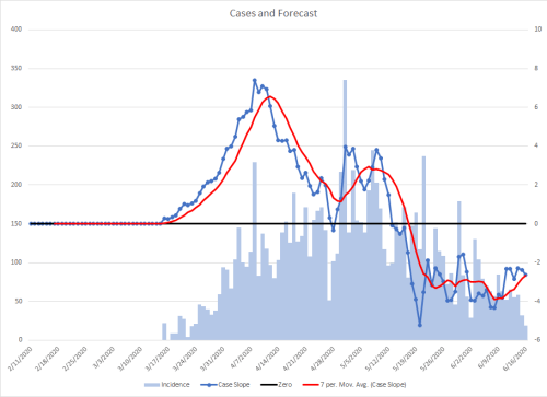
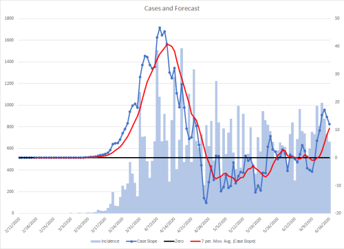
I’ll try to tie together all of the pieces related to how changing social controls can influence survival or death. I’ve done a graph like this before that indicated how it changed the case volume, but this will tie all three together. This graph combines a lot of information and may take some time to digest.

Since that time, I’ve found a bit of updated data so a few of the colored bars may appear to be in different locations, but they are minor and what is important is the trend. New Jersey has been filtered out of the data set for this graph because a change in their case definition skewed the data

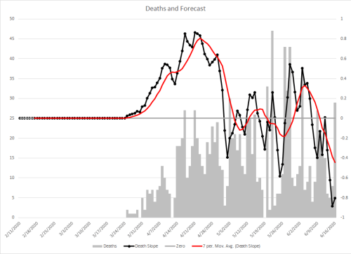
The colored vertical bars are superimposed over gray ones in the background. The height of them is the number of deaths each day, which are on the left y-axis.

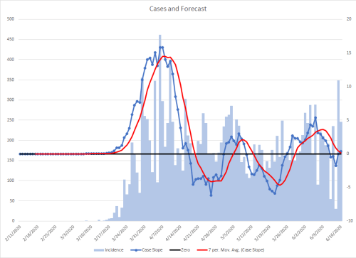
All of the colored bars are three weeks after some type of social event that could influence the course of the pandemic. I have found that interval to be very predictive of showing up in the number of cases.

The yellow bar at the left end represents the date of impact of St. Patrick’s Day on case counts. The three on the right are the dates of impact of Memorial Day weekend.

The green bars represent dates three weeks after a state first implemented some sort of significant social control, such as stay at home orders, closing businesses, etc. The darker the bar for a given day, the more states that enacted those measures. If over five states had measures on the same day, the excess were moved and added to the closest day with room to the left or right to keep the color scaling consistent.

The brown bars are similar, but represent the projected impact date three weeks after the first measure was released in the state, again a similar heat map to indicate how many on a given day.

The moving red line is a derivative function from calculus. It is the slope representing the data from that day and the 20 days prior (3 weeks), and is measured on the right axis. When That line is above zero (the horizontal green line), the number of cases goes up, when it is below, they go down. The speed of the increase or decrease is directly proportional to the distance of the red line from the green line at that date. This line has been shifted to the right, to more easily visualize the impact of the number of cases on deaths, which lags for three weeks.

It is readily apparent that when the green vertical lines are clustered (3 weeks after restrictions started), it caused the red line to move rapidly down into the area where cases would be decreasing. This also had an impact on the seven day averages of deaths, which is the black line moving through the data. It’s very clear that this black line started moving downward when the red line went below zero.

The next part to observe is the spread of the vertical brown lines, particularly when the most states were clustered together around May 20th. As restrictions were eased in many states by that date, the rate at which the number of cases had been declining started turning a corner to where they would be increasing, which should be readily apparent in the red sawtooth pattern after that date.

The important part is that while that red line stays below the green one, it will appear to many that the situation is under control because the number of deaths is falling. As that red line crosses above the green, the number of deaths will increase as well.

The first spike above the green line is a result of the record number of cases in the US the past few days. The rest is a forecast. The number of new cases will seem to stabilize the next few days and then start to rise on July 1, with almost unbelievable numbers of new cases the following days, cresting again July 4-July 5th, before settling again. Those first few days in July will then cause the hospitals that haven’t already run into problems to be overwhelmed two weeks later. July is going to be a very bad time to need hospitalization for anything across most of the country.

STAY HOME

The Decreasing Death Illusion

Many people think that the pandemic is declining in the US because of the decrease in death numbers. That’s simply not the case. Those declines have to do with the social restrictions that were put into place.

The red line is the same as the blue line with the dots on the other graphs I have done recently. Each of those points represented a 21 day retroactive slope calculation representing case incidence for that day. The slope scale is on the right axis. This is essentially a derivative approach from calculus. It is shifted to the right 20 days to make it easier to understand the relationship between the two on the graph..

The gray columns are new deaths (the death incidence) for that day and are measured on the left axis. The black line is a seven day moving average of deaths.

When the red line is above zero (the green line), it predicts that deaths will be going up on average. The further further it is above zero, the faster the rise in deaths. When it goes below zero, deaths should be dropping on average.

The reason for the decline in deaths has everything to do with the social restrictions that were put into place. This derivative measure also predicts average deaths to start going up, which they have. Look at the big spike in deaths on June 25th.

We will be seeing very high numbers of deaths the next few days.

Update: Someone let me know that New Jersey had done some reclassification, which accounts for the big spike on June 25. I filtered NJ out and the graph became even more telling.

The important part is that deaths should be in their downward weekly trend. It will be telling if the normal valley that should occur is less deep or eliminated over the next few days.

When the Valley Becomes a Mountain

There is something very disturbing in the data today, but it’s not unexpected if you understand exponential growth during a pandemic.

Since the first part of the exponential growth of COVID-19 in the middle of March, one very evident cycle that lasts just slightly over seven days has emerged with peaks and valleys. These are most evident in the derivative function I created that is the dark blue line.

On the graph, I’ve colored the four data points red for the past five weeks where we were in the downward part of that cycle – until this week. What should have been the valley is now a peak. That means that over the next three days the number of cases is going to explode.

We are in deep trouble.

STAY HOME

A Derivative Function is Predictive of Death

There have been a number of false notions about the use of case data to predict the course of the pandemic and that death data would be a better tool. The problem is that death data lags at least seven days and often up to a month, and that delays any needed interventions.

I have been using a calculus derivative function to predict the course of the pandemic in relation to cases, but decided to look at its predictive value in relation to deaths. While morbid, it’s clear that this approach provides a prediction of mortality.

The gray bars represent new DEATHS this time instead of cases. The black line is the seven day moving average of them.

The red line is my derivative function that predicts the future path of the pandemic. Given that deaths trail cases by a week, it predicts deaths in slightly over a week, in part due to getting deaths recorded. It’s a tighter match the further back in time.

The way to view it is to look at the red line when it crosses zero. The farther it is above zero, the faster the deaths will be climbing in a week. The further below zero, the faster the deaths will drop.

The steep rise in the average deaths is completely accounted for by the sharp initial rise in the red line.and the gradual decline is because the red line is hovering just below zero one week before.

This means that we are going to see a rapid rise in deaths for at least the next week from the data, but given my epidemiology experience, it’s going to climb sharply for quite a long time after that.

Testing is NOT Influencing Case Counts Significantly

Right click to zoom in.

As the pandemic was first unfolding, I had been posting data including case fatality rates (CFRs) as a means to determine fatal outcomes from the disease. This was before much testing was in place in large numbers. I had assumed that as testing increased, the CFR would drop as the denominator had become larger. Unfortunately, that is not the case.

As you can see from this data set, the CFR has settled at about 6%. The slightly downward curvature starting about mid-May is simply due to a lag in reporting the data. “It is important to note that it can take several weeks for death records to be submitted to National Center for Health Statistics (NCHS), processed, coded, and tabulated. Therefore, the data shown on this page may be incomplete, and will likely not include all deaths that occurred during a given time period, especially for the more recent time periods.”

We can see this same lag in comparing the slopes of cases to deaths that I’ve been using in recent graphs. In about a month, I would suspect that these would align more closely for the May data. The sentence in the paragraph above also explains why the red death slope curve splits downward relative to the black case curve as the date gets closer to the present.

My conclusion from both of these pieces of evidence is that anyone who is making the argument that the increase in cases is simply due to increased testing is wrong. That could change in the future, but it is not evident in the current data.

STAY HOME

June 21 State Update

Right click to expand graphs.

These are the same methodology as I previously described, but there are some additional new elements.

First, the yellow bars represent my projected impact dates from major social mixing events. The left one is when I expected to start seeing St. Patrick’s Day show up in the data, the three clustered on the right are when I expected Memorial Day weekend to show up in the data.

The other item to note the the red tail to the trend line that extends beyond the graph. That is predictive data for where each geographical location will be going.

Also, in states that have had relatively low case counts, I have forced the scale on the right to range from -5 to +5 so as not to overemphasize trend changes. As with any graph, pay attention to scales.

The states that are highlighted red are ones that never had statewide stay at home orders, although some implemented them regionally.

NOTE: Data appears to be missing for the past three days for MS. If that is the case, the downward current downward trend cannot be relied on as a predictor.

St. Patrick’s Day

Right click graphs to see them full size.

I realized that St. Patrick’s Day happened just before many states started implementing social controls. I searched for some data on the best cities to celebrate St. Patrick’s Day, under the assumption that I might find something by studying the graphs of the respective metro areas. The first yellow bar is when I projected impacts to be seen (3 weeks later) and the second wider one is the projected impact days from Memorial Day weekend.

It seemed like I might be on to something but decided to zoom out to have the entire US data set. I think I found the impact from that day.

One of the obvious cycles in the data follows a seven day pattern. My hunch is that this has to do with increased spread over the weekends, as people go to bars, restaurants, night clubs, beaches, malls, and religious services. That’s why it took some time for that pattern to show up in the data. It took a few generations of spread and amplification on the weekends to become a visible pattern.

The graph below is of the entire US, with the same yellow bars. In this one, I marked what were the peaks seen in the early data green. After the influence of St. Patrick’s Day, they are red.

The first thing to notice is that there is an initial jump (the red lines) 1-3 weeks after, that subsides for a bit, then reemerges 7 weeks after. I’m going to conjecture that the first 3 weeks are individuals who celebrated and became symptomatic. After that, the virus was circulating, but it took about 3-4 generations of spread to show up as the new peak period one day later.

What I can derive from this is that my initial estimate of cases becoming visible in the data set at three weeks seems accurate, but major changes influencing obvious changes because of multiple generations may not come into play until 10 weeks after an event.

Of course, this could simply be the natural way the disease itself works without any impact of human social conditions, but I find the data to be pretty suspicious in support of my hypothesis.

US Social Restrictions and Easing

Right click to expand a graph.

This graph is using the usual case/slope data as in recent posts. There is a prior version of this, but it used a table of state data of restrictions and easing them that was a good starting point, but I felt it would be better to tighten up that data and use a consistent source. I decided to use information gathered by USA Today and a little further digging when the information was insufficient or seemed to be an error.

The green and orange shaded bars on the case counts are the dates three weeks after social changes had been implemented. That has been my ongoing assessment of when we begin to see changes in data related to implementation. They are also similar to a heat map, the lighter ones representing one state, the darkest five, for a given day. The two dates outlined in yellow had more than five states represented that day.

I expect that the steep descent in the case slope trend (the red line) we saw nationally between April 10th and April 23rd will soon be marked by a similar upward curve within about a week, the only question is how steep and for how long.

There are two other things that can be seen in the graph. First, on June 11, I had predicted a bigger tooth in the saw pattern of the slope line due to Memorial Day. There is an arrow pointing to the part of the graph where the three week delay shows in the data.

The other thing I had been thinking about was what was behind this sawtooth pattern. I reached a reasonable conclusion that would fit around the social distancing measures that had been enacted. Early on as the virus first started getting its grip on the US, it was likely spread much more on the weekends, when bars, restaurants, malls, and churches brought more people close together indoors. That set the cycle in motion and are even apparent in the blue dots on the graph in the big curve in March and April. Now that it has started, I expect it to become more pronounced as we enter another stretch of exponential growth.

On a final predictive outcome note, I have been saying since April that we would see an increase in cases in June. I found something I wrote on May 18th that said June 15th would be the date when we would start seeing an increase in cases around the country. Oddly enough, that’s the exact date where the red trend line crosses zero.

State Case vs Death Assessment

Right click to expand the graphs.

These use the same approach as prior posts.

I’ve created three graphs for each location. The difference between them is that one graphs new cases and associated trend lines, the other graphs new deaths and associated trend lines, and the third is just the slopes of cases and deaths and their trend lines together.

Deaths lag about a week behind cases. If there is an increase in cases due to more testing, then there should be apparent differences between the 21 day incident slope graph and it’s associated trend line between the cases and deaths. The third graph is to make it easier to compare the two. If they are roughly the same, that is an indicator that there is true disease and not increased testing to account for increased cases. This will be more difficult to assess when there are fewer cases due to the small sample sizes. The close match in the US overall though is a good indicator that testing is only a small fraction of what is currently happening.

“10 states are seeing their highest average of daily new Covid-19 cases since the pandemic started.” Those states are highlighted below.

US

Alabama

Alaska

Arizona

Arkansas

California

Colorado

Connecticut

Delaware

District of Columbia

Florida

Georgia

Hawaii

Idaho

Illinois

Indiana

Iowa

Kansas

Kentucky

Louisiana

Maine

Maryland

Massachusetts

Michigan

Minnesota

Mississippi

Missouri

Montana

Nebraska

Nevada

New Hampshire

New Jersey

New Mexico

New York

North Carolina

North Dakota

Ohio

Oklahoma

Oregon

Pennsylvania

Puerto Rico

Rhode Island

South Carolina

South Dakota

Tennessee

Texas

Utah

Vermont

Virginia

Washington

West Virginia

Wisconsin

Wyoming

International View

Right click to expand images. These use the same approach as the prior two posts. This only includes countries with more than 10,000 cases.

I’ve created a pair of graphs for each location. The difference between them is one graphs new cases and associated trend lines, the other graphs new deaths and associated trend lines.

Death lag about a week behind cases. If there is an increase in cases due to more testing, then there should be apparent differences between the 21 day incident slope graph and it’s associated trend line between the cases and deaths.

If the cases are a measure of true disease burden, the curves of these lines should be similar, but the one on the death graph should simply be offset some to the right in comparison.

Please pay attention to scales and recall that reporting from some countries may be influenced by local politics. China is omitted. The data set is from Johns Hopkins University.

I noticed after I had finished the graphs that the titles on them should have been written better. They do not mean new cases per day or new deaths per day. A better wording would be New Cases with 21-day and Derivative Trends or New Deaths with 21-day and Derivative Trends.

Global

Afghanistan

Algeria

Argentina

Armenia

Austria

Azerbaijan

Bahrain

Bangladesh

Belarus

Belgium

Bolivia

Brazil

Questionable Data

Canada

Including graphs for the two most impacted provinces.

Ontario, Canada

Quebec, Canada

Colombia

Czechia

Denmark

Dominican Republic

Ecuador

Egypt

France

Germany

Ghana

Guatemala

India

Indonesia

Iran

Iraq

Ireland

Israel

Italy

Japan

Kazakhstan

Korea, South

Kuwait

Mexico

Moldova

Netherlands

Nigeria

Oman

Pakistan

Panama

Peru

Philippines

Poland

Portugal

Qatar

Romania

Russia

Saudi Arabia

Serbia

Singapore

South Africa

Spain

Sweden

Switzerland

Turkey

Ukraine

United Arab Emirates

United Kingdom

US