
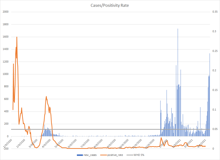
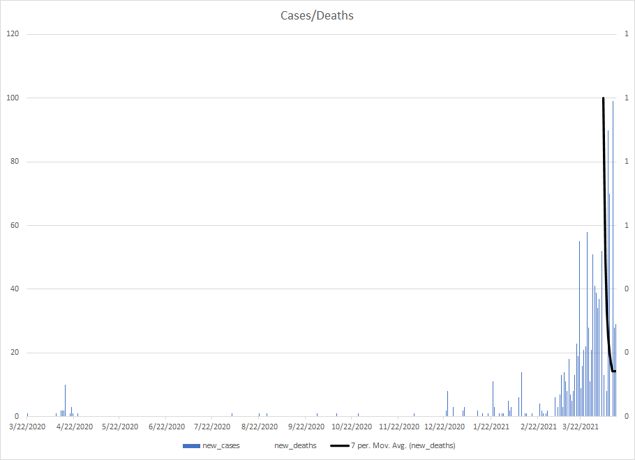
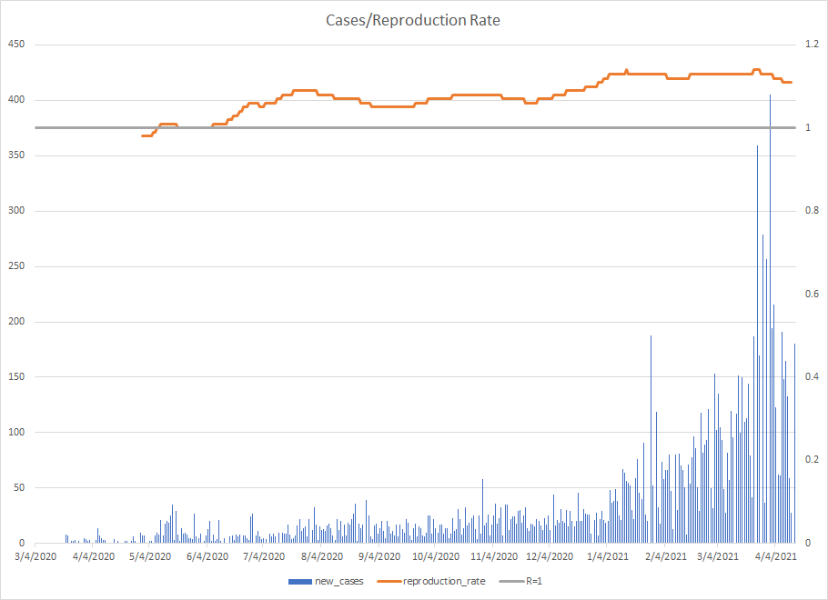
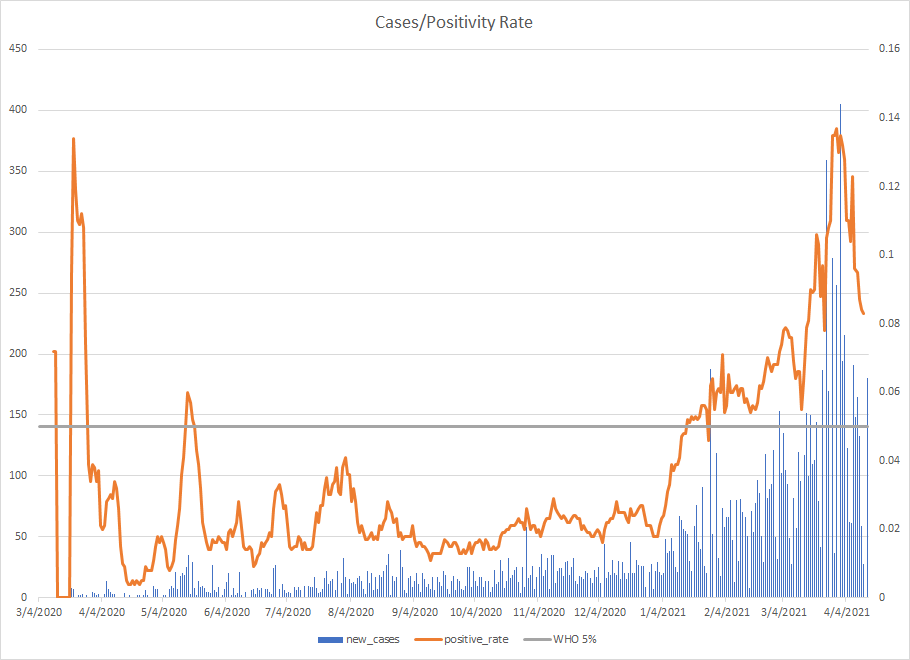
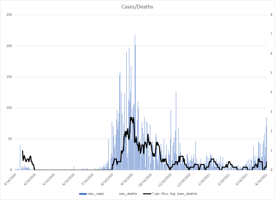
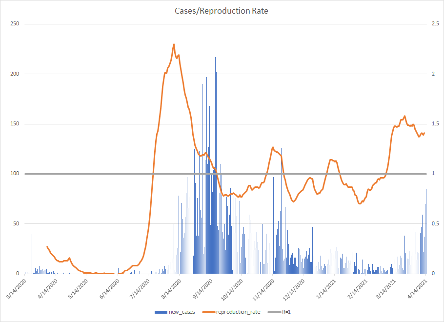
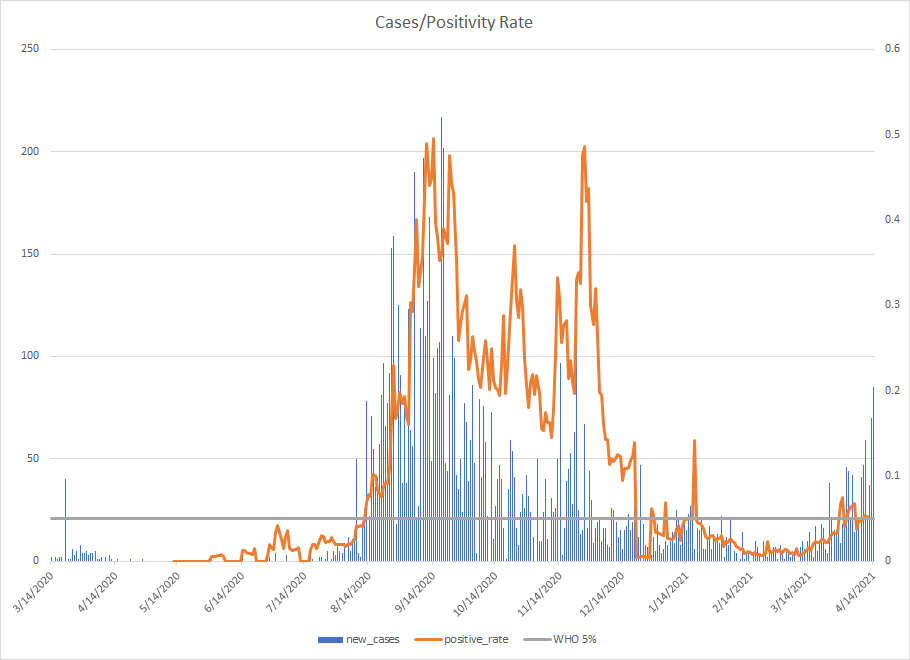
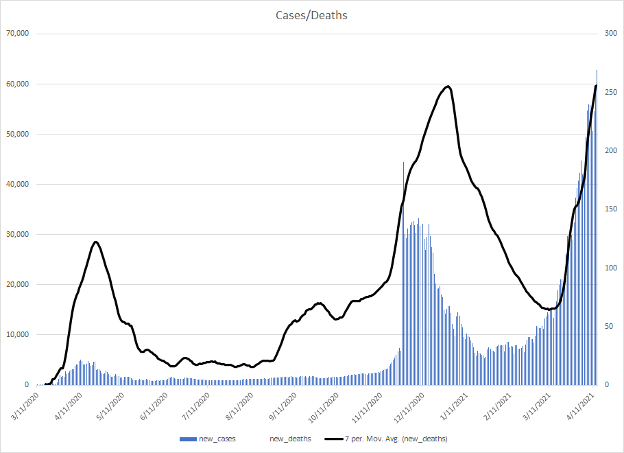
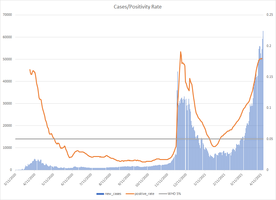
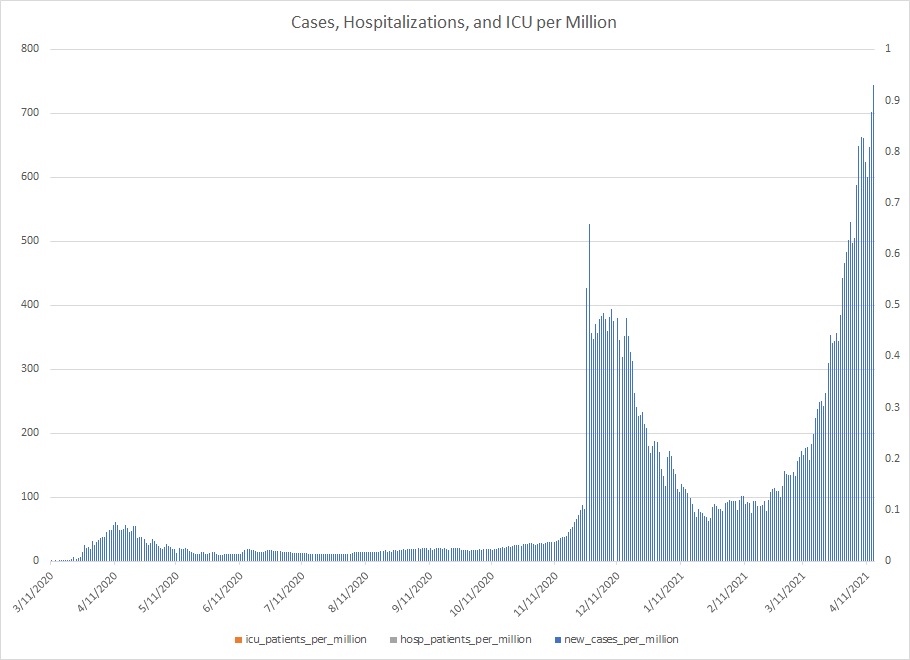
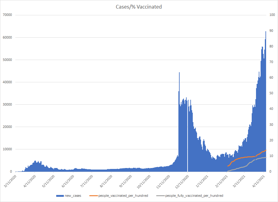
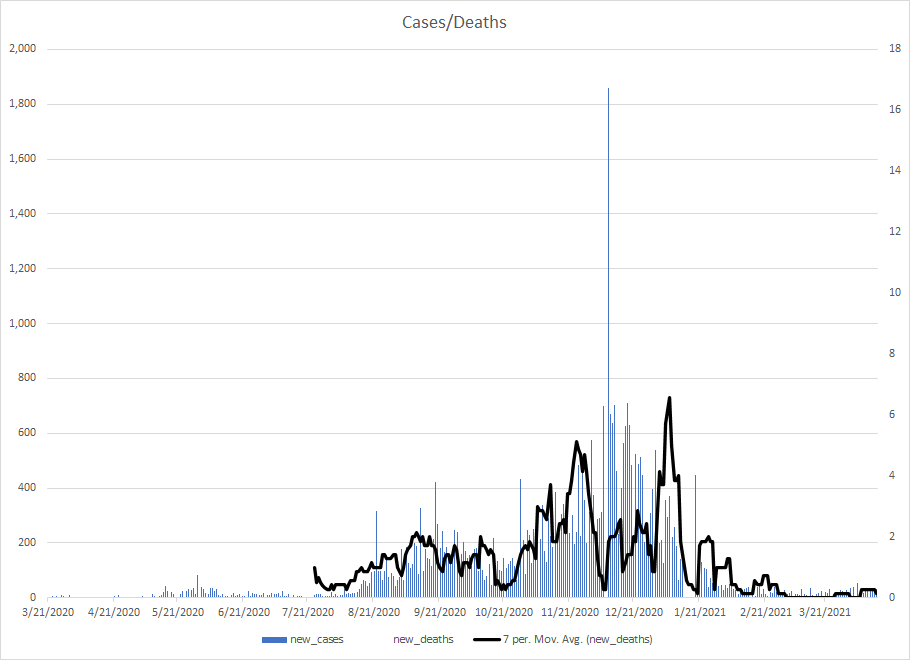
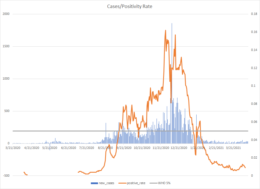
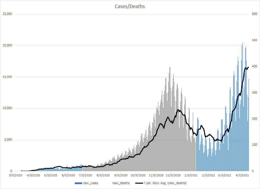
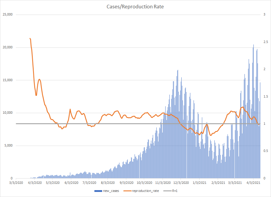
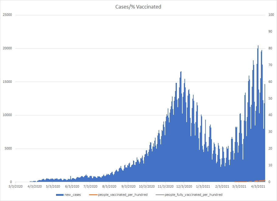
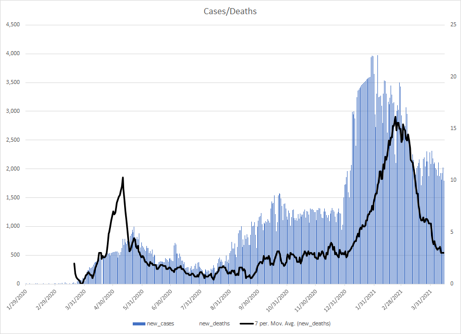
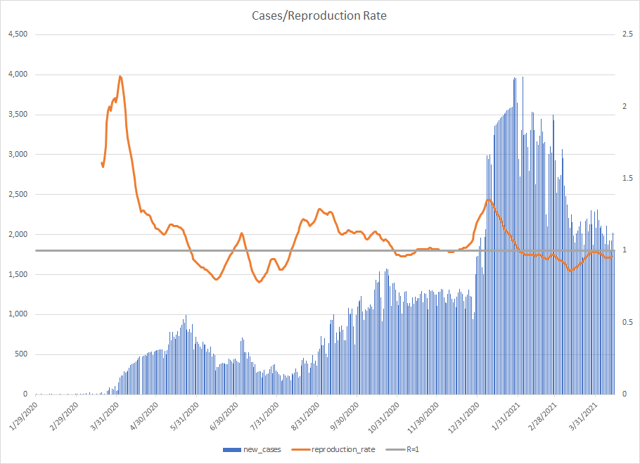
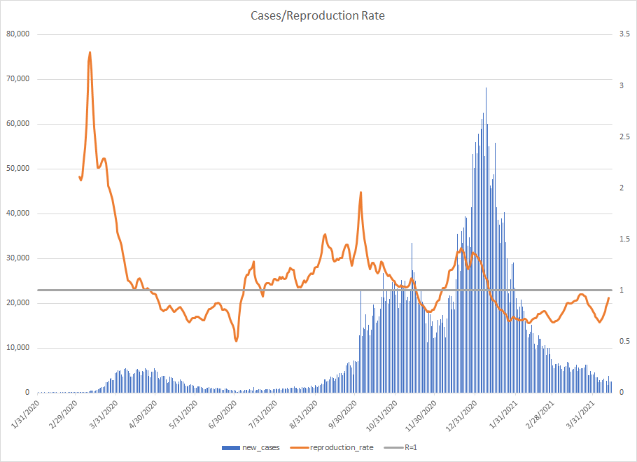
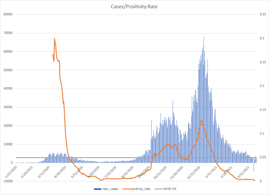
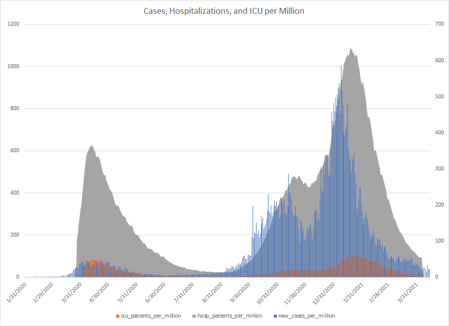
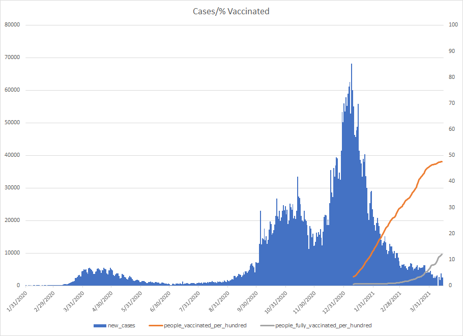
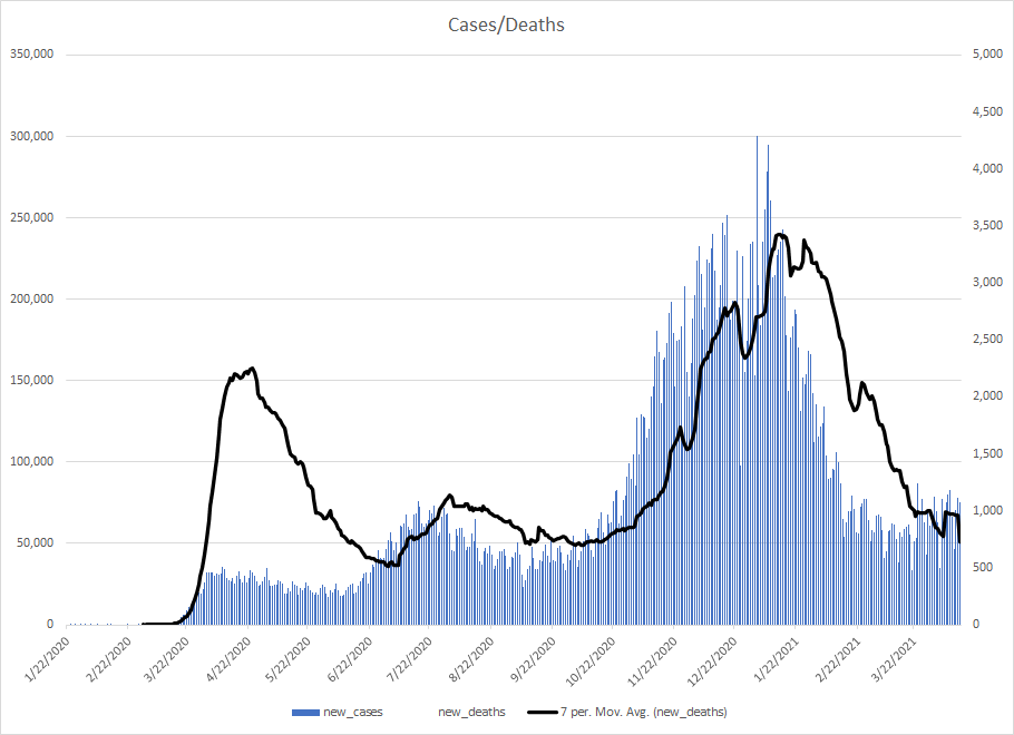
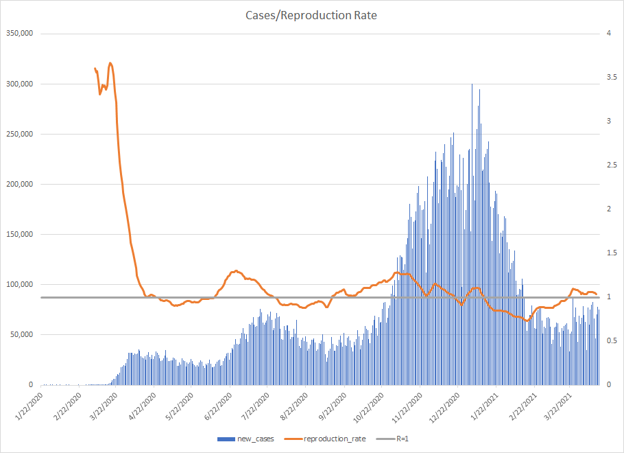
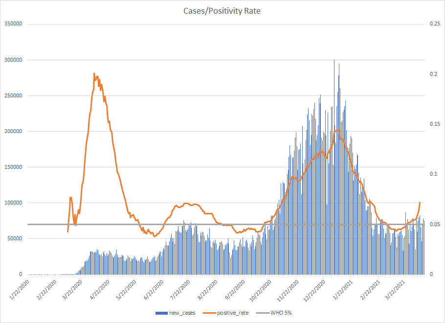
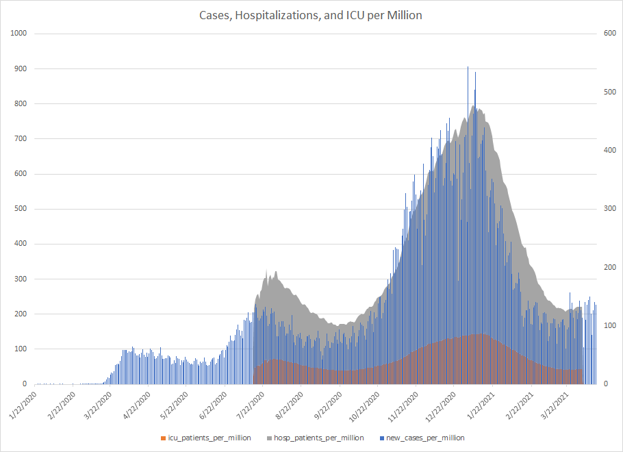
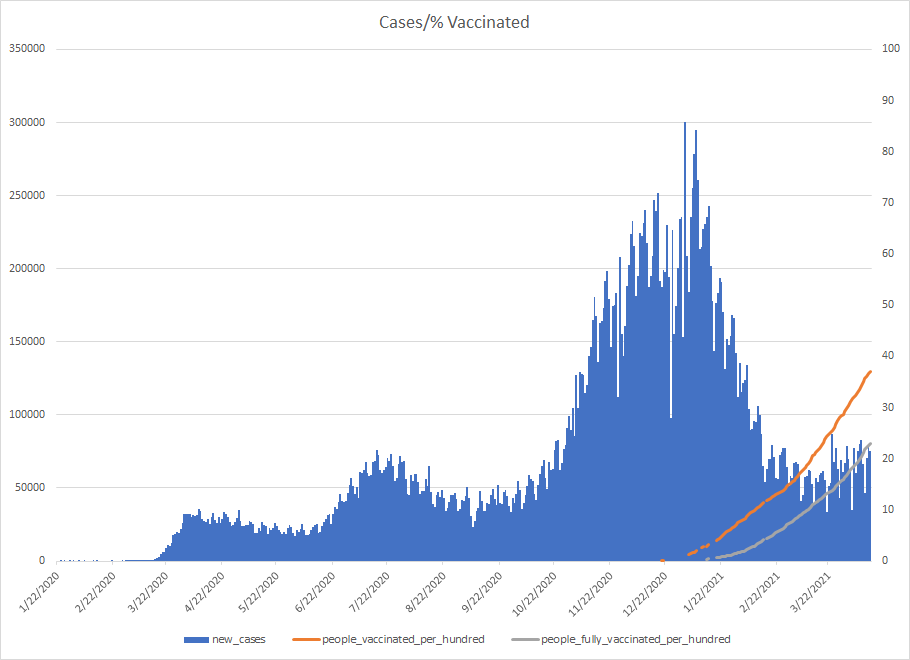
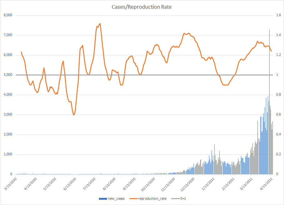
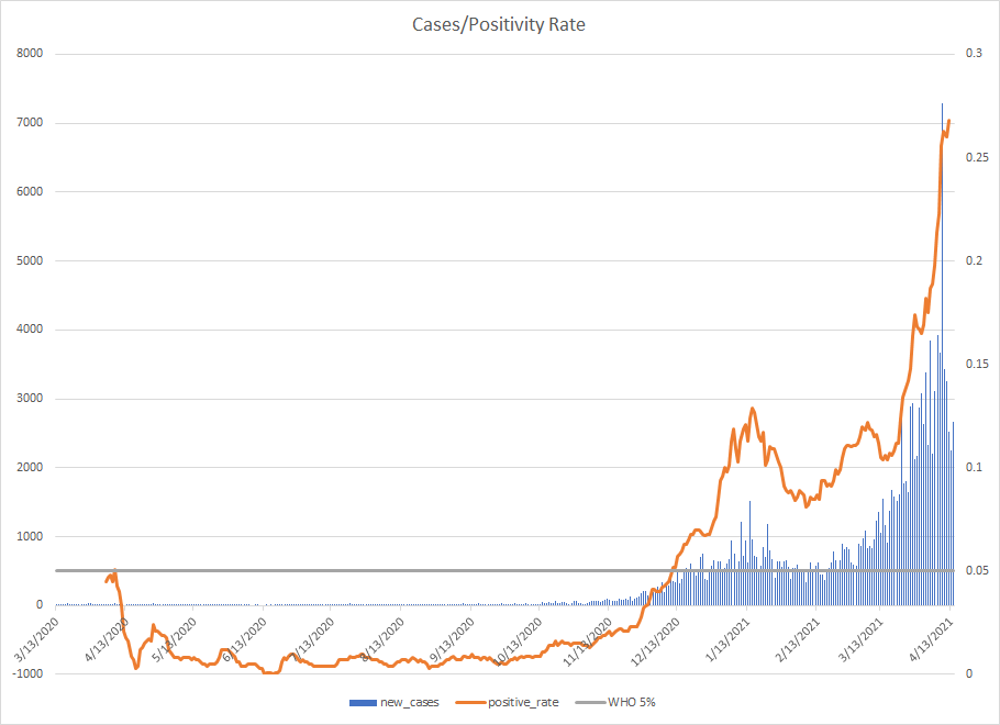
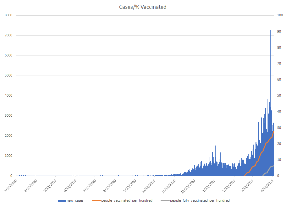
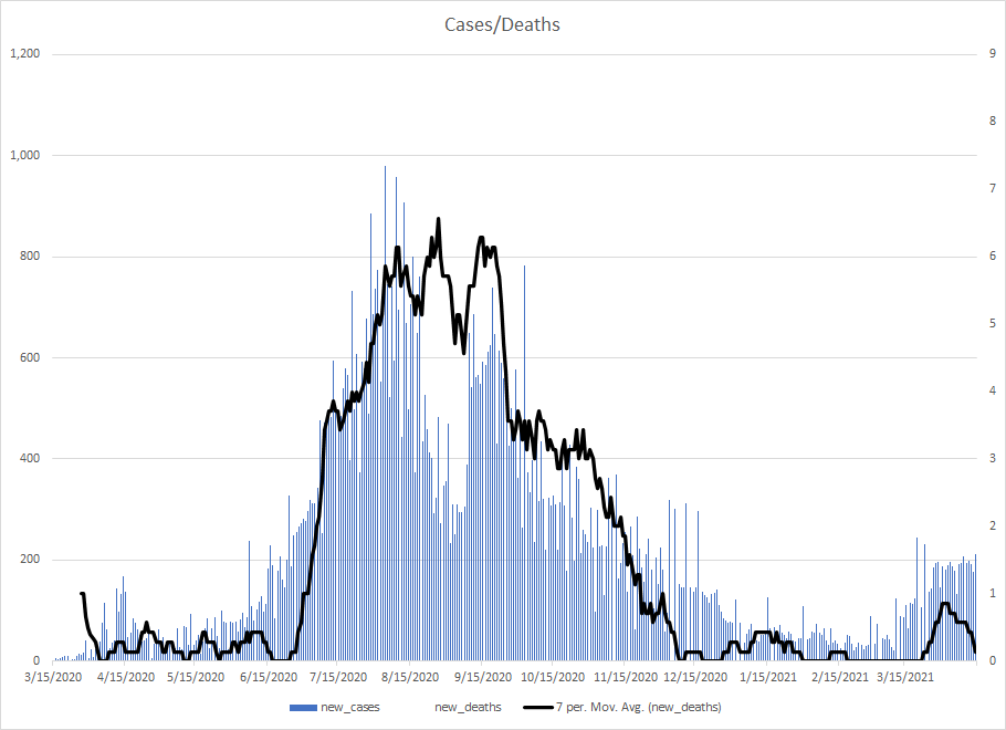
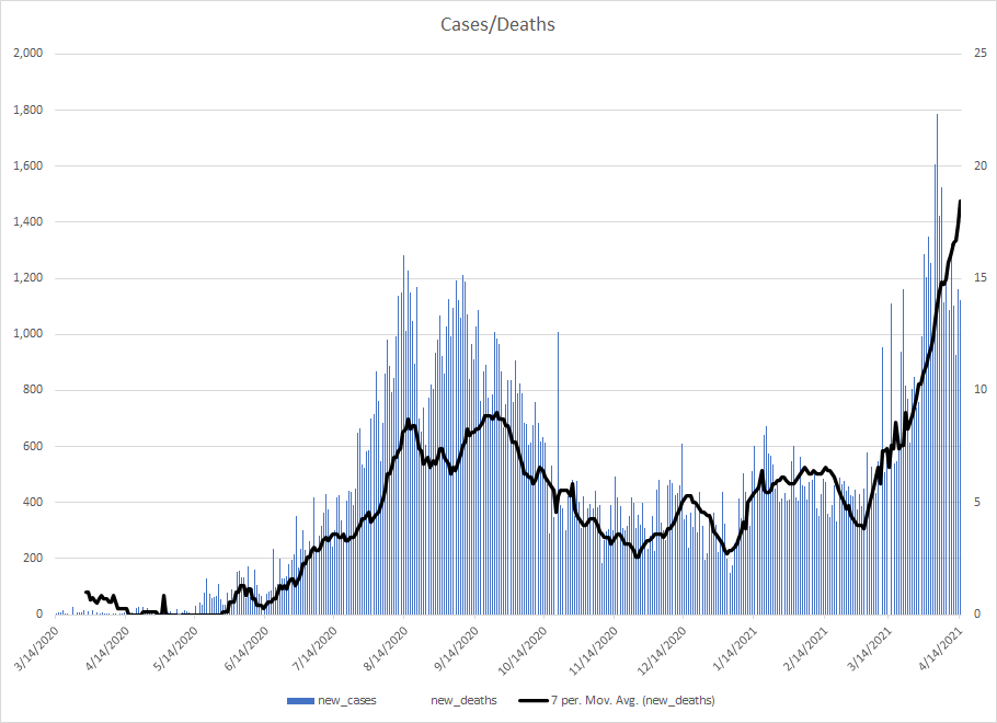
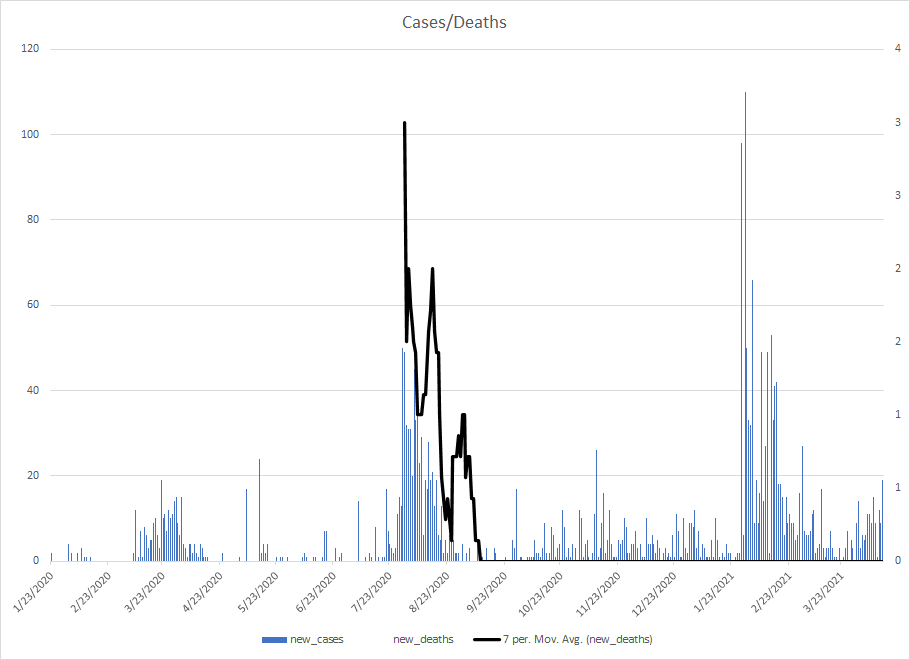
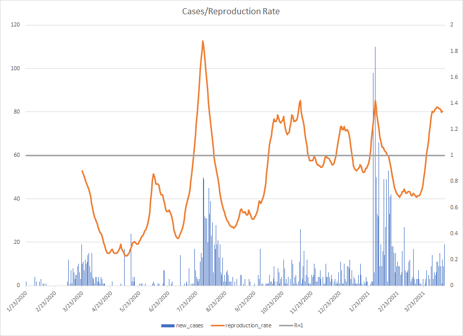
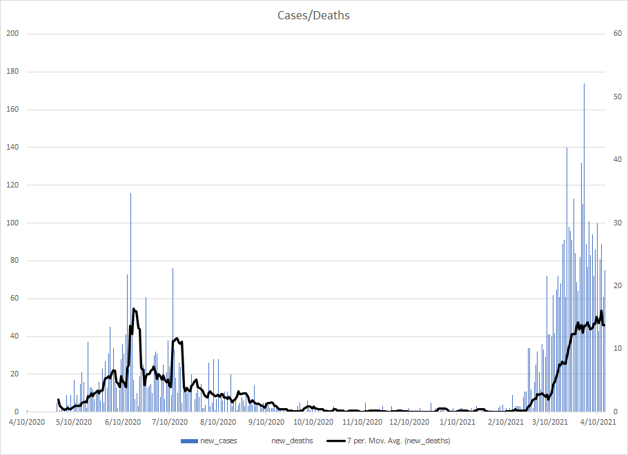
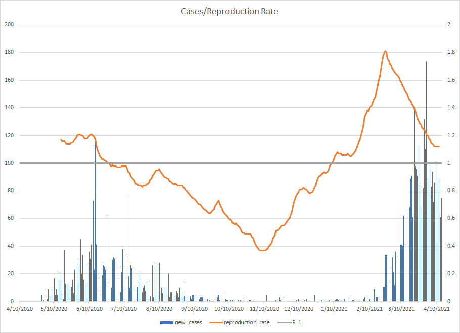
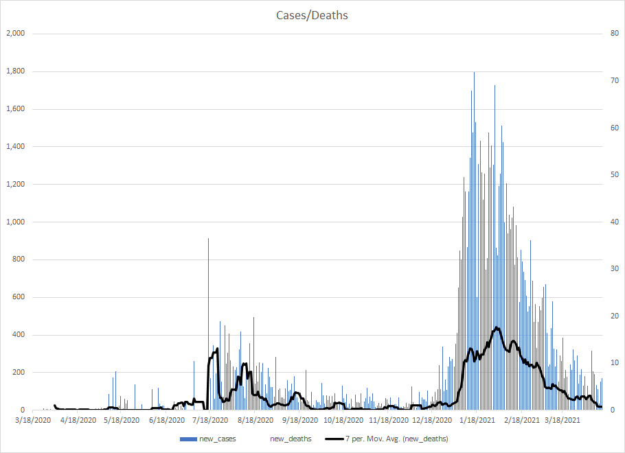
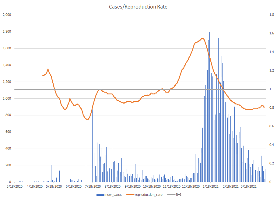
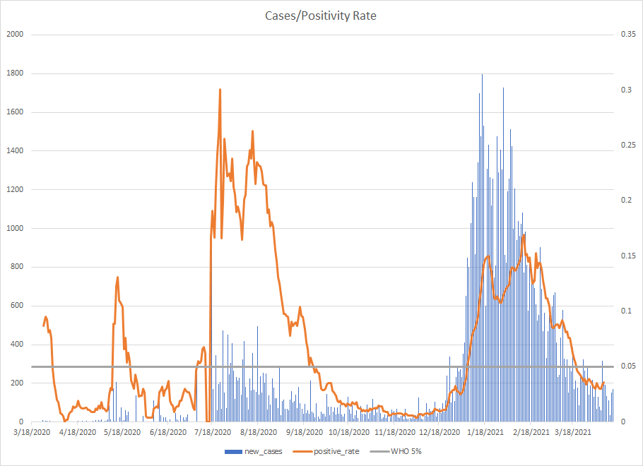
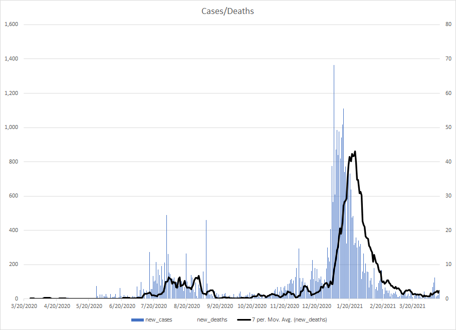
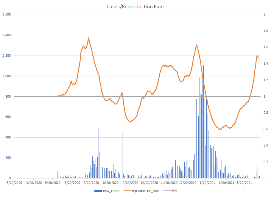
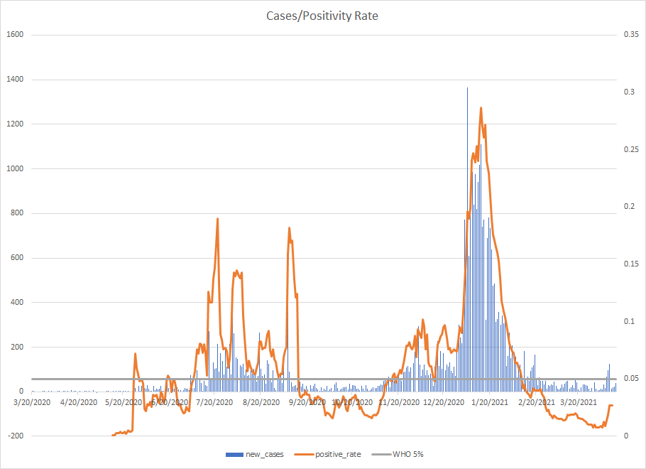
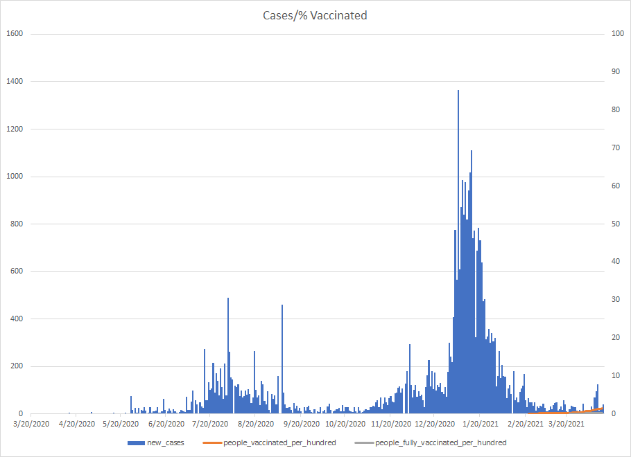
I’ve pulled together data together to provide up to five different graphs per country. Each one will have a basic epidemic curve of cases, and those will be represented on the scale on the left. Superimposed on each will be deaths, the transmission rate, the positivity rate, the hospitalization rate (and ICU use), and the percentage of the population having received one dose or having been fully vaccinated. Full data sets are obviously not going to be available for every country, so some will not have all five graphs. That’s simply a limitation of data availability.
It’s my opinion after having studied modern influenza pandemics that we are entering a very dangerous phase. We have become accustomed to waves of hospitalization and death, but it seems that most people simply don’t grasp the bigger problems that loom on the horizon. Our global supply chains are becoming more and more compromised (medications, silicon chips, etc.), social upheaval is underway (racial, socioeconomic, etc.), and economies are strained globally. This combination creates a tinderbox for conflict (Myanmar, Northern Ireland, Russia-Ukraine, Iran-Israel, etc.).
| Afghanistan |


| Albania |


| Algeria |


| Andorra |


| Angola |


| Antigua and Barbuda |


| Argentina |


| Armenia |


| Australia |


| Austria |


| Azerbaijan |


| Bahamas |


| Bahrain |


| Bangladesh |


| Barbados |


| Belarus |


| Belgium |


| Belize |


| Benin |


| Bhutan |


| Bolivia |


| Bosnia and Herzegovina |


| Botswana |


| Brazil |


| Brunei |


| Bulgaria |


| Burkina Faso |


| Burundi |


| Cambodia |


| Cameroon |


| Canada |


| Cape Verde |


| Central African Republic |


| Chad |


| Chile |


| China |


| Colombia |


| Comoros |


| Congo |


| Costa Rica |


| Cote d’Ivoire |


| Croatia |


| Cuba |


| Cyprus |


| Czechia |


| Democratic Republic of Congo |


| Denmark |


| Djibouti |


| Dominican Republic |


| Ecuador |


| Egypt |


| El Salvador |


| Equatorial Guinea |


| Eritrea |


| Estonia |


| Eswatini |


| Ethiopia |


| Fiji |

| Finland |


| France |


| Gabon |


| Gambia |


| Georgia |


| Germany |


| Ghana |


| Greece |


| Grenada |


| Guatemala |


| Guinea |


| Guinea-Bissau |


| Guyana |


| Haiti |


| Honduras |


| Hungary |


| Iceland |


| India |


| Indonesia |


| Iran |


| Iraq |


| Ireland |


| Israel |


| Italy |


| Jamaica |


| Japan |


| Jordan |


| Kazakhstan |


| Kenya |


| Kosovo |


| Kuwait |


| Kyrgyzstan |


| Laos |

| Latvia |


| Lebanon |


| Lesotho |


| Liberia |


| Libya |


| Liechtenstein |


| Lithuania |


| Luxembourg |


| Madagascar |


| Malawi |


| Malaysia |


| Maldives |


| Mali |


| Malta |


| Mauritania |


| Mauritius |


| Mexico |


| Moldova |


| Monaco |


| Mongolia |


| Montenegro |


| Morocco |


| Mozambique |


| Myanmar |


| Namibia |


| Nepal |


| Netherlands |


| New Zealand |


| Nicaragua |

| Niger |


| Nigeria |


| North Macedonia |


| Norway |


| Oman |


| Pakistan |


| Palestine |


| Panama |


| Papua New Guinea |


| Paraguay |


| Peru |


| Philippines |


| Poland |


| Portugal |


| Qatar |


| Romania |


| Russia |


| Rwanda |


| Saudi Arabia |


| Senegal |


| Serbia |


| Sierra Leone |


| Slovakia |


| Slovenia |


| Somalia |


| South Africa |


| South Korea |


| South Sudan |


| Spain |


| Sri Lanka |


| Sudan |


| Suriname |


| Sweden |


| Switzerland |


| Syria |


| Taiwan |


| Tajikistan |


| Thailand |


| Timor |
| Togo |

| Trinidad and Tobago |
| Tunisia |

| Turkey |
| Uganda |
| Ukraine |
| United Arab Emirates |
| United Kingdom |
| United States |

| Uruguay |
| Uzbekistan |
| Venezuela |
| Vietnam |
| Yemen |
| Zambia |
| Zimbabwe |
Sources
JHU CSSE COVID-19 Data
European Centre for Disease Prevention and Control
gov.UK
Canada UK Tracker
US Department of Health & Human Service
Our World in Data
