
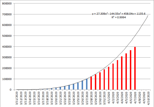
On March 27th, I projected the number of total cases we would see in the US based on the case data that was available at that time. Fortunately, enough people have been doing their part to “flatten the curve.”
The blue bars were the total US cases up to that time and the line represented the case growth curve if nothing changed. The red bars are the actual data that resulted.
Now if we could just convince those not in compliance to do their part.
STAY HOME
