
Right click to expand images. These use the same approach as the prior two posts. This only includes countries with more than 10,000 cases.
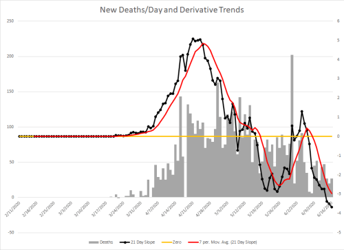
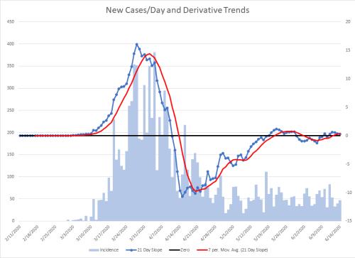
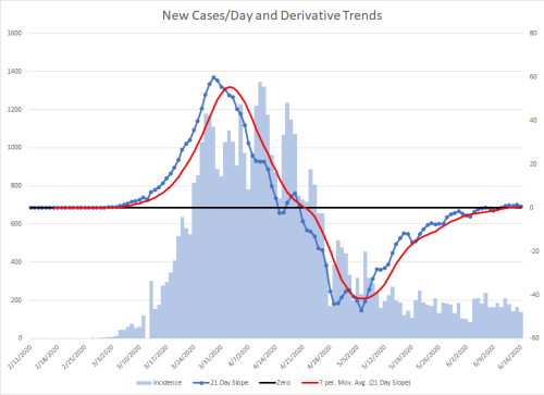
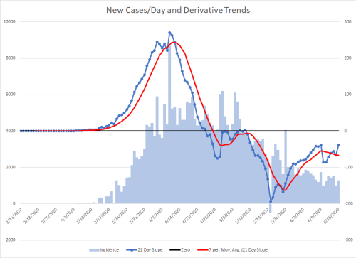
I’ve created a pair of graphs for each location. The difference between them is one graphs new cases and associated trend lines, the other graphs new deaths and associated trend lines.
Death lag about a week behind cases. If there is an increase in cases due to more testing, then there should be apparent differences between the 21 day incident slope graph and it’s associated trend line between the cases and deaths.
If the cases are a measure of true disease burden, the curves of these lines should be similar, but the one on the death graph should simply be offset some to the right in comparison.
Please pay attention to scales and recall that reporting from some countries may be influenced by local politics. China is omitted. The data set is from Johns Hopkins University.
I noticed after I had finished the graphs that the titles on them should have been written better. They do not mean new cases per day or new deaths per day. A better wording would be New Cases with 21-day and Derivative Trends or New Deaths with 21-day and Derivative Trends.
Global


Afghanistan


Algeria


Argentina


Armenia


Austria


Azerbaijan


Bahrain


Bangladesh


Belarus


Belgium


Bolivia


Brazil


Canada
Including graphs for the two most impacted provinces.


Ontario, Canada


Quebec, Canada

Colombia


Czechia

Denmark


Dominican Republic


Ecuador


Egypt


France


Germany


Ghana


Guatemala


India


Indonesia


Iran


Iraq


Ireland


Israel


Italy


Japan


Kazakhstan


Korea, South


Kuwait


Mexico


Moldova


Netherlands

Nigeria


Oman


Pakistan


Panama


Peru


Philippines


Poland


Portugal


Qatar


Romania


Russia


Saudi Arabia


Serbia


Singapore


South Africa


Spain


Sweden


Switzerland


Turkey


Ukraine


United Arab Emirates


United Kingdom

US


