
Right click to expand the graphs.
These use the same approach as prior posts.
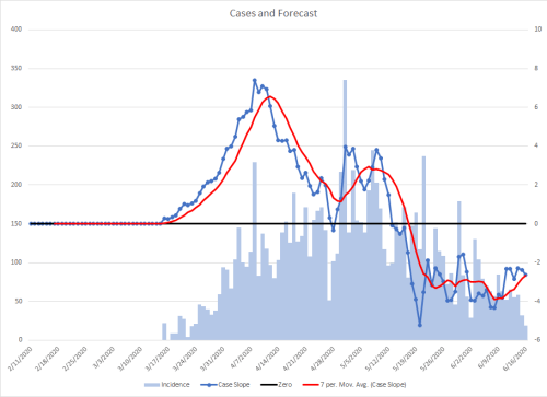
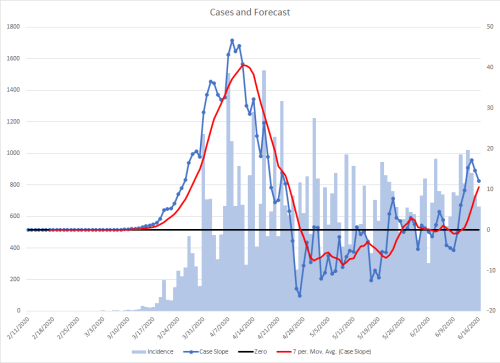
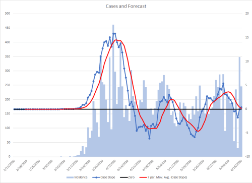
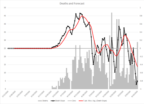
I’ve created three graphs for each location. The difference between them is that one graphs new cases and associated trend lines, the other graphs new deaths and associated trend lines, and the third is just the slopes of cases and deaths and their trend lines together.
Deaths lag about a week behind cases. If there is an increase in cases due to more testing, then there should be apparent differences between the 21 day incident slope graph and it’s associated trend line between the cases and deaths. The third graph is to make it easier to compare the two. If they are roughly the same, that is an indicator that there is true disease and not increased testing to account for increased cases. This will be more difficult to assess when there are fewer cases due to the small sample sizes. The close match in the US overall though is a good indicator that testing is only a small fraction of what is currently happening.
“10 states are seeing their highest average of daily new Covid-19 cases since the pandemic started.” Those states are highlighted below.
US


Alabama


Alaska


Arizona


Arkansas


California


Colorado


Connecticut


Delaware


District of Columbia


Florida


Georgia


Hawaii


Idaho


Illinois


Indiana


Iowa


Kansas


Kentucky


Louisiana


Maine


Maryland


Massachusetts


Michigan


Minnesota


Mississippi


Missouri


Montana


Nebraska


Nevada


New Hampshire


New Jersey


New Mexico


New York


North Carolina


North Dakota


Ohio


Oklahoma


Oregon


Pennsylvania


Puerto Rico


Rhode Island


South Carolina


South Dakota


Tennessee


Texas


Utah


Vermont


Virginia


Washington


West Virginia


Wisconsin


Wyoming


Just looking at these visually, do death rates lag the « cases » curve by about 2-3 weeks? And lessening in fatality rates? (Are we getting smarter about treating patients)
It is a 5-7 day delay. That can be seen best on the national Case to Death Comparison graph.
The reason the death graph is slightly lower on the comparison is because of the different zeros on the y-axes. The dotted trend lines are getting closer together, again, so I suspect that we haven’t improved treatment much. The divergence in May might represent more testing, but it doesn’t seem to be a factor in current cases.