
(Graphs will continue to be updated)

Misinformation and outright lies has been a major part of the problem of the COVID response in the US. This seems to be a particular problem related to the right and right-leaning media.
Methods
2020 election outcome data for the presidential race was used to group voters by county into six strata:
- 80-100% Republican
- 60-80% Republican
- 50-60% Republican
- 50-60% Democrat
- 60-80% Democrat
- 80-100% Democrat
Each of these strata were pooled for both 2010 population per the US Census Bureau and the incidence of COVID Cases. Due to the geographical election structure not aligning with county structure in Alaska, Alaska was excluded from this analysis.
The pooled COVID cases for each strata were then calculated as an incidence rate per 100,000 per calendar day. A 7-day moving average was then applied to each strata to remove some of the normal weekday variations and each line on the graph was colored to represent the degree of dominance of a political party (dark red represents >80% Republican, dark blue represents >80% Democrat) by 2020 presidential vote.
The hypothesis was that the more strongly a county voted Republican, the more likely it was to listen to and be influenced by misinformation and disinformation channels.
Results
There is a clear gradient in case rates depending on the political leanings of counties. This has remained consistent over time with two exceptions.
When the pandemic first started, a large proportion of the spread was in New York City. This was before there was a good understanding of the mode of transmission and in a very dense population area. As the virus spread into less populous area of the country and more knowledge was gained about transmission, other factors became more important in spread, such as messaging and beliefs.
The other anomaly in this pattern is in the spring of this year. This could be an effect of college students traveling during spring break, who are at an age where they are eager to return to normal and more likely to be a source of asymptomatic community transmission.

For better clarity in just how big the differences are in the extremes, the next graph only shows the >80% wins in the election. Except during the rapid case declines that were due to the vaccination efforts that reduced spread and the previously noted exceptions, the rates of new cases in strongly republican counties were almost four times as high as those in strongly democratic.

Discussion
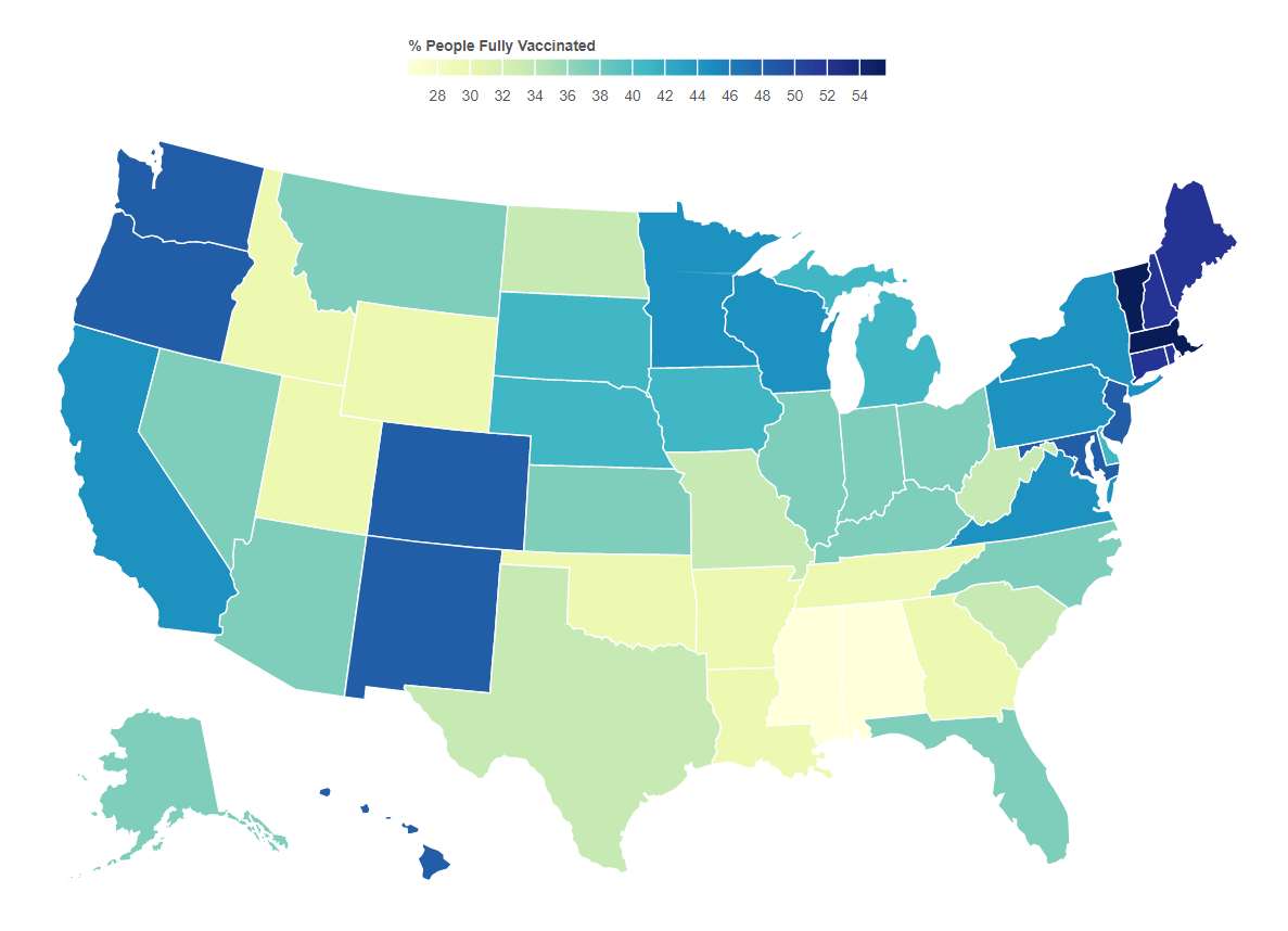
This becomes much more important as it related to vaccination efforts. As of this writing, the vaccination rates by state correlate well with voting. A current view of this map can be found here.
The majority of lies and disinformation seems to spread mostly in right wing media and is instigated by twelve different people. This is causing irreparable harm to health and to the economy. Sadly, as new variants come to dominate cases, the spread will be most obvious among those who have been fooled by these sources. What remains to be seen is whether the media will be held responsible for the damage they have caused.
Do your part. Get vaccinated. Encourage others to do so. As B.1.617.2 (the delta variant) gains a foothold, your health and life may depend on it.
An Epilogue
There is a similar pattern for deaths when stratified the same way, which is not surprising at all. The two big jumps for about a month in May 2020 are due to states catching up on death reports and submitting them all at once.

8/21/21 Addendum. Fox “News” carries some responsibility for what is happening by allowing lies like this.
8/26/21 Others are picking up on this source of the problem as well.
12/4/21 The rapid drop in the 80%+ Republican counties the past few weeks has been puzzling. The data hasn’t been tracking with that of the other strata. One possible explanation might have something to do with those who move south for the winter. However, the data this week painted a darker picture. While it may be easy to skew case data by not reporting it, it’s much harder to do so with death data. While this certainly doesn’t draw any specific conclusions, it certainly supports evidence that some governors have been trying to hide the impact in their states.
12/9/21 It appears that data from a very red state has been suppressed for about a month.
