A study was published this past week that aligned well with the start of the school year, hence a little deeper dive into the impacts of COVID on children and how schools play a role in community spread.
In this multi-center study of 898 children, 147 of which were uninfected controls, the authors intentionally broke down the analysis into cohorts of school age-children and adolescents. The older group was composed of 4,469 adolescents (1,360 controls). The results were clear.
“In models adjusted for sex and race and ethnicity, 14 symptoms in both school-age children and adolescents were more common in those with SARS-CoV-2 infection history compared with those without infection history, with 4 additional symptoms in school-age children only and 3 in adolescents only. These symptoms affected almost every organ system. Combinations of symptoms most associated with infection history were identified to form a PASC research index for each age group; these indices correlated with poorer overall health and quality of life.”
44% of the children had problems with memory, focus, and sleep. In addition, daytime sleepiness was reported among 52% of the younger children and 89% of adolescents. This certainly suggests a contributing factor in the drop in ACT scores since the start of the pandemic.
I have many other studies on the impacts on children with links and quotes here. This sample of studies should make it quite obvious that we are doing a great deal of harm to children. In addition, those harms will also impact society in the future when they become adults who cannot function at their full potential. These societal impacts are also happening now while they are still in school.
It certainly didn’t help that people like Emily Oster wrote pieces like this that downplayed the role of schools in community spread. She has had many incorrect takes on the disease throughout that pandemic and is a poor source of pandemic information. I don’t understand why anyone would listen to an economist about anything related to the pandemic. They have overall been some of the worst minimizers. The truth is that about 70% of cases in households were caused by children bringing the disease home.
It’s not just a problem in the US. This person claims to be an infectious disease physician and PhD. I have my doubts based on some of the things that they have said which have no basis in science. Worse though is that they spread propaganda like this which harms and kills people. Don’t listen to anything that they say. It’s usually a tell when someone won’t identify themselves by name.
Another study found “This analysis shows that an increase in visits to both K–12 schools and colleges is associated with a subsequent increase in case and death growth rates. The estimates indicate that fully opening K–12 schools with in-person learning is associated with a 5 (SE = 2) percentage points increase in the growth rate of cases. We also find that the association of K–12 school visits or in-person school openings with case growth is stronger for counties that do not require staff to wear masks at schools.”
The data from that study is also a strong case for the benefit of requiring respiratory protection in schools.
The mean start date of schools in the US is between August 12th and 16th, yet some schools have already had to close due to COVID outbreaks. Of course, given the poor guidance coming from places like the CDC, one only planned to be closed for two days to do “thorough cleaning and sanitization before reopening.” The fact that schools think that this will do anything to help shows just how bad public health messaging has been through the pandemic.
In 2022, there were 4,228 candidates awaiting lung transplant in the US, compared to 4,208 in 2020. What appears to be a stable demand could simply be due to COVID killing a number of people who need lung transplant. In fact, the demand will be increasing due to COVID.
Currently, 10% of lung transplants are going to COVID patients. That certainly suggests what will be an increasing demand in the pulmonary fibrosis is a progressive disease, which means that it worsens over time.
In addition, some people are removing themselves from donor lists because they don’t like that programs require organ recipients to be vaccinated. That requirement is nothing new. It’s simply a political reaction to vaccine mandates. Recipients have been required to have certain vaccines to prevent themselves from being bumped to the bottom of the list. It’s the same idea as requiring those who were to get a lung transplant to have stopped smoking six months beforehand. There is no reason to give a scarce organ to someone who isn’t going to protect it.
Another study was recently published addressing some of the damage that occurs from a COVID infection at the cellular level. It is particularly important because it was looking only at those who were asymptomatic or only had a few symptoms.
One of the outcomes studied was blood leukocyte DNA methylation Age (DNAmAge). DNAmAge refers to the biological age of a person as determined by DNA methylation levels. This concept is based on the idea that DNA methylation patterns change with age, and these changes can be used to estimate an individual’s biological age, which may differ from their chronological age.
“Increased leukocyte DNAmAge correlates with the duration of SARS-CoV-2 infection (average 17 days) because prolonged infections lead to sustained inflammatory responses and cellular stress, which induce significant epigenetic changes. This mechanism is similar to that observed in other viral infections like HIV.
Where this gets really interesting (and concerning) is looking at this result in context with a study from 2021 on telomere length and biological aging from COVID. In the introduction, the authors state “In humans, telomere shortening is associated in vivo with the aging process and, in vitro, with cellular replicative senescence.” Cellular replicative senescence is a phenomenon where cells permanently stop dividing after a certain number of divisions. This process is primarily driven by the shortening of telomeres, which are protective caps at the ends of chromosomes. In human cells, that limit is about 50 divisions, because the telomeres become shorter each time the cell divides.
This is why I suspect that COVID appears to be more of a problem in the elderly. In their case, many cells in various types of tissue have reached the end of their replicative life, which means that the tissue that they compose can no longer function as well.
In children, uninfected cells still have a lot of replicative potential, so these cells divide sooner than would normally occur. That may make the disease seem milder in the short term, but it also has diminished the ability of cells to divide in the future, because they have used up some of their replication potential. This is still not a well understood part of biology yet and also varies by tissue type.
This also means that this likely has a cumulative effect, meaning that the tissue of a child infected multiple times over the course of the pandemic will have some tissue of a 70-year-old person even if they are chronologically only 40-50 years old.
It’s also important to think of that in the context of chronic diseases. Most chronic diseases don’t manifest themselves while a person is young, and they have a lot to do with the ability of tissue to function properly, but this becomes more difficult as more cells in the tissue can no longer replicate, leaving higher demand on the surrounding cells.
Campisi et al continue, “Our findings confirm that chronic diseases are linked to elevated DNAmAge, consistent with previous research on frailty, cancer, diabetes, cardiovascular diseases (CVDs), dementia, and decreased lung function (FEV1) in COPD patients, a known consequence of aging.”
Not only does this impact the future health of people, but it also affects their ability to work. Campisi also looked at Work Ability Index (WAI) scores. The WAI is a tool used to assess a worker’s ability to perform their job based on their health and job demands and is used most often in occupational health in healthcare settings. “HCWs with greater DNAmAge showed lower WAI scores, marking this as the first study to link leukocyte DNAmAge with WAI, consistent with the decline in work capacity due to aging and chronic diseases…Chronic job-related stress and inflammation accelerate telomere shortening, impairing cellular repair and function.”
The next sentence is quite telling. “This relationship is biologically plausible as shorter TL indicates advanced cellular aging, which reduces physical and cognitive capacity, impacting work ability.” It correlates well with what we have seen for increasing MVAs and is why I’m reluctant to take a commercial flight.
Finally, they used COPD patients as a control group to compare to the HCWs who participated in the study. “COPD patients are considered a suitable positive control group because they exemplify accelerated biological aging due to chronic inflammation and oxidative stress.
Our results revealed that the blood leukocytes and IS cells of HCWs are biologically older than those of COPD patients, as determined by AgeAcc and predicted TL. This indicates that COVID-19 may induce more pronounced epigenetic changes and telomere attrition than COPD.”
This is what is so upsetting about those who think we should allow children to get repeatedly infected. The data is quite solid that we are saddling them with chronic diseases and a shorter lifespan, although that has not yet become evident. Those behind and supporting The Great Barrington Declaration have really signed the death warrant of millions, even though it’s not an immediate execution. It’s criminal.
I still have trouble wrapping my mind around this idea. My fear is that it is a way to offset Medicare and Social Security costs in the future. The question is if the US government can be that evil.
In grad school, I had started my thesis work on bioterrorism preparedness planning in 2000. When 9/11 happened, it suddenly became far too big of a project due to the volume of publications. As part of my research prior to that day though, I had submitted some FOIA requests related to the topic. What I found was pretty disturbing, so yes, our government can be that evil.
ACT Scores
These are ACT scores since 2010. The green band is < 2 standard deviations (SD) below the mean (dotted black line). The yellow band is 2-3 SD below the mean.
Normally speaking, values within 2 SD is considered just normal variation in the data. We start thinking that some effect is happening when it gets higher than that. It’s pretty obvious that we could exceed -3 SD in 2024.
I admit that some of this might be due to virtual school at the start of the pandemic, but that effect should have washed out by now and I don’t think it would have been this pronounced.
I think what we are seeing is MUCH more influenced by the cognitive impact of an infection, or in kids, repeated infections, since so many believe it’s minor for them. Schools are a main source of community spread. We are going into the season with COVID cases at full throttle.
Ivermectin Grifters
I’m very happy to report that two big ivermectin grifters and misinformation spreaders who are a part of the Front Line COVID-19 Critical Care Alliance had their board certifications revoked by the American Board of Internal Medicine (ABIM). Pierre Kory, MD, is no longer certified in critical care medicine, pulmonary disease, and internal medicine and Paul Ellis Marik, MD, is no longer certified in critical care medicine or internal medicine.
All one has to do is look at who people like this associate with to figure out if one should avoid them as clinicians.
Yoda probably said it best. “Hmm…FAFO they did.”
Mpox
A new clade (1b) of mpox (formerly monkeypox) emerged in September, 2023 in the Democratic Republic of the Congo. This is different than the clade that began to spread globally a couple of years ago, which had its highest impact in the MSM community. There have been 548 deaths from mpox in the DRC this year, but equally as alarming, about “40% of cases are in children under 5 years old.” This suggests that this is much more infectious than what we had seen in the past and is likely being spread via contact, fomite, and airborne transmission routes.
On August 13th, the Africa Centres for Disease Control and Prevention declared a public health emergency for the first time in their history, and the WHO declared a global public health emergency the following day.
On August 16th, the first case was reported outside of Africa, in a person who returned to Sweden after a visit to the DRC.
The other big unanswered question with this disease is how much impact a COVID-damaged immune system will have on both the course of the disease in an individual and how that will affect spread to those around them.
Given how people flaunted public health recommendations, the likely lack of adequate vaccine volume as well as vaccine hesitancy by many, and how poorly we had done at the start of the COVID pandemic, I’m incredibly worried. This could be considerably harder to protect yourself from compared to COVID.
The US state graphs now have the new variants included in a data visualization. In addition, they have been slightly blurred, which will make the mind perceive them as being in the background, which makes the other data trends much more easy to follow.
COVID and Motor Vehicle Accidents (MVAs)
A very interesting study was published by the AAA Foundation for Traffic Safety this week. A single graph sums up the findings on traffic deaths related to COVID. The paper also demonstrated the accuracy of their model in predicting MVA fatalities.
We have known for some time that infectious diseases have impacts on brain function, and even have been correlated with motor vehicle accidents. One example is toxoplasmosis.
The danger of a MVA is also heightened after a COVID infection due to the immune system damage caused by the virus. In a study in Australia by Ingram et al., “a novel finding was that motor vehicle accidents (MVAs) accounted for 78% of all trauma-related cases, suggesting MVAs should receive greater recognition as a potential precipitant of cutaneous mucormycosis.”
This is a CT image of a skull from that study of someone who had cutaneous murcomycosis.
One of the factors that may drive increasing MVA rates after COVID is the impact on the brain’s ability to process and construct visual data, as measured by the Rey-Osterrieth Complex Figure Test (ROCF), which was used in a study by de Paula et al., as quoted below.
We observed significant cognitive impairment only in the ROCF, a drawing task test used to assess visuospatial abilities, executive functions and memory. The deficits observed in the ROCF could not be explained by socio-demographic factors, ophthalmologic deficits or psychiatric symptoms, suggesting cognitive deficit secondary to SARS-CoV-2 infection. Other factors which may influence performance, such as motor coordination, spatial neglect, visual attention, semantic knowledge, intelligence and executive functions were not likely to explain the observed difficulties, since we did not find any significant differences in other non-verbal (Trail Making Test and Five Points Test) and verbal tests (verbal fluency, digit span) also related to these processes…
…Visuoconstructive deficits are usually defined as an atypical difficulty in using visual and spatial information to guide complex behaviors like drawing, assembling objects or organizing multiple pieces of a more sophisticated stimuli. In drawing a complex figure, as in the ROCFT, the patient must organize visual and spatial information in a planned manner to execute the drawing per se, a processes that demand several more specific cognitive abilities related to perceiving, processing, storing and recalling visuospatial information, both regarding shape and position, as well the planning and execution of the drawing per se.
In one study on cognitive abilities that had nothing to do with viruses, the researchers happened to find Acanthocystis turfacea chlorella virus 1 (ATCV-1) in the oral swabs of the test subjects. “This family of algae-infecting viruses is common in aqueous environments but not previously thought to infect humans or animals or to inhabit human mucosal surfaces.”
“A significant association occurred between the presence of oropharyngeal ATCV-1 DNA and a lower level of performance on the Trail Making Test Part A (Trails A), a test of visual motor speed (P < 0.002), as well as the total score of the Repeatable Battery for the Assessment of Neuropsychological Status (RBANS) (P < 0.014). Within the RBANS test, there were statistically significant differences between those who had detectable oropharyngeal ATCV-1 DNA and those who did not in the domains of delayed memory (P < 0.039) and attention (P < 0.011). These differences were independent of the covariates of age, sex, race, socioeconomic status, educational level, place of birth, and current cigarette smoking. On the other hand, no differences were observed between the presence/absence of ATCV-1 DNA and scores on the Wechsler Adult Intelligence Scale (WAIS) Information subtest, a test of general knowledge.”
Just this year, Serafim et al. found “The data indicate higher percentages of cognitive difficulties in the severe group, followed by the moderate group, compared to the mild group. Notably, even within the mild group, 11% of participants exhibited difficulties in at least one assessed cognitive function 18 months after COVID-19 infection.”
Of course, we’ve known all of this for well over 30 years. “Profound changes in behaviour are observed following infection of the central nervous system by some viruses. Irritability, insomnia, hyperactivity and learning disability are some of the behavioural disturbances that have been described in both humans and animals with central nervous system infection.”
What I really would like to know is how the impairment compares to that who are driving under the influence. I also wonder if DMVs should be performing a cognitive test as part of driver’s license exams and renewals to make the roads safer.
The data from The Insurance Institute for Highway Safety (IIHS) also shows a marked increase in traffic deaths since the start of the pandemic. The red line indicates the 2020 data points. The sharp increase
This is data from FRED combined with the IIHS data. The purpose was to determine if changes in passenger air miles would account for the increase in MVA deaths.
The black line is road miles, the light blue is air miles, and the red is MVA deaths per 100,000 population per 100,000 miles. The orange line is simply to make it easy to look at the year 2000 on all three. The drop in air and road miles is expected, but the big jump in mortality is telling. Part may be due to higher speeds on empty roads, but that also might be related to increased risk-taking behavior as a result of COVID infection. Now the highways are congested again, but the mortality hasn’t dropped. It’s another argument that COVID is driving up MVAs.
In addition, we could have expected MVA deaths to drop on less congested roads because those driving at significantly excess speeds at the time could have been outliers, which makes it even more suspicious since fatalities should have dropped during 2020.
Social media may also play a role in risk-taking behaviors due to a concept known as relative deprivation. A simple example is when a child complains that all of their friends are doing something that they are not allowed and the child proclaims “It’s not fair!” This kind of thinking is promoted on social media due to the biased nature of posts of people only showing the good things in their lives, which leads to some people thinking that their lives are substandard, and inevitable depression if they dwell on it.
“A total of 11,270,763 adults were identified. Overall, 9,425,473 (84%) had received a COVID vaccine and 1,845,290 (16%) had not received a COVID vaccine at study baseline (July 31, 2021). The 2 groups spanned a diverse range of demographics, with comparable general health care utilization. The largest relative differences were that those who had not received a COVID vaccine were more likely to be younger, living in a rural area, and below the middle socioeconomic quintile. Those who had not received a vaccine also were more likely to have a diagnosis of alcohol misuse or depression and less likely to have a diagnosis of sleep apnea, diabetes, cancer, or dementia. About 4% had a past COVID diagnosis, with no major imbalance between the 2 groups.”
In that analysis, “living in a rural area” really stood out to me, particularly because I had picked up on how COVID was impacting Republicans and Democrats very differently, which is very fascinating if it weren’t so sad. Most people realize that Republicans dominate rural areas, as this voting map from 2020 shows.
Another important piece to tie this story together is education level. The data is very clear that Democrats have achieved a much higher level of education than Republicans.
Circling back to the original article, we can see the impact that education has on the severity of MVAs, and particularly during the pandemic.
Sadly, it’s not just those in vehicles who are impacted, but cyclists and pedestrians have been harmed in higher numbers as well.
When someone says “What do you care if I wear a mask or get vaccinated or not?” I get irritated. I care because it impacts others, whether through traffic injuries or fatalities, the loss of healthcare, and higher auto insurance and health insurance rates.
H5N1
Vectors
One study showed that blowflies are a potential vector of H5N1 in Japan. Guess what blowflies like. “Blowflies are well-known for their necrophagous habits, being attracted to deceased animals and birds to feed on decaying flesh. They are also attracted to feces, making them commonly observed insects around livestock facilities.”
“Farm B first noted dairy cattle illnesses on March 20th with the illnesses increasing over the next 13 days, eventually affecting an estimated 14% of the milking herd. On March 22, illnesses were first noted in the Farm B’s feral cats with cats showing lethargy, paralysis, and increased respiratory rate. Farm B estimated that 15-20 of their ∼40 feral cats died during the next 14 days.” That’s pretty suggestive of nearly a 50% mortality rate in felines.
“We identified several mutations that alter host cell specificity, target drug binding sites and known to cause antigenic shifts or cause mild drug resistance.” This in itself isn’t surprising since mutations readily happen in influenza viruses, but it does point to just how dangerous mutations are for the human population.
This is what is most concerning. “The second worker had a MN of 1:80. She worked in the Farm A’s cafeteria. She reported experiencing fever, cough or sore throat during that last 12 months as well as being around others at work with similar respiratory signs and symptoms. She had just recovered from a respiratory illness when we enrolled her.”
Given that she was a cafeteria worker, that means that she likely had little or no exposure to the cattle. This implies one of two possibilities. First, that somehow an airborne spread occurred from the location of the cattle into the cafeteria, which seems pretty unlikely. Much more alarming is that this case may represent human to human transmission. This is very problematic in that we are not doing much testing, just like early in the COVID pandemic, so we are unable to characterize what is really happening in the field.
COVID-19 policies were confirmed at all 67 patient-serving NCI-designated cancer centers. 28 cancer centers (41.8%) required universal masking in at least some clinical areas, with 12 (17.9%) requiring universal masking in all areas. Only 14 (20.9%) had accurate up-to-date policies flagged on the home page of their websites. In 8 cancer centers (12.0%), policies posted on websites differed from those noted by telephone. Cancer centers were more likely to require universal masking in at least some areas if they were located in the Northeast (11 [78.6%]), had longer NCI designation duration (first quintile: 10 [83.3%]), had more program funding (first quintile: 11 [84.6%]), or had a higher care ranking (first quintile: 11 [84.6%])
The data indicate higher percentages of cognitive difficulties in the severe group, followed by the moderate group, compared to the mild group. Notably, even within the mild group, 11% of participants exhibited difficulties in at least one assessed cognitive function 18 months after COVID-19 infection.
We showed that cognitive symptoms persist in mild cases and are even more prevalent in individuals with severe manifestations. Furthermore, we confirmed our central hypothesis: people with severe forms of COVID-19 show diminished cognitive performance 18 months after infection compared to those with mild to moderate forms.
Oddly, there is still a lot of vaccine hesitancy and conspiracy theories even though that has all been debunked. What’s even more puzzling are the number of people who will claim that it hasn’t been tested adequately (it’s been tested far more than any other vaccine at launch), but then they will go on to take drugs like hydroxychloroquine and ivermectin, that hadn’t been tested much for COVID initially, and after they have been tested and found not to provide any benefit, they still insist that it’s a cover up. Another study was published in JAMA this week indicating that ivermectin is no better than placebo.
So are vaccines better at preventing COVID infection, hospitalizations, and death? The data paints a very cleart picture.
Infection
This graphs represents cases by vaccination status per 100,000 people.
At first glance, the green line at the bottom right doesn’t seem to any benefit from the bivalent boosters. However, this is due to the big surge of cases at the start of 2022, which changes the scale of the y-axis. This is a view of just the part of the graph when the bivalent data became available.
Of course, there were legitimate concerns about the safety of the vaccine in adolescents and children. Views of the data can be found in the link in the sources section below. This is what the case data looks like for the <5 year old cohort, suggesting efficacy among this age group as well
Hospitalization
This is hospitalizations per 100,000 among the >18 year old population by vaccination status.
Hospitalization data isn’t available in their visualization tool for the <5 age group, but this is how hospitalizations look for 5-11 year olds by vaccination status.
Deaths
This represents deaths per 100,000 among those over 18 by vaccination status.
Again, it’s useful to zoom in to see the imapact of the bivalent boosters.
2020 election outcome data for the presidential race was used to group voters by county into six strata:
80-100% Republican
60-80% Republican
50-60% Republican
50-60% Democrat
60-80% Democrat
80-100% Democrat
Each of these strata were pooled for both 2010 population per the US Census Bureau and the incidence of COVID Cases. Due to the geographical election structure not aligning with county structure in Alaska, Alaska was excluded from this analysis.
The pooled COVID cases for each strata were then calculated as an incidence rate per 100,000 per calendar day. A 7-day moving average was then applied to each strata to remove some of the normal weekday variations and each line on the graph was colored to represent the degree of dominance of a political party (dark red represents >80% Republican, dark blue represents >80% Democrat) by 2020 presidential vote.
The hypothesis was that the more strongly a county voted Republican, the more likely it was to listen to and be influenced by misinformation and disinformation channels.
Results
There is a clear gradient in case rates depending on the political leanings of counties. This has remained consistent over time with two exceptions.
When the pandemic first started, a large proportion of the spread was in New York City. This was before there was a good understanding of the mode of transmission and in a very dense population area. As the virus spread into less populous area of the country and more knowledge was gained about transmission, other factors became more important in spread, such as messaging and beliefs.
The other anomaly in this pattern is in the spring of this year. This could be an effect of college students traveling during spring break, who are at an age where they are eager to return to normal and more likely to be a source of asymptomatic community transmission.
For better clarity in just how big the differences are in the extremes, the next graph only shows the >80% wins in the election. Except during the rapid case declines that were due to the vaccination efforts that reduced spread and the previously noted exceptions, the rates of new cases in strongly republican counties were almost four times as high as those in strongly democratic.
Discussion
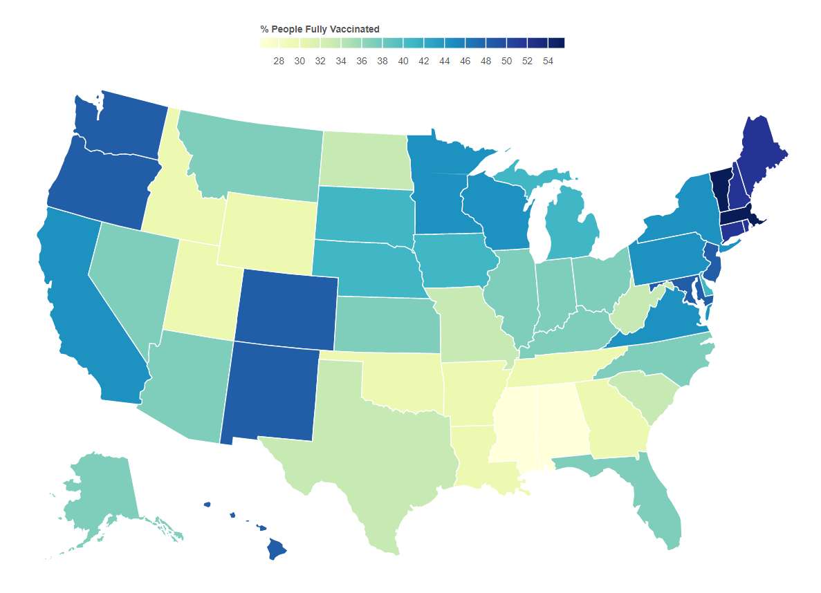
This becomes much more important as it related to vaccination efforts. As of this writing, the vaccination rates by state correlate well with voting. A current view of this map can be found here.
The majority of lies and disinformation seems to spread mostly in right wing media and is instigated by twelve different people. This is causing irreparable harm to health and to the economy. Sadly, as new variants come to dominate cases, the spread will be most obvious among those who have been fooled by these sources. What remains to be seen is whether the media will be held responsible for the damage they have caused.
Do your part. Get vaccinated. Encourage others to do so. As B.1.617.2 (the delta variant) gains a foothold, your health and life may depend on it.
An Epilogue
There is a similar pattern for deaths when stratified the same way, which is not surprising at all. The two big jumps for about a month in May 2020 are due to states catching up on death reports and submitting them all at once.
8/21/21 Addendum. Fox “News” carries some responsibility for what is happening by allowing lies like this.
12/4/21 The rapid drop in the 80%+ Republican counties the past few weeks has been puzzling. The data hasn’t been tracking with that of the other strata. One possible explanation might have something to do with those who move south for the winter. However, the data this week painted a darker picture. While it may be easy to skew case data by not reporting it, it’s much harder to do so with death data. While this certainly doesn’t draw any specific conclusions, it certainly supports evidence that some governors have been trying to hide the impact in their states.
12/9/21 It appears that data from a very red state has been suppressed for about a month.
Yesterday I showed the impacts that could be expected in the US by age overall. I’ve taken US census data on a deeper dive and broken that down to the state level so people could see what that could mean for each state if drastic measures are not in place.
Something interesting jumped out at me as I looked at the table. It’s pretty obvious that states that are thought of as retirement destinations are going to have proportionally bigger problems.
These numbers are using the assumptions of an attack rate of 20% and the case fatality rates for age groups reported by the China CDC.
10-19
20-29
30-39
40-49
50-59
60-69
70-79
80+
AL
261
260
240
486
1,687
4,243
6,017
5,438
AK
39
45
43
69
245
600
560
465
AZ
386
401
367
691
2,208
5,959
9,331
8,426
AR
165
161
152
289
995
2,522
3,707
3,364
CA
2,081
2,331
2,273
4,056
12,957
29,902
38,492
41,586
CO
293
329
340
594
1,832
4,559
5,606
5,129
CT
187
185
176
356
1,353
3,166
4,295
4,666
DE
49
50
48
89
348
918
1,350
1,080
DC
28
54
58
65
191
425
627
611
FL
991
1,070
1,065
2,091
7,383
19,426
31,193
33,094
GA
597
586
564
1,120
3,513
8,001
10,553
8,874
HI
65
78
77
138
447
1,285
1,699
2,092
ID
103
93
89
169
547
1,439
1,994
1,726
IL
670
695
686
1,290
4,360
10,486
13,713
14,544
IN
364
369
341
646
2,268
5,592
7,244
7,354
IA
174
169
161
285
1,043
2,712
3,575
4,249
KS
165
161
148
274
938
2,455
2,965
3,540
KY
230
244
221
446
1,546
3,887
5,093
4,989
LA
250
255
254
441
1,539
3,968
4,982
4,657
ME
60
61
64
127
522
1,445
1,878
1,962
MD
306
319
329
612
2,185
5,018
6,600
6,377
MA
340
400
368
680
2,518
5,878
7,791
8,431
MI
512
552
482
955
3,540
9,159
11,924
11,963
MN
291
294
307
534
1,961
4,690
5,928
6,574
MS
174
161
153
287
967
2,507
3,500
2,964
MO
317
331
316
576
2,086
5,321
7,364
7,372
MT
54
55
54
95
346
1,069
1,430
1,248
NE
108
104
104
179
600
1,588
1,956
2,374
NV
154
163
169
321
999
2,483
3,513
2,874
NH
67
68
65
132
552
1,324
1,700
1,673
NJ
452
454
462
931
3,296
7,445
9,955
10,835
NM
118
112
110
191
670
1,862
2,604
2,466
NY
943
1,110
1,064
1,923
6,884
16,323
22,179
24,484
NC
553
562
530
1,075
3,534
8,804
12,222
10,859
ND
37
50
42
65
235
601
722
995
OH
610
621
582
1,126
4,088
10,472
13,731
14,207
OK
220
219
210
369
1,259
3,149
4,352
4,388
OR
202
226
232
430
1,345
3,861
5,069
4,830
PA
637
672
641
1,220
4,609
11,762
15,819
17,903
PR
156
172
144
333
1,121
2,873
4,846
5,053
RI
52
61
54
99
382
949
1,247
1,429
SC
266
269
253
498
1,742
4,546
6,619
5,424
SD
49
48
44
77
284
777
957
1,114
TN
350
369
346
687
2,297
5,849
7,915
7,207
TX
1,696
1,647
1,634
2,975
8,855
19,949
25,128
23,616
UT
208
203
178
307
776
1,933
2,411
2,366
VT
30
33
29
57
232
664
871
778
VA
440
466
465
874
2,948
7,014
9,125
8,961
WA
368
425
442
752
2,458
6,254
8,266
7,434
WV
88
89
83
182
638
1,864
2,436
2,406
WI
301
307
296
545
2,098
5,284
6,615
7,232
WY
33
29
31
53
187
556
657
581
*Please note that there is insufficient data for children <10