
The CDC used to have a good reputation until the pandemic. Now, I find myself often wondering if information that is provided is skewed because of political appointees, particularly RFK Jr.
This isn’t a new problem. The first public facing change was in 2022, when CDC change the colors on their risk levels map. The old map is on the left, the new one is on the right using the revised methodology. This was what I considered their first attempt to minimize the pandemic. The old one was more of a measure of transmission (cases and positivity), the one on the right is more of a measure of severity (hospitalization and hospital capacity).

There have been two changes to CDC categorization of wastewater data since that time.
In 2025, they changed their baseline criteria. The biggest change was using a baseline of the past 24 months. That greatly skewed the categorization because if the prior 24 months had been excessively high, the current reading of what might have been high in the past would be considered normal. Categories of risk were also changed at this time.
Original categories
- Minimal: < 1.5
- Low: 1.5 to ≤ 3
- Moderate: > 3 to ≤ 4.5
- High: > 4.5 to ≤ 8
- Very High: > 8
2025 categories
- Very Low: < 2
- Low: > 2 to ≤ 3.4
- Moderate: > 3.4 to ≤ 5.3
- High: > 5.3 to ≤ 7.8
- Very High: > 7.8
2026 categories
- Very Low: ≤ 2.6
- Low: >2.6 to 4.9
- Moderate: >4.9 to 7.9
- High: >7.9 to 11.6
- Very High: > 11.6
Here’s how that looks graphically. You can really see how this completely changes the public perception of risk.
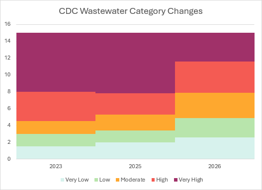
That makes minimization on a dashboard really easy to do.

You can see pre- and post-implementations of these changes on a map produced by Dr. Michael Hoerger.
Here’s what the 2026 methodology looks like…

Here’s what the map would be prior to those changes. Most of the public doesn’t have a clue how bad COVID is right now. A big part of that is due to lower hospitalizations.

I find it shameful that there is better information coming from a handful of us trying to protect the public than from the agencies who should be doing that work. It’s even worse when the health leadership in this administration further wants to derail the public health train.

