The data set I used yesterday was from Friday. It took a long time to compile it all. I used a single source of reference with only a couple of cross checks for close/open information. I’m looking more closely at each and trying to find a more accurate date for each if needed. This is challenging because there is no standard definition, so I’m using the earliest date that should have some impact for each measure.
The impact of restrictions and relaxation of restrictions is pretty obvious if you look at the data regularly, but it might not be to the casual observer. To illustrate, I’m going to do a series of graphs, ranging in scale from national to metropolitan statistical areas (commonly called metro areas).
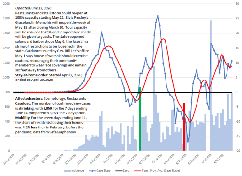
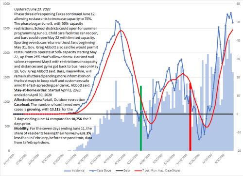
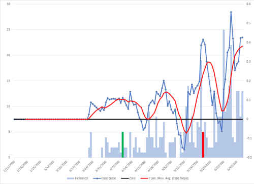
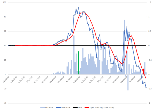
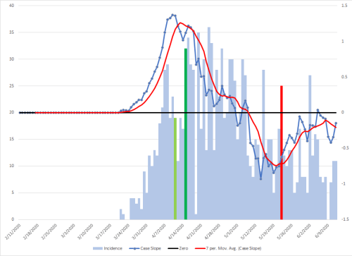
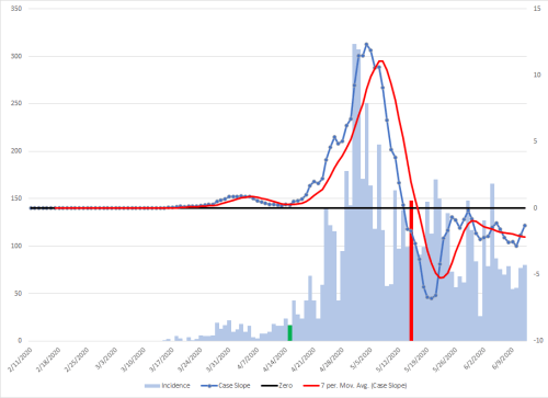
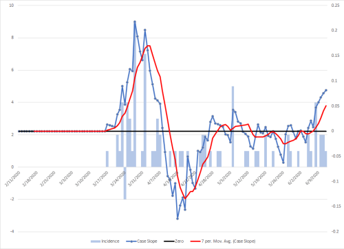
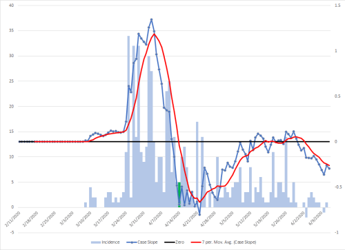
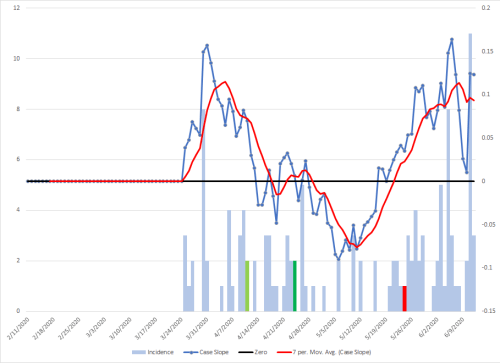
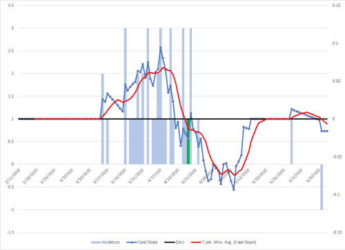
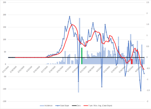
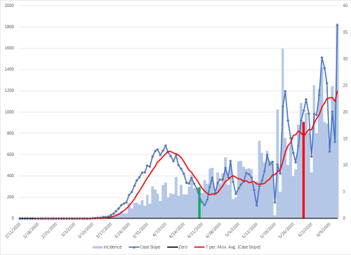
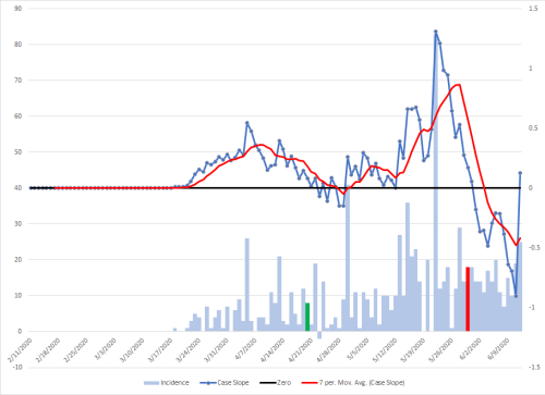
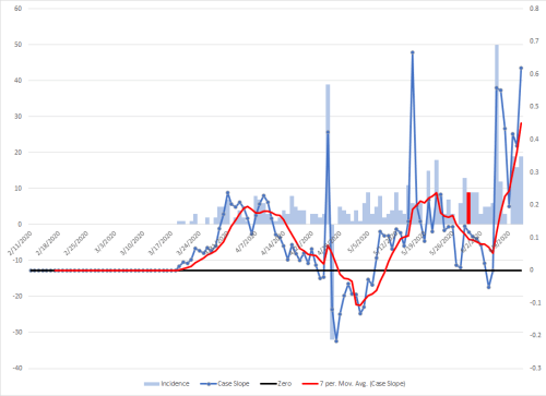
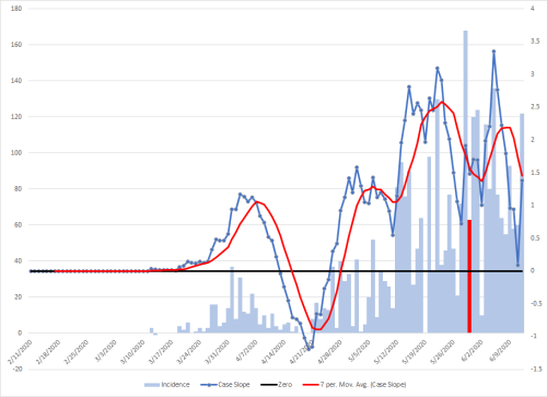
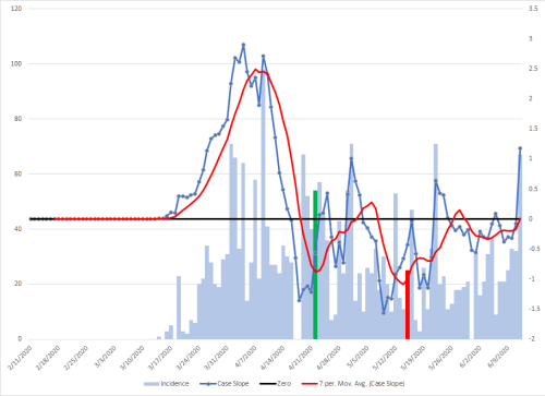
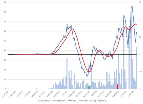
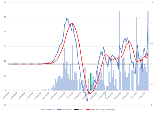
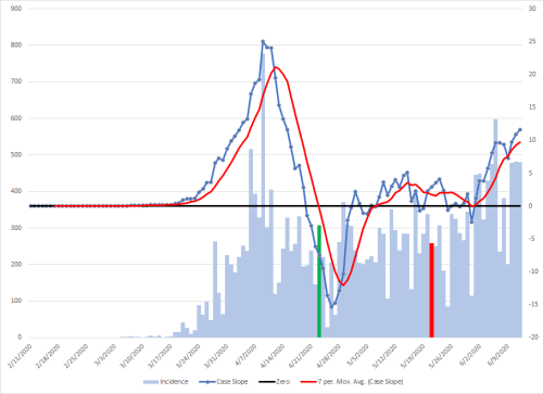
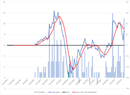
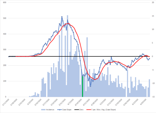
The graphs are going to all have the same format. Cases are plotted on the left y-axis scale and are the light blue bars, the 3-week changing slope is the dark blue line with the points for each day’s retrospective slope, and the red line is the trend of the slope. These are both on the scale on the right axis. When the blue line are above zero (the black line) cases are increasing, when it is below, they are decreasing. The distance vertically from a point on a line to the black zero line is directly proportional to the rate of increase or decrease. The further the distance from that bar, the faster that cases are rising or falling over the prior three weeks.
I’ve added to visual elements to these graphs. The green bar represents three weeks after the date restriction orders were started (or the first in the country on the national map). The red one is three weeks after the relaxation of those orders (or the first state on the national map). When a metro area is in multiple states, the primary city will be red and green, the surrounding areas will be lighter colors.
It’s pretty clear that those orders make a difference. The restriction data is located here, although some searching was needed for a bit of clarification on some. The color bars may not be visible at times if there are no cases that days so look to another one in the same state to identify where it would be. Most states made restrictions statewide.
Note that smaller metropolitan areas may be difficult to interpret because of the lack of a sufficient sample size. There is a seven day oscillation in cases and it may be tempting to make conclusions that are not valid. Also be aware of gaps of no cases followed by a spike. This might be due to delayed reporting of data and will skew trend lines. Also pay attention to the scales as they change significantly between graphs.
There area some areas that are in trouble or have lessons to teach. They are highlighted. States that are highlighted red are close to running out of ICU or hospital beds.If you get infected with this virus in those areas going forward, you may be at risk of not getting a bed. This will become a problem throughout the US in the next few weeks. Do everything you can to avoid unnecessary contact with those outside of your immediate household.
6/15 Update: I suspect the surge in cases that showed up in the hospital bed use graph for Michigan might be due to the weird spike in data that may be an error in the data set. It’s possible that those graphs are generated by an automatic data feed. I’ve pulled it off for now along with the national one that may have been influence by it as well until updated. I’ve left my graphs in because I just pull the data and graph as is. I’m not sure what the methodology is though for the bed use one.
6/15 Update: I’ve also changed the national view to show how there is a cumulative impact related to restrictions and easing. The green bars on the case graph represents restrictions going into place. The darker the bar, the more states that put them in effect that day. The peach bars are the easing of restrictions, with the darker ones indicating more on that day.
Two things should be noted. The closely clustered restrictions brought cases down quickly. The gradual easing of restrictions over time has resulted in a slow uphill trend in cases. Most importantly though, the impact of 15 states that have recently eased up or not removed restrictions does not yet show up in the data.
Los Angeles-Long Beach-Anaheim, CA – Los Angeles County under stricter orders, Orange County following state (red bar).
Madera, CA
Merced, CA
Modesto, CA
Napa, CA – Remains under restriction.
Oxnard-Thousand Oaks-Ventura, CA – Modified restrictions, but partially following state on 5/29
Redding, CA
Riverside-San Bernardino-Ontario, CA
Sacramento-Roseville-Folsom, CA
Salinas, CA
San Diego-Chula Vista-Carlsbad, CA – remains under restriction.
San Francisco-Oakland-Berkeley, CA – remains under restriction.
San Jose-Sunnyvale-Santa Clara, CA – San Benito county following state order (red bar), Santa Clara county locked down.
San Luis Obispo-Paso Robles, CA
Santa Cruz-Watsonville, CA – remains under restriction.
Santa Maria-Santa Barbara, CA
Santa Rosa-Petaluma, CA – remains under restriction.
Stockton, CA
Vallejo, CA – remains under restriction.
Visalia, CA
Yuba City, CA
Colorado
Boulder, CO
Colorado Springs, CO
Denver-Aurora-Lakewood, CO
Fort Collins, CO
Grand Junction, CO
Greeley, CO
Pueblo, CO
Connecticut
Bridgeport-Stamford-Norwalk, CT
Hartford-East Hartford-Middletown, CT
New Haven-Milford, CT
Norwich-New London, CT
Worcester, MA-CT
Delaware
Dover, DE
District of Columbia
Outcomes of easing restrictions will not be visible until after June 19.
Washington-Arlington-Alexandria, DC-VA-MD-WV
Florida
Cape Coral-Fort Myers, FL
Crestview-Fort Walton Beach-Destin, FL
Deltona-Daytona Beach-Ormond Beach, FL
Gainesville, FL
Homosassa Springs, FL
Jacksonville, FL
Lakeland-Winter Haven, FL
Miami-Fort Lauderdale-Pompano Beach, FL
Naples-Marco Island, FL
North Port-Sarasota-Bradenton, FL
Ocala, FL
Orlando-Kissimmee-Sanford, FL
Palm Bay-Melbourne-Titusville, FL
Panama City, FL
Pensacola-Ferry Pass-Brent, FL
Port St. Lucie, FL
Punta Gorda, FL
Sebastian-Vero Beach, FL
Sebring-Avon Park, FL
Tallahassee, FL
Tampa-St. Petersburg-Clearwater, FL
The Villages, FL
Georgia
Albany, GA
Athens-Clarke County, GA
Atlanta-Sandy Springs-Alpharetta, GA
Augusta-Richmond County, GA-SC
Brunswick, GA
Columbus, GA-AL
Dalton, GA
Gainesville, GA
Hinesville, GA
Macon-Bibb County, GA
Rome, GA
Savannah, GA
Valdosta, GA
Warner Robins, GA
Hawaii
Kahului-Wailuku-Lahaina, HI
Urban Honolulu, HI
Idaho
Boise City, ID
Coeur d’Alene, ID
Idaho Falls, ID
Lewiston, ID-WA
Pocatello, ID
Twin Falls, ID
Illinois
Outcomes of easing restrictions will not be visible until after June 19.
Bloomington, IL
Carbondale-Marion, IL
Chicago-Naperville-Elgin, IL-IN-WI
Danville, IL
Decatur, IL
Kankakee, IL
Peoria, IL
Rockford, IL
Springfield, IL
Indiana
Bloomington, IN
Columbus, IN
Elkhart-Goshen, IN
Evansville, IN-KY
Fort Wayne, IN
Indianapolis-Carmel-Anderson, IN
Kokomo, IN
Lafayette-West Lafayette, IN
Michigan City-La Porte, IN
Muncie, IN
South Bend-Mishawaka, IN-MI
Terre Haute, IN
Iowa
Ames, IA
Cedar Rapids, IA
Davenport-Moline-Rock Island, IA-IL
Des Moines-West Des Moines, IA
Dubuque, IA
Iowa City, IA
Sioux City, IA-NE-SD
Waterloo-Cedar Falls, IA
Kansas
Lawrence, KS
Manhattan, KS
Topeka, KS
Wichita, KS
Kentucky
Bowling Green, KY
Elizabethtown-Fort Knox, KY
Lexington-Fayette, KY
Louisville/Jefferson County, KY-IN
Owensboro, KY
Louisiana
Baton Rouge, LA
Hammond, LA
Houma-Thibodaux, LA
Lafayette, LA
Lake Charles, LA
Monroe, LA
New Orleans-Metairie, LA
Shreveport-Bossier City, LA
Maine
Outcomes of easing restrictions will not be visible until after June 22.
Bangor, ME
Lewiston-Auburn, ME
Portland-South Portland, ME
Maryland
State eased restrictions on May 15th but many counties maintaining stricter controls, particularly in the DC area. Red line represents three weeks after state eases restrictions.
Baltimore-Columbia-Towson, MD
California-Lexington Park, MD
Cumberland, MD-WV
Hagerstown-Martinsburg, MD-WV
Salisbury, MD-DE
Massachusetts
Outcomes of easing restrictions will not be visible until after June 22.
Barnstable Town, MA
Boston-Cambridge-Newton, MA-NH
Pittsfield, MA
Springfield, MA
Worcester, MA-CT
Michigan?
Outcomes of easing restrictions will not be visible until after June 24.
Ann Arbor, MI
Battle Creek, MI
Bay City, MI
Detroit-Warren-Dearborn, MI
Flint, MI
Grand Rapids-Kentwood, MI
Jackson, MI
Kalamazoo-Portage, MI
Lansing-East Lansing, MI
Midland, MI
Monroe, MI
Muskegon, MI
Niles, MI
Saginaw, MI
Minnesota
Duluth, MN-WI
Mankato, MN
Minneapolis-St. Paul-Bloomington, MN-WI
Rochester, MN
St. Cloud, MN
Mississippi
Gulfport-Biloxi, MS
Hattiesburg, MS
Jackson, MS
Missouri
Cape Girardeau, MO-IL
Columbia, MO
Jefferson City, MO
Joplin, MO
Kansas City, MO-KS
Springfield, MO
St. Joseph, MO-KS
St. Louis, MO-IL
Montana
Billings, MT
Great Falls, MT
Missoula, MT
Nebraska – No orders.
Grand Island, NE
Lincoln, NE
Omaha-Council Bluffs, NE-IA
Nevada
Carson City, NV
Las Vegas-Henderson-Paradise, NV
Reno, NV
New Hampshire
Manchester-Nashua, NH
New Jersey
Outcomes of easing restrictions will not be visible until after July 6.
Atlantic City-Hammonton, NJ
Ocean City, NJ
Trenton-Princeton, NJ
Vineland-Bridgeton, NJ
New Mexico
Outcomes of easing restrictions will not be visible until after June 21.
Albuquerque, NM
Farmington, NM
Las Cruces, NM
Santa Fe, NM
New York
Outcomes of easing restrictions will not be visible until after July 1.
Albany-Schenectady-Troy, NY
Binghamton, NY
Buffalo-Cheektowaga, NY
Elmira, NY
Glens Falls, NY
Ithaca, NY
Kingston, NY
New York-Newark-Jersey City, NY-NJ-PA
Poughkeepsie-Newburgh-Middletown, NY
Rochester, NY
Syracuse, NY
Utica-Rome, NY
Watertown-Fort Drum, NY
North Carolina
Asheville, NC
Burlington, NC
Charlotte-Concord-Gastonia, NC-SC
Durham-Chapel Hill, NC
Fayetteville, NC
Goldsboro, NC
Greensboro-High Point, NC
Greenville, NC
Hickory-Lenoir-Morganton, NC
Jacksonville, NC
Myrtle Beach-Conway-North Myrtle Beach, SC-NC
New Bern, NC
Raleigh-Cary, NC
Rocky Mount, NC
Virginia Beach-Norfolk-Newport News, VA-NC
Wilmington, NC
Winston-Salem, NC
North Dakota – No orders
Bismarck, ND
Fargo, ND-MN\
Grand Forks, ND-MN
Ohio
Akron, OH
Canton-Massillon, OH
Cincinnati, OH-KY-IN
Cleveland-Elyria, OH
Columbus, OH
Dayton-Kettering, OH
Lima, OH
Mansfield, OH
Springfield, OH
Toledo, OH
Youngstown-Warren-Boardman, OH-PA
Oklahoma – No orders
Enid, OK
Lawton, OK
Oklahoma City, OK
Tulsa, OK
Oregon
Relaxing of rules varied by county. The red bar indicates the effect of the earliest openings. Increasing cases stopped any additional counties from opening on June 12.
Albany-Lebanon, OR
Bend, OR
Corvallis, OR
Eugene-Springfield, OR
Grants Pass, OR
Medford, OR
Portland-Vancouver-Hillsboro, OR-WA
Salem, OR
Pennsylvania
Allentown-Bethlehem-Easton, PA-NJ
Altoona, PA
Bloomsburg-Berwick, PA
Chambersburg-Waynesboro, PA
East Stroudsburg, PA
Erie, PA
Gettysburg, PA
Harrisburg-Carlisle, PA
Johnstown, PA
Lancaster, PA
Lebanon, PA
Philadelphia-Camden-Wilmington, PA-NJ-DE-MD
Pittsburgh, PA
Reading, PA
Scranton–Wilkes-Barre, PA
State College, PA
Williamsport, PA
York-Hanover, PA
Puerto Rico
Rhode Island
Providence-Warwick, RI-MA
South Carolina
Charleston-North Charleston, SC
Columbia, SC
Florence, SC
Greenville-Anderson, SC
Hilton Head Island-Bluffton, SC
Myrtle Beach-Conway-North Myrtle Beach, SC-NC
Spartanburg, SC
Sumter, SC
South Dakota – No orders
Rapid City, SD
Sioux Falls, SD
Tennessee
Chattanooga, TN-GA
Clarksville, TN-KY
Cleveland, TN
Jackson, TN
Johnson City, TN
Kingsport-Bristol, TN-VA
Knoxville, TN
Memphis, TN-MS-AR
Morristown, TN
Nashville-Davidson–Murfreesboro–Franklin, TN
Texas
Abilene, TX
Amarillo, TX
Austin-Round Rock-Georgetown, TX
Beaumont-Port Arthur, TX
Brownsville-Harlingen, TX
College Station-Bryan, TX
Corpus Christi, TX
Dallas-Fort Worth-Arlington, TX
El Paso, TX
Houston-The Woodlands-Sugar Land, TX
Killeen-Temple, TX
Laredo, TX
Longview, TX
Lubbock, TX
McAllen-Edinburg-Mission, TX
Midland, TX
Odessa, TX
San Angelo, TX
San Antonio-New Braunfels, TX
Sherman-Denison, TX
Texarkana, TX-AR
Tyler, TX
Victoria, TX
Waco, TX
Wichita Falls, TX
Utah
Logan, UT-ID
Ogden-Clearfield, UT
Provo-Orem, UT
Salt Lake City, UT
St. George, UT
Vermont
Burlington-South Burlington, VT
Virginia
Blacksburg-Christiansburg, VA
Charlottesville, VA
Harrisonburg, VA
Lynchburg, VA
Richmond, VA
Roanoke, VA
Staunton, VA
Virginia Beach-Norfolk-Newport News, VA-NC
Winchester, VA-WV
Washington
Release of restrictions varies by county but most impacts will not be seen on the graph by today.
I have heard people trying to make the argument that the increasing number of cases in the US is due to more testing. While that certainly plays a role, I don’t believe that what we are seeing occur supports that notion.
I wanted to try to figure out if there was a way to answer that question. I will admit that I may be making some type of error in my thoughts and certainly invite another interpretation. I’ll try to explain my conclusions as clearly as possible.
This graph above is two graphs superimposed on each other and offset so as not to obscure each other. The blue one is related to cases, the red one is related to deaths. In both, these represent the slopes of the data.
There is a fainter line for both colors with dots on it. These are the true slopes for those three prior weeks. The dark solid smoothed lines are the averaged seven day trend lines for those slopes. These flatten out the weekly cycles of disease that have emerged.
The blue data is on the left axis, the red on the right. The colored horizontal lines represent zero for each respective color.’
The way to interpret these is what I have described before for the slope graphs. When the line is above zero, cases are increasing. When below, they are decreasing. The distance vertically the the zero line from a given point is the speed at which cases are increasing or decreasing. You can see that around the first week of April, we were experiencing exponential growth in the US. It should also be noted that deaths have consistently lagged about a week behind rises and falls in cases.
For the two week period March 15th to March 29th, to April 1st, we went from 2859 total cases in the US to 121,786, an increase of 43x. I was shocked when I saw that figure and thought I must have calculated wrong. I got the same answer. One way to validate it would be to compare the increase in total deaths, but one week later for each measuring point. On March 22nd, there were 453 total deaths, and two weeks later, there were 10,849, and increase of 24x. Either multiplication factor is frightening. That’s how exponential growth works and how something that doesn’t seem like much of a problem right now can explode in a matter of days
One interpretation has to do with the bump in cases related to deaths from the end of April to mid May. My assumption had been that had represented more testing. However, as I was searching for data to support or reject that hypothesis, I found something much more illustrative that the increase in numbers is NOT due to increased positive tests, but is due to true illness.
This is the part I hope I’m interpreting right. If the percentage of positive cases from tests is going down (as represented by the black line on the above graph), then we should be seeing a downward trend in cases and deaths. However, the trend of cases in the upper graph has been going up since about May 20th and among deaths since the beginning of June. That indicates to me that we are experiencing a resurgence in cases.
I have been looking at the graphs I posted of various states using slope trends and today looked at various metro areas. From the state data, I calculated that my assumptions of about a 3-week interval from social control measures is accurate about 80% of the time. Obviously that’s considerably better than chance alone and also leaves some room for normal variation tht commonly occurs in data.
Look at the pictures from that day in the link above and think about the age group. That is not a representative sample of the population. That is the group that might get infected but remain asymptomatic or develop more mild illness overall (although it’s clear that isn’t always the case). There is an important inference to be made from that. Increases in cases from activities over the Memorial weekend are may not show up until the second or third generation of the disease, meaning that we won’t see much for increases from events like that until five or six weeks later.
However, families and friends across age groups may have spent time together over the weekend in ways that wouldn’t have gotten media attention. Those kinds of events WILL start showing up in the data this weekend.
I expect to see something like this in the data by Monday. Essentially a much larger sawtooth in the normal disease cycling. The question is how large it will be.
The same holds true for the protests. They have largely been a younger demographic. I’ve been seeing people post on social media that we should be seeing spikes now from those events. It’s not that simple. It has a lot to do with social distancing and mask use as well as the composition of the crowds. I expect the same kind of lagging response in the data though. It’s probably going to be closer to the end of June before those events make an impact. However, by then we will be seeing a sure in cases anyway so it may not be very easy to tease that out. I do have a method to do that devised that I will try in just over a week when there is data available.
Right click on any graph to open in a new tab for a better image.
I’m going to build on my previous post. To start, I’ve plotted new cases of disease as a bar graph on the left y-axis. I have previously divided this data in to three sections, Emergence, Stay at Home, and Resurgence. These are where I expected the trend lines to be heading different directions based on when states were locking down or opening up. It should be noted that the opening up period will be continuing through most of June, so that is why we will see the trend line curving up as more states are contributing more cases in the future.
The blue line is the slope for the prior 21 days for that date. I have them set to zero by default for the first 21 days of the data. This is graphed on the right y-axis and a black line represents zero. The dotted red line is the 7-day averaged trend to remove the 7 day cycling of cases that has emerge from the spread of this virus.
To reiterate, the important part of that trend line is the distance from the black line. The further it is from the line, the more the cases are rising or falling in an exponential manner. When the line is above zero, we are seeing an overall increase in cases, and below, an overall decrease. It should be apparent we are starting our rise again.
I also expect there will be spikes in the numbers of cases over the coming weekend that will be visible in the data.
US
It will be roughly the same format for the states but I’m going go start the graph on March 15th, since that is when the rise in cases really began. That will allow a better view of the more important data. I had made some rough date estimates for when cases would start emerging in the data and when it might become obvious to the casual observer. I’ll mark those columns as follows:
Cases emerge: dark blue. Visible in the data: yellow
In some cases, there these data won’t be visible in the data because I either didn’t have that data at the time, the state didn’t implement social controls, or we have not reached that point on the calendar yet. In cases the date is in the future, I’ve listed that next to the state. It also should be noted where there are few cases there isn’t enough data to reach meaningful conclusions because of small sample sizes. In some cases, the dark blue bar will be shifted a day to the right because of the lack of one for that day or too small to easily see.
Alabama
Alaska
Arizona
Arkansas
California – varies by region
Colorado
Connecticut – June 10
Delaware
District of Columbia
Florida – varies by region
Georgia
Hawaii – June 21
Idaho
Illinois – this wasn’t available at the time, but I’ve since with what I’ve found now, I project June 21.
Indiana
Iowa
Kansas
Kentucky – June 10
Louisiana
Maine – varies by region
Maryland
Massachusetts
Michigan – June 18
Minnesota
Mississippi
Missouri
Montana
Nebraska
Nevada
New Hampshire – June 21
New Jersey – June 26th
New Mexico – June 21 – varies by region
New York – June 18 – varies by region
North Carolina – June 12
North Dakota
Ohio – June 19
Oklahoma
Oregon – varies by region
Pennsylvania – June 25 – varies by region
Puerto Rico
Rhode Island
South Carolina
South Dakota
Tennessee
Texas
Utah
Vermont
Virginia – July 1 – varies by region
Washington
West Virginia
Wisconsin – overturned by WI Supreme Court on May 13
The graph below is essentially a derivative. The blue line represents the slope of the data from the three weeks prior to the date indicated. The slope of a line indicates how steeply it is climbing or falling. If it’s climbing, the slope will be above zero, if it is falling, it will be below zero. The distance from zero indicates how quickly it’s either rising or falling.
Right click on images to open in a new window to enlarge and scale properly.
Remember, I had said that releasing restriction would only BEGIN to show up in the data about May 15th. Given the roughly weekly cycles in the data, I had no way of having any indication the data to make that forecast on May 17th. It was strictly based on my understanding of the clinical course and epidemiology of the disease.
I added a black dotted trend line that is a moving average over a 7-day period to eliminate this cycling. Look at the lowest point of this trend line. It’s right about May 16th or 17th.
The important point though is that we have seen the impact of only some states easing restrictions. There also has been incremental easing of them, where things like allowing 25% capacity in restaurants, gathering of people at worship services with restrictions on crowd size, etc. have come into play. This is also with at least some social distancing taking place in many areas (see map below).
Also, look at the red line on the graph. That is zero. When the slope graph goes above it, cases are increasing. Given that we aren’t even toward the end of the period of seeing impacts from states opening up which will be at the end of the month, it’s pretty safe to assume from this trend that we are going to see cases rising again, and I have been telling people to expect that it will become obvious to most people about June 15th. What remains to be seen after that date is how quickly they will rise. I’m putting my money on exponential growth that will overwhelm the ICU capacity in many areas by the end of the June.
It’s been awhile since the data for different has been graphed here. Part of that has to do with the events in the US the past two weeks.
Note: I’m still working on how best to get the graphs loaded to look correct.. While they might look bad in this page, if you right click and open the image in a new tab or window, it should be large enough to view in detail. I’m all ears if any readers have an idea of how to do this without creating a lot of extra work on my end.
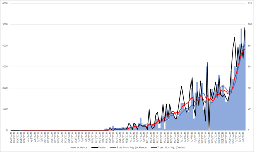
The light blue bars are new cases each day, measured on the left y-axis, the black line is deaths measured on the right y-axis.
The blue line is the 7-day moving average of cases, the red line is the 7-day moving average of deaths. Remember that the scales are different between graphs, so do not make the mistake of comparing them directly.
Countries that seem to be doing an outstanding job will be highlighted. It would be worth learning what their control strategies were that made them successful.
One interesting thing in both the raw cases and deaths is the seven day cycle of peaks and valleys. That could either be due to less reporting on the weekends or perhaps the natural cycles of the disease. It should also be noted that the deaths lag about a week behind identified cases, or at least that was the pattern in the US.
I am only including countries that have had at least 10,000 reported cases. If anyone has an interest in any other particular countries not included here, send a message and I will generate them for all of the ones requested next weekend.
Global – One interesting point of note for this is that the deaths and new cases diverge about mid-April. My guess is that this has to do with much more testing being done.
Note: I’m still working on how best to get the graphs up. While they might look bad in this page, if you right click and open the image in a new tab, it should be large enough to view.
Time for a quick look at the states. The light blue is new cases, measured on the left y-axis, the black line is deaths measured on the right y-axis.
The blue line is the 7-day moving average of cases, the red line is the 7-day moving average of deaths.
The columns represent new cases of COVID-19 and are plotted by day on the x-axis and on the left y-axis. The green section represents the time that I had previously indicated would see benefits from the various lockdown orders. The yellow section represents when there would be gradual increases in cases as these restrictions are removed.
The black line represents deaths and is measured on the y-axis on the right. Deaths lag about one week behind cases.
There is a blue and red arrow along the bottom. This is just a best guess the cooling period of cases from social control and the reheating as those restrictions are lifted. Unfortunately, I realized a better way to do this after I had created each frame so it’s not as smooth as a gradient I would like in most frames but the general idea should be clear. I intentionally picked seven days into the yellow section to start looking at the trend data so there would be a relatively decent number of points from which to work.
There is a purple trend line for the downward trend seen in the green section of the graph. The red trend line is really the most important piece. It will continue to flatten and will start to slope upward, and will become steep in what will seem overnight once we hit the return of exponential growth. That’s when the trouble will be just starting.
Most important, within about a week it will be obvious throughout the US that there is trouble ahead. My warnings of a lack of ICU beds have already been reported in Montgomery, Alabama and also now in Arizona. There are likely already other areas around the country starting to come up against this problem.
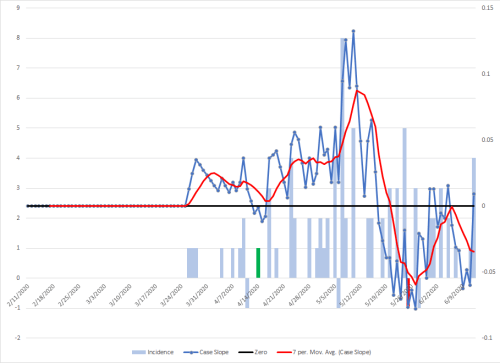
Another way to look at this is a graph of the slopes of the red trend line. What is interesting, the trend line for this data is already flat. That line will start slowing up as well and will be a pretty good indicator for future trends. Currently, I have it set to linear, but at some point it may fit the data better as an exponential curve. I expect hospitals in much of the country to be overwhelmed worse than what was seen in NYC sometime in July.
Alaska Alabama Arkansas California Colorado Delaware Florida Georgia Idaho Indiana Kansas Mississippi Missouri Montana Nebraska Nevada North Dakota Oklahoma Rhode Island South Carolina Tennessee Texas Utah Washington West Virginia Wisconsin Wyoming
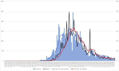
A graph of the US data since March 15th can provide some insights. Cases are the bar graphs and use the left axis for the scale, deaths are along the red line and uses the right axis for scale. Splitting cases and deaths onto different vertical scales makes it easier to see them in comparison to each other.
First, I think it’s worth noting that deaths clearly follow the case trend, but with a delay of about a week.
I’ve broken the data into three sections each with a representative trend line for that period, the first based on the emergence of the pandemic and exponential growth.
The second section projects start of impact by stay at home orders in most states, which is represented by the green area over the dates. I’ve also included the following 11 days as part of the benefit of that period, although it likely extends even longer than that.
The orange section is the start of when I expected to see impacts from the relaxing of stay at home orders. Each state did this a little bit differently, but it had been my best effort to project forward from whatever language was used by a given state.
The dark straight trend lines for the cases in each section are what I’m most focused on. It’s clear we had rapid growth through the beginning of April and that we succeeded at flattening the curve as indicated by the second trend line.
While a subtle change, the third trend line is concerning. For those with a mathematical interest, the slope of the benefit of the stay at home section is -216.56. The slope of the line for the resurgence section is -128 currently. The important thing is that it has changed that much with only about 1/2 of the states starting to see the impact of those changes, and 11 of them in the last 8 days, so this is just the start of the change that is coming.
I accept that some of the increased case count is due to more testing. However, I am sticking to my initial estimate of the middle of June to start seeing a rapid climb in cases again followed by quickly overwhelming our ICUs and eventually our hospital beds and morgues.