This set of graphs allow for direct comparisons between cases and deaths in every state. They are population adjusted.
One important thing to note is that early this year we were going into this without knowing how to treat the disease. While there is still room for improvement, this does not indicate in any way that during the beginning of the pandemic that some were doing better or worse than others in relation to deaths. It’s simply a matter of the scale of cases with a relatively unknown disease.
The first graph of the set shows cases as light blue and deaths as gray, with corresponding 14-day moving averages for each. Cases are on the left y-axis, deaths on the right.
The second is the same epidemic curve for cases, with the recommended maximum level for positivity per WHO in red and the state positivity as the black line. Cases are on the left axis, the positivity percentage on the right A graph of positivity with tests completed is also available.
The third graph provides cases, hospitalizations, ICU use, and ventilator use. All of this data may not be available in for many states. Cases (light blue) and hospitalizations (light green) are on the left y-axis, ICU (red) and ventilator (yellow) use are on the right y-axis
I had not been providing updated graphs since they have become readily available on various media sources or simply searching online. I have wanted to combine some different data sets though to show the interactions between cases, positivity, regular hospital bed use, ICU bed use, and ventilator use. Some states do not provide all hospitalization data points.
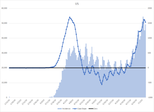
Note; The light blue in the graphs are the numbers of cases or deaths each day, measured on the y-axis on the left. The y-axis on the right is a measure of the rate of change over time.
Summer
I had been a bit surprised and puzzled at the relatively sudden rise and drop in cases in July in the US this summer.
I had been considerably worried that this marked the next resurgence of the disease. However, there are a few behavioral, administrative, and environmental variables that explain this decrease.
As some Americans began to see the rapid rise in cases accompanied by the hospital bed shortage problems that followed in AZ, CA, FL, and TX, they likely began to take the disease and precautions more seriously, including mask use and maintaining distance.
These changes were accompanied in some areas by administrative restrictions that reinforced these behaviors, including mask mandates, business capacity maximums, and other restrictions.
The biggest contributor to reduced cases, hospitalizations, and death though was the shifting demographics of those infected. Summer weather also likely played a role in this. Teenagers and young adults spent more time together as schools and universities were out over the summer. Many young adults congregated at beaches and bars. Since this demographic would have milder illness, they would have been less likely to be tested, to be hospitalized, or to die than if this were equally distributed across the population as a whole.
Fall and Winter
Most of the dynamics that reduced cases over the summer are changing now. One way to see some supporting evidence of this is to look at countries that experienced winter over the past few months in the southern hemisphere.
This is also supported by the resurgence of cases now in Europe and North America as the weather cools, humidity drops, school starts, and people spend more time indoors.
Another factor that can be increasing the spread globally is pandemic fatigue. People are getting tired of the added precautions and restrictions, especially when it superficially appears that things are back under control. There is also some related danger in having created some good habits and reacting automatically instead of thinking things through. Even though I completed my board certification in healthcare infection prevention, I catch myself making mistakes. They are not intentional, and perhaps just because I’m getting very worn out from this brutal year. Fortunately, they have been small ones that were relatively low risk, but given that I know the prevention field like the back of my hand, it concerns me that those with only a cursory understanding of all of the components one needs to consider are doing this correctly. In 1984, during The Troubles in Ireland, the IRA made a statement that could apply if COVID could speak: “Today we were unlucky, but remember, we only have to be lucky once. You have to be lucky always.”
Even though this is a very different family of virus than that of the Spanish Flu in 1918, there is a lesson to be learned there as well. When it emerged in the spring of that year (most likely in Kansas), it caused what had been a typical bout of influenza. However, it mutated over the summer into something much more deadly. I’m not at all indicating I’m expecting that to happen with CoV, but the timing of the resurgence should serve as a warning. The Spanish Flu had it’s worst hit in the fall in major cities in the northern hemisphere.
The other major difference between 1918 and now is transportation. The disease moved pretty quickly across the country at that time in the course of a month, at a time when long distance travel was by train and cars were less common. Now, people can (and even do) travel across the country in hours, further promoting spread among different areas. During the emergence of H1N1 in 2009, NEJM published an article implicating the airlines in the global spread of the virus.
We are also at a mathematical risk compared to earlier this year. We are building back up to a higher number of baseline cases in comparison. As children and young adults return to school and potentially cause more community spread among other age strata, the need for hospitalizations and potential deaths increases. That increased baseline is especially important when thinking about this from an exponential spread standpoint.
We are still at risk of overwhelming our healthcare delivery system. Where this had been limited to urban areas due to population density, the virus has had more time to spread in more rural areas, where hospital beds are fewer, or don’t exist at all in some counties. As hospitals go beyond capacity, that also means that those who need care for other conditions may not be able to get it.
In addition, our pharmaceutical supply chain is at risk. Around 70-80% of the pharmaceuticals used in the US do not originate here. Many of the raw materials are shipped from China to India, where they are manufactured into the final consumer product. India is surging toward 100,000 new cases EACH DAY, which could adversely reduce production if left unchecked.
The other problem is related to how those pharmaceuticals arrive in the US. Traditionally, they arrive in the cargo holds of passenger flights. As this continues to resurge, those flights are likely to become less frequent, and alternate means of transportation may need to be established.
Back at the point of use though, there are shortages related to the virus. Some of the medications used to treat infections have been in short supply. One of these, albuterol, is used in inhalers to treat asthma. That could drive some dire consequences for those with asthma if the global supply is used more quickly than it can be manufactured.
We have a cultural problem in the US to combat this disease. Science denial is common, conspiracy theories abound, and compassion for others seems to have been forgotten. Those could become a deadly cocktail for our country.
For example, it’s mind boggling how people can think that this will become a non-issue after the election. I don’t know how anyone can possibly believe than about 800,000 deaths outside of the US could possibly be faked or part of a big conspiracy to influence our vote.
Unless people quickly learn to accept science and medicine, develop critical thinking skills, and learn to empathize to others, we are in big trouble.
One of the strangest things that has happened during the COVID-19 pandemic is the politicization and polarization of the American public. Instead of relying on science, people are relying on echo chambers of social media for their understanding of the disease. This breeds a lot of lies and disinformation. Instead of trying to pick apart the false arguments though, I’m simply going to show why the narrative makes a difference.
Sanche et al. reported that early on, the reproductive rate (R0) for the virus was thought to be 2.2-2.7. That is simply the number of people who get the disease from an infected individual. However, the authors calculated a R0 of 5.7 over a 6-9 day period. Just for the sake of argument though and to keep this simple, I’ll use a lower value of 3.0, which is below the 95% confidence interval in their report and 9 days for my illustration.
Under the above conditions, assume that something I say or write causes one person to behave differently and prevents them from getting infected. Over the next four generations of disease (36 days), and assuming that everyone downstream from that person doesn’t do anything to keep from becoming infected but isn’t exposed through anyone else, that would prevent 81 people from becoming infected. For arguments sake under the same conditions, let’s say I prevent that directly among 10 people. That prevents 810 infections. Assume I prevent 100 people initially from making mistakes. That would prevent 8100 infections, and if the case fatality rate was 1%, it would prevent 81 deaths.
On the flip side though, what if someone spreads messages that this is really not of any concern and to go about business as usual. No mask, no social distancing, going into crowds as one sees fit, etc. The opposite is then true under the same assumed conditions. That will spread the disease to 81, 810, or 8100 people. That’s why it’s so important to push science and facts as opposed to a laissez-faire approach fueled by anti-science and conspiracy theories. (For a recent examination of conspiracy theories in the US, there is a great episode of Frontline titled “United States of Conspiracy.”)
Set the R0 to 3, the fatality rate to 1%, the susceptibility to 100% (that’s why it’s called a “novel” virus), and see what happens with various approaches to isolation. It’s pretty stunning how quickly it spreads through 1000 people if you set that to zero.
I’ve been accused of all kinds of crazy things, such as deriving joy from watching this unfold and fear mongering. Nothing is further from the truth. I have had many sleepless nights since February as this has been unfolding.
If those assumptions were true, would I have spent much of my career working on prevention of pandemic impacts and writing here to try to get people to take it seriously? I think that a number of Americans have gone completely mad, including many I know personally.
Even then, I still want to mitigate their risk, even though I feel like I’m constantly beating my head against a wall.
A Florida high school held its graduation on July 25th. Shortly after that date, one of those in attendance tested positive for coronavirus. Almost 300 graduates and their families who were in attendance were told to quarantine by the health department.
Campers from other states (27) were not included in the analysis. 597 residents of the state were in attendance. At the time of publication, results were available for 344 (58%), and of those, 260 (76%) were positive. The age range of attendees was 6-19 years old. The authors noted that because a portion of the status of campers was not known, an even higher percentage could be infected, some transmission may have been outside of camp attendance, and it’s unknown how well prevention measures were followed at the camp.
There are a few things worth quoting verbatim from the summary:
“These findings demonstrate that SARS-CoV-2 spread efficiently in a youth-centric overnight setting, resulting in high attack rates among persons in all age groups, despite efforts by camp officials to implement most recommended strategies to prevent transmission. Asymptomatic infection was common and potentially contributed to undetected transmission.”
“Children of all ages are susceptible to SARS-CoV-2 infection and, contrary to early reports, might play an important role in transmission.”
“Physical distancing and consistent and correct use of cloth masks should be emphasized as important strategies for mitigating transmission in congregate settings.”
The results are worth noting. “The observed differences in median CT values between young children and adults approximate a 10-fold to 100-fold greater amount of SARS-CoV-2 in the upper respiratory tract of young children. We performed a sensitivity analysis and observed a similar statistical difference between groups when including those with unknown symptom duration. Additionally, we identified only a very weak correlation between symptom duration and CT in the overall cohort “
Essentially that means that among children under five years of age, there was evidence of 10-100x more virus in the upper respiratory tract than those of older children or adults, who had similar values.
They concluded “Thus, young children can potentially be important drivers of SARS-CoV-2 spread in the general population, as has been demonstrated with respiratory syncytial virus, where children with high viral loads are more likely to transmit. Behavioral habits of young children and close quarters in school and day care settings raise concern for SARS-CoV-2 amplification in this population as public health restrictions are eased.”
One particularly important finding was “individuals with viral co-infection were significantly more likely to require ICU admission, respiratory support, or inotropic support.” That does not bode well for the influenza and RSV season.
Only 93 (16%) never developed clinical symptoms. Four of the children died, two of them had no known pre-existing conditions. “Our data show that severe COVID-19 can occur both in young children and in adolescents, and that a significant proportion of those patients require ICU support, frequently including mechanical ventilation.”
Second, they state “Limited emerging evidence suggests that susceptibility to infection also generally increases with age.” and go on so state “Age-related differences in infectivity are less clear. Findings from a few contact-tracing studies suggest that children may be less infectious than adults,” although they do admit that the evidence for the second is weak For both comments, they cite research that has not yet been peer reviewed, which is unusual. The MMWR study about the outbreak at the camp in Georgia clearly provides contrary evidence against those claims.
Third, they make a case that experiences in other countries indicate that opening schools did not seem to have a big impact. The problem in drawing that comparison is that they failed to address the prevalence rate in much of the US, which is alarmingly high in many areas, so that comparison isn’t very useful.
Schools reopened on May 17th. Israel began to reopen the economy. Beaches, synagogues, and shopping malls opened on May 20th. On May 27th, restaurants, bars, nightclubs, and hotels were allowed to reopen.
Changes that increase or reduce new cases show up three weeks after they are put in place. In the epidemic curve in this graph, the green vertical bar represents three weeks after the lockdown started.
The red bar represents three weeks after schools opened. The yellow bars represent the same interval after the other economic changes were made. It’s clear that all of these three events contributed to the exponential growth that followed.
One item that is particular noteworthy happens two weeks after the impact of schools opening (indicated by dark blue bars). I had previously expected events such as protests, youth sports, and other activities that involved a population composed of individuals who were younger and thus more likely to have milder symptoms or to be asymptomatic to not be indicated in the case data. They would spread the disease to family members and others in their social circles that would be part of the 2nd or 3rd generations of disease from them 2-4 weeks after later if they themselves would have become recognized cases if tested, but didn’t.
As expected, that rise in cases is accompanied by the subsequent rise in deaths a few weeks later.
To the authors’ credit, they did state “The safest way to open schools fully is to reduce or eliminate community transmission while ramping up testing and surveillance. Adults would need to maintain social distance from each other and engage in other measures to reduce adult-to-adult transmission: for example, wearing personal protective equipment (PPE), closing school buildings to all nonstaff adults, and holding digital faculty meetings…If such measures were adopted now, transmission in many states could probably be reduced to safe levels for mid-September or early-October school reopenings.”
Unfortunately, that does not seem to have occurred in many places around the US.
The biggest omission though was a discussion around the long term impacts of infection with COVID-19, which are not known for children.
Long Term Health Impacts
There is more information about the impact of COVID-19 on other organs besides the lungs. What remains unknown is the prevalence of the clinical problems described below in those who have recovered from less severe disease, but it does seem pretty clear that ACE2 receptors are a common link in the pathological mechanism. Even less is known about the pathological findings in children and adolescents from this problems, which could hypothetically cause significant problems later in life.
Cardiac
According to UCSF, a 57-year old woman died of COVID-19. What was very unusual though was while she had mild pneumonia, the virus had ruptured her heart.
“Clinicians, too, were seeing surprising numbers of COVID-19 patients develop heart problems – muscle weakness, inflammation, arrhythmias, even heart attacks…It stands to reason that SARS-CoV-2 affects the heart. After all, heart cells are flush with ACE2 receptors, the virus’s vital port of entry.”
Hepatology published a retrospective cohort study of 1826 patients with confirmed COVID-19. “Liver test elevation has been identified as one of a growing spectrum of non-pulmonary manifestations described in COVID-19, which may potentially be attributable to hepatic expression of the primary viral entry receptor, angiotensin converting enzyme II (ACE2). Based on a large systematic review and meta-analysis (17 studies, 2711 patients), liver test abnormalities are estimated to occur in approximately 15% of patients.”
“SARS-Cov1 and SARS-CoV use Angiotensin Converting Enzyme (ACE2) as an entry point to cells. Angiotensin I and angiotensin II have been associated with inflammation, oxidative stress, and fibrosis, and ACE2 is involved in their deactivation. If overwhelming coronavirus infection, with binding to ACE2 on epithelial targets not only in the lung but in other tissues expressing these proteins, including the kidney, intestines, and brain, were to interfere with ACE2 activity, the resulting increases in angiotensin II could lead to reactive oxygen species formation and interference with antioxidant and vasodilatory signals such as NOX2 and eNOS, with further complement activation.
Ackerman et al. also described some of the vascular endothelial implications. “We found greater numbers of ACE2-positive endothelial cells and significant changes in endothelial morphology, a finding consistent with a central role of endothelial cells in the vascular phase of Covid-19. Endothelial cells in the specimens from patients with Covid-19 showed disruption of intercellular junctions, cell swelling, and a loss of contact with the basal membrane. The presence of SARS-CoV-2 virus within the endothelial cells, a finding consistent with other studies, suggests that direct viral effects as well as perivascular inflammation may contribute to the endothelial injury.
It is thought that the damage seen in blood vessels might account for MIS-C, stroke, COVID toe, and other problems.
Given how many American adults refuse to wear masks, it’s no wonder that a county education department had to create guidelines that state “If your child had a fever overnight or in the morning, please DO NOT give him/her Tylenol/Motrin and then SEND THEM TO SCHOOL!” It’s unclear how common this practice is, but it could spell problems related to notifying school districts if that data isn’t available and the parent(s) of an infected child decide to send them to school.
Conclusion
Admittedly, there are difficulties and consequences related to moving schools to a completely virtual option. The prevalence of COVID-19 in a community could be helpful in guiding those decisions, but it is imperative to think about the possible long-term impacts of this disease when making these decisions and policies. It’s a high price to pay to solve an immediate problem, especially one where there it is still unclear as to what percentage of transmission indoors is due to droplets versus aerosols, which can stay suspended for long periods of time.
It is odd to hear objections to this based on hunger, abuse, disparity, and socialization from people who have never raised these objections before the pandemic. These problems should be addressed, and should have been addressed long before this problem emerged. There is no greater need to tackle these issues than now given that it will be nearly impossible to keep children, adolescents, teachers, administrators, and support staff safe, as well as their families. It seems to be forgotten that one of the most traumatic things that can happen to a child is the death of a family member.
I don’t claim to have the right answer, but I think I know the wrong one.
Less resistance. A child’s immune system is not as strong as an adult’s when it comes to fighting cold germs.
Winter season. Most respiratory illnesses happen in fall and winter, when children are indoors and around more germs. The humidity also drops during this season. This makes the passages in the nose drier and at greater risk for infection.
School or daycare. Colds spread easily when children are in close contact.
Hand-to-mouth contact. Children are likely to touch their eyes, nose, or mouth without washing their hands. This is the most common way germs are spread.
Think about this in relation to COVID-19. EVERY ONE of these factors also places children at risk of infection with COVID-19 in a school setting.
The Imperial College of London has modeled outcomes of disease by age group. The table below mapped that data to US Census Bureau data to calculate hospitalization and death outcomes. Unfortunately, there was not enough data at the time of publication to estimate the risks to children under 10 years of age.
Assuming that opening schools would spread COVID-19 to just 5% of the population, the impact numbers are pretty staggering, but this is just a model.
The study did break down deaths by age category though
Age
Deaths
10-19
4,327
20-29
4,319
30-39
4,063
40-49
8,818
50-59
27,577
60-69
53,364
70-79
67,332
80+
84,111
Total
253,911
Of course, this is assuming that the disease ONLY spreads evenly within 5% of the population. We know that large spread leads to exponential spread. Given that 70% of the population must be immune for herd immunity and that we don’t know if there is long-term immunity after illness, this is a VERY conservative estimate of the outcome of opening schools.
“Educators and pediatricians share the goal of children returning safely to school this fall. Our organizations are committed to doing everything we can so that all students have the opportunity to safely resume in-person learning.
We recognize that children learn best when physically present in the classroom. But children get much more than academics at school. They also learn social and emotional skills at school, get healthy meals and exercise, mental health support and other services that cannot be easily replicated online. Schools also play a critical role in addressing racial and social inequity. Our nation’s response to COVID-19 has laid bare inequities and consequences for children that must be addressed. This pandemic is especially hard on families who rely on school lunches, have children with disabilities, or lack access to Internet or health care.
Returning to school is important for the healthy development and well-being of children, but we must pursue re-opening in a way that is safe for all students, teachers and staff. Science should drive decision-making on safely reopening schools. Public health agencies must make recommendations based on evidence, not politics. We should leave it to health experts to tell us when the time is best to open up school buildings, and listen to educators and administrators to shape how we do it.
Local school leaders, public health experts, educators and parents must be at the center of decisions about how and when to reopen schools, taking into account the spread of COVID-19 in their communities and the capacities of school districts to adapt safety protocols to make in-person learning safe and feasible. For instance, schools in areas with high levels of COVID-19 community spread should not be compelled to reopen against the judgment of local experts. A one-size-fits-all approach is not appropriate for return to school decisions.
Reopening schools in a way that maximizes safety, learning, and the well-being of children, teachers, and staff will clearly require substantial new investments in our schools and campuses. We call on Congress and the administration to provide the federal resources needed to ensure that inadequate funding does not stand in the way of safely educating and caring for children in our schools. Withholding funding from schools that do not open in person fulltime would be a misguided approach, putting already financially strapped schools in an impossible position that would threaten the health of students and teachers.
The pandemic has reminded so many what we have long understood: that educators are invaluable in children’s lives and that attending school in person offers children a wide array of health and educational benefits. For our country to truly value children, elected leaders must come together to appropriately support schools in safely returning students to the classroom and reopening schools.”
An analogy of a rocket launch is appropriate. The accelerations of the first stage of a rocket is relatively slow as it needs to break free from the bonds of gravity. The second stage already has plenty of momentum behind it and acceleration is considerably easier with the effect of gravity further behind.
The same thing is happening with COVID-19 in the US. When starting with very few cases, it’s easier to keep hospitals from getting overwhelmed. Now that we have started this next surge with a baseline of over 2000 cases/day, it will accelerate considerably faster. This will put most of the healthcare system in the country in overload in the next few weeks, leading to very difficult decisions about who will receive care and who will die. That’s not just for people who have COVID-19 either, it will be a challenge for anyone needing a hospital bed.
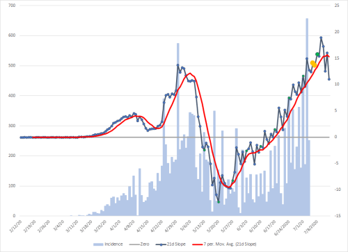
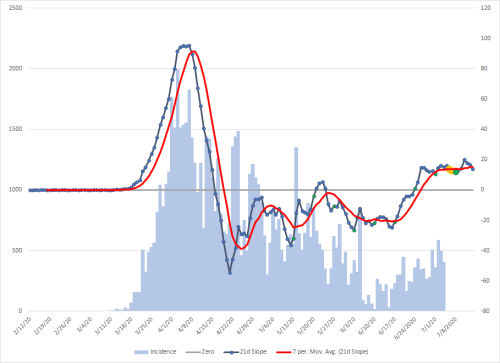
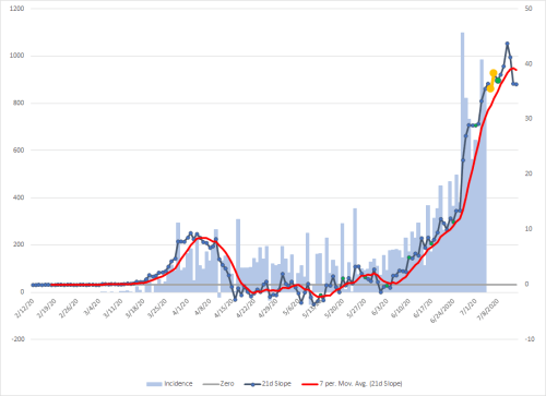
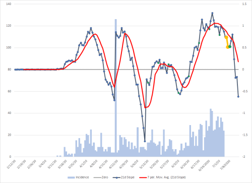
Each state has two graphs. The first has vertical light blue bars. They are known as an epidemic curve and each bar is simply the number of cases (known as “incidence”) on a given day. They are measured against the scale to the left.Some of these bars are colored. These are all three weeks after the actual event, because that is the average amount of time to see the impact of one of these changes.Green: The date that a major social restriction was put in place.Red: The date that a major social restriction was relaxed.Yellow: These represent different events that bring people close together. Currently, from left to right: St. Patrick’s Day, Easter weekend, and Memorial Day weekend.
The orange line is the seven-day moving average.The blue line is a derivative function. It helps measure the rate of change in cases. It uses the scale on the left. There is a gray line at zero. When this line is above zero, cases are increasing, when below, decreasing. The distance from the zero line is directly proportional to the rate of increase or decrease.
There are small yellow dots every seven days. There is a seven-day cycle in cases that is relatively easy to spot. These yellow dots occur at the normal peaks.There is another wave that is much harder to distinguish and lengthens each cycle.
The large green dots represent where there is a trough and cases will be pulled lower for a few days on either side, the red dots are peaks and have the same kind of effect. You can sometimes see this effect on the orange line, but you have to keep in mind that other cycles and events are influencing cases at the same time.
The curving red line is a seven-day moving average of the blue slope line with the dots.
Finally, you can see the blue and red lines extending to the right. This is a ten-day forecast.
The second graph with the gray background is an epidemic curve of deaths, again measured on the left axis. This has the same general features as the cases graph.
The orange line is the seven-day moving average of deaths.
The black line is the slope derivative like the blue one in cases. The red line is the seven-day moving average of that line.
This graph also has a ten-day forecast.
The data set is pulled from Johns Hopkins University. If you would like to validate that, you can go to their website, click on “US” in the left column, go to the bottom right corner of the screen and click on “Daily Cases.” That will turn the orange graph into an epidemic curve and you will see it matches mine perfectly. If you want to expand it, go to the top right corner of the graph window and a tool will pop up. You’ll only be able to do this from the desktop site, not the mobile one.
One particularly important thing to note in the case graphs is that the green dots are the trough of a wave and will make it look like things are heading downward because of the strength of that wave in some states. That influences the derivative that is used, so assume that downward looking trends are only an artifact of that trough and it will change in a few days.
I was sent a link to this video and decided to look at the countries mentioned to see what I could find in the data. I normally wouldn’t link to a video but it makes a strong point. It was very revealing.
* According to the Vietnamese Ministry of Health, Vietnam has had 355 confirmed cases of COVID-19 within its borders since the virus first became known.
336 people have recovered and were released from the hospital.
19 cases are being isolated for treatment.
It has been 77 days without any cases of community transmission in Vietnam; the most recent 88 confirmed cases are all people who arrived in Vietnam with COVID-19 and (like all arrivals) were sent immediately to centralized quarantine. For further details please see the Vietnamese Ministry of Health website here.
* All people in Vietnam are encouraged to wear face masks and avoid close contact with others in public places if possible. All travelers on domestic and international flights must wear face masks during the flight and while at the airport.
KPMG stated on March 20th “the Vietnamese government is currently implementing multiple measures, including travel restrictions, compulsory medical declaration, medical checks, and quarantine upon arrival, with immediate effect. In addition to this, the government is limiting approval for new foreign workers to travel to and work in Vietnam in an effort to reduce external transmission of COVID-19 to Vietnam.”
Prime Minister Modi announced a public curfew on March 22 from 7:00 am to 9:00 pm. On May 1, the curfew was extended until May 18. For the complete guidelines on restrictions, visit the Ministry of Home Affairs webpage, and consult “Guidelines.”
Following a high level meeting of Indian ministers on March 16, the government proposed extensive social distancing measures, including closure of all schools, museums, and cultural and social centers;prohibiting gatherings of more than 50 people; and calling on the public to avoid all non-essential travel. The complete list of measures can be found here.
On March 16, 2020 the Government of India expanded compulsory quarantine for passengers coming from or transiting through UAE, Qatar, Oman, and Kuwait. Fourteen-day mandatory quarantine also applies to passengers from China, Italy, Iran, Republic of Korea, France, Spain, and Germany.
On March 16, 2020 the Government of India prohibited the entry of passengers from the European Union, the European Free Trade Association (Iceland, Liechtenstein, Norway and Switzerland), Turkey, and the UK. On March 17, the government also prohibited the entry of passengers from Afghanistan, Philippines, and Malaysia.
In addition to the restrictions put in place by the central government, on March 16, Maharashtra Chief Minister Uddhav Thackeray announced mandatory quarantine for travelers from the United States, Dubai, and Saudi Arabia. Other states have announced disparate restrictions as well, including the prohibition of entry of foreigners.
There is much more to the story in India though. According to the Brookings Institution, “After a 14-hour ‘Janata Curfew’ test run, India went into full lockdown on March 24; at the time, India had just 500 confirmed COVID-19 cases and fewer than 10 deaths. The sudden lockdown had a severe impact on millions of low-income migrant workers and daily-wage earners. With no savings and little guidance or financial help from the government, these workers and their families faced food insecurity and hardships that led many to walk hundreds of miles to reach their villages.” This action clearly had the unintended consequences of spreading the disease across the country, which has turned into massive exponential growth in cases.
However, there is something to be learned from the data. I had noticed an almost vertical change in the slope of the epidemic curve one day. I’ve changed the scale of the graph to make it stand out and made that particular part of the graph of the derivative slopes red and the three surround areas on either side orange.
The day three weeks prior to May 1st was April 10th. That didn’t mean anything to me at first and my first idea was to do a search on holidays in India. I was obviously shocked a the result. April 10th was Good Friday. Only 2.3% of the Indian population is Christian. I was puzzled at how such a small percentage of the population could have such a big impact, so I did a simple search using “Good Friday India.”
The first result from that search answered the question.
“Many Christians in India attend special church services or pray on Good Friday. Some people also fast or abstain from meat on this day. Many Christians hold parades or open air plays to portray the last days and hours of Jesus’ life in some areas of India…
…Large prayer meetings and parades may cause local disruption to traffic. This is particularly true in areas with a large Christian population.”
It would be interesting to correlate geographical religious concentrations to increasing cases. Finding this relationship between the data and a social practice is one of the things that makes epidemiology so fascinating to me.
Taiwan
I added the points of emphasis in the quoted section below.
“Lost in the fractious and frankly broken conversation about reopening the economy is a simple truism: containing the virus is the best fiscal stimulus. The U.S. Congressional Budget Office is projecting double-digit contractions in the gross domestic product for 2020 and unemployment rates going up to 16% this year — the highest they have been since the Great Depression. By comparison, Taiwan’s central bank expects growth to slow to about 1.5% for the year, and unemployment has “surged” to 4.1%.
To get the economy moving again, we need a functioning health care system.
A lot can be learned about handling a pandemic — and its aftermath — by looking at the health care systems in other countries. Over the past few years, we have been studying 11 countries to write a book titled, “Which Country has the World’s Best Health Care?” Taiwan was one of the countries we studied, and its successful response to Covid-19 was not a matter of luck. It was the result of careful planning and digital innovation, which the U.S. must learn from.”
Of course, we could just stay on the course we are taking in the US, but in my opinion, it’s not a good one to me, especially with our healthcare system on the line.
While it may appear that we are cresting this current wave, that is not the case. There are two factors that are interacting to create that illusion. The minor one is a weekly wave that is readily apparent in almost any graph of the data (see the large green dot to the furthest right on any graph below). The other one is much stronger, and only became apparent after looking at it in many different ways (see the two yellow dots on each graph). The larger one has a period that increases by about 4 days each cycle.
Both of them are at the bottom of their valleys between 7/7 and 7/9. This is why it looks like cases are decreasing in the US right now. That will continue through 7/9 as the weekly cycle pushes cases back up and peaks on 7/11. That should put the US close to a 60,000 case day after which they will decline again as the weekly cycle declines.
The impact of the depression of the larger cycle will begin to fade and a large surge in cases will follow. This will be worsened by the relaxation of social restrictions around the country combined with the impact of the July 4th weekend starting which will become evident on July 25th as an unbelievable rise in cases as the larger cycle crests on July 31st. The weekly cycle also will be peaking on the 29th, so the end of the month is going to have more cases than is even imaginable. That will result in any hospital systems that haven’t been completely overwhelmed and implementing crisis standards of care already to reach that point by mid August.
In many places around the US getting infected now will put people at risk of not receiving hospitalization if necessary given the lag from infection to hospitalization. That will be true everywhere in the country in the near future and includes hospitalization for things that are not COVID-19 related.
I urge anyone who had social contact with people outside of their immediate household recently to self-quarantine for two weeks to help limit the spread.