Tag Archives: COVID-19

The Global View

It’s been awhile since the data for different has been graphed here. Part of that has to do with the events in the US the past two weeks.

Note: I’m still working on how best to get the graphs loaded to look correct.. While they might look bad in this page, if you right click and open the image in a new tab or window, it should be large enough to view in detail. I’m all ears if any readers have an idea of how to do this without creating a lot of extra work on my end.

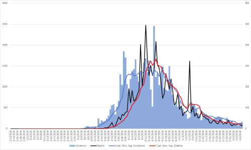
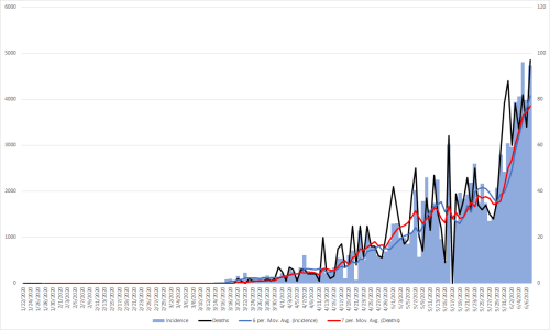
The light blue bars are new cases each day, measured on the left y-axis, the black line is deaths measured on the right y-axis.

The blue line is the 7-day moving average of cases, the red line is the 7-day moving average of deaths. Remember that the scales are different between graphs, so do not make the mistake of comparing them directly.

Countries that seem to be doing an outstanding job will be highlighted. It would be worth learning what their control strategies were that made them successful.

One interesting thing in both the raw cases and deaths is the seven day cycle of peaks and valleys. That could either be due to less reporting on the weekends or perhaps the natural cycles of the disease. It should also be noted that the deaths lag about a week behind identified cases, or at least that was the pattern in the US.

I am only including countries that have had at least 10,000 reported cases. If anyone has an interest in any other particular countries not included here, send a message and I will generate them for all of the ones requested next weekend.

Global – One interesting point of note for this is that the deaths and new cases diverge about mid-April. My guess is that this has to do with much more testing being done.

Afghanistan

Algeria

Argentina

Armenia

Australia

Austria

Bahrain

Bangladesh

Belarus

Belgium

Bolivia

Brazil – It should be noted that reported data from Brazil could become inaccurate.

Canada

Chile

China – Data from China has been questioned as well. The spikes in cases and deaths seem to support that notion.

Colombia

Denmark

Dominican Republic

Ecuador – Difficult to interpret because of reporting spikes.

Egypt

France

Germany

India

Indonesia

Iran

Iraq

Ireland

Israel

Italy

Japan

Kazakhstan

Korea, South – This is a particularly good warning. Things appeared to be under control and now cases are climbing again. There is some data available on their NPI approach.

Kuwait

Mexico

Netherlands

Nigeria

Oman

Pakistan

Panama

Peru

Philippines

Poland

Portugal

Qatar

Romania

Russia

Saudi Arabia

Serbia

Singapore

South Africa

Spain

Sweden

Switzerland

Turkey

Ukraine

United Arab Emirates

United Kingdom

US

The Slope of Concern

There is something apparent in the raw case data that is likely hard to see without some training in epidemiology and statistics. It’s very important and is worth understanding as a means to grasp what is changing and how it aligns perfectly with what I have been forecasting. I have previously explained why there is a 3-6 week delay in outcomes from changes in social controls.

The columns represent new cases of COVID-19 and are plotted by day on the x-axis and on the left y-axis. The green section represents the time that I had previously indicated would see benefits from the various lockdown orders. The yellow section represents when there would be gradual increases in cases as these restrictions are removed.

The black line represents deaths and is measured on the y-axis on the right. Deaths lag about one week behind cases.

There is a blue and red arrow along the bottom. This is just a best guess the cooling period of cases from social control and the reheating as those restrictions are lifted. Unfortunately, I realized a better way to do this after I had created each frame so it’s not as smooth as a gradient I would like in most frames but the general idea should be clear. I intentionally picked seven days into the yellow section to start looking at the trend data so there would be a relatively decent number of points from which to work.

There is a purple trend line for the downward trend seen in the green section of the graph. The red trend line is really the most important piece. It will continue to flatten and will start to slope upward, and will become steep in what will seem overnight once we hit the return of exponential growth. That’s when the trouble will be just starting.

Most important, within about a week it will be obvious throughout the US that there is trouble ahead. My warnings of a lack of ICU beds have already been reported in Montgomery, Alabama and also now in Arizona. There are likely already other areas around the country starting to come up against this problem.

Another way to look at this is a graph of the slopes of the red trend line. What is interesting, the trend line for this data is already flat. That line will start slowing up as well and will be a pretty good indicator for future trends. Currently, I have it set to linear, but at some point it may fit the data better as an exponential curve. I expect hospitals in much of the country to be overwhelmed worse than what was seen in NYC sometime in July.

STAY HOME

US Trend Forecasting

I’ve described that it takes at least three weeks for changes in policy to begin to show up in the data related to COVID-19. Using that rationale, I’ve also indicated that the impacts of stay at home orders would begin having impact between April 12th and May 3rd. I have also projected that relaxing these restriction would start to show up in the data for most states between May 15th and the end of June. I did this so people could not accuse me of data mining retrospectively so I could have a prospective look at my hypothesis. We have reached that date for these states:

 Alaska
 Alabama
 Arkansas
 California
 Colorado
Delaware
 Florida
 Georgia
 Idaho
 Indiana
 Kansas
 Mississippi
 Missouri
 Montana
 Nebraska
 Nevada
 North Dakota
 Oklahoma
 Rhode Island
 South Carolina
 Tennessee
 Texas
 Utah
 Washington
 West Virginia
 Wisconsin
 Wyoming

A graph of the US data since March 15th can provide some insights. Cases are the bar graphs and use the left axis for the scale, deaths are along the red line and uses the right axis for scale. Splitting cases and deaths onto different vertical scales makes it easier to see them in comparison to each other.

First, I think it’s worth noting that deaths clearly follow the case trend, but with a delay of about a week.

I’ve broken the data into three sections each with a representative trend line for that period, the first based on the emergence of the pandemic and exponential growth.

The second section projects start of impact by stay at home orders in most states, which is represented by the green area over the dates. I’ve also included the following 11 days as part of the benefit of that period, although it likely extends even longer than that.

The orange section is the start of when I expected to see impacts from the relaxing of stay at home orders. Each state did this a little bit differently, but it had been my best effort to project forward from whatever language was used by a given state.

The dark straight trend lines for the cases in each section are what I’m most focused on. It’s clear we had rapid growth through the beginning of April and that we succeeded at flattening the curve as indicated by the second trend line.

While a subtle change, the third trend line is concerning. For those with a mathematical interest, the slope of the benefit of the stay at home section is -216.56. The slope of the line for the resurgence section is -128 currently. The important thing is that it has changed that much with only about 1/2 of the states starting to see the impact of those changes, and 11 of them in the last 8 days, so this is just the start of the change that is coming.

I accept that some of the increased case count is due to more testing. However, I am sticking to my initial estimate of the middle of June to start seeing a rapid climb in cases again followed by quickly overwhelming our ICUs and eventually our hospital beds and morgues.

STAY HOME

State Check In

It might be worth looking at data from states that have ended stay at home orders to see if it has any impact on new case trends. Only three states have a sufficient number of cases and population at this point for review. My commentary for each is in red text. The rest of narrative about each state is from CNN and was updated on May 20th. The three week post opening point is the divider between the blue and gray portions of the graph. Trend lines are the dotted lines within each.

Colorado

Colorado also has some interesting results from PCR versus serology testing. Clearly the testing impacts some of the numbers of cases. More interesting is that such a high percentage of serology tests are negative. I wonder if people think that they had been infected really weren’t. I’ve heard a lot of people claiming that they “probably” had this back in January or late last year. I’ve told them it’s just about impossible if they were in the US during that time frame.

The state’s “safer-at-home” order took effect April 27 and is in effect until May 27.

Retail businesses can reopen with curbside delivery and elective medical procedures can resume. Businesses such as personal training and dog grooming can reopen with social distancing.

Retail businesses began to reopen May 1, while people were permitted to return to non-essential office work May 4.

On May 11, Gov. Jared Polis said state park campsites would be available for rental beginning May 12.

A decision on restaurant reopenings will happen May 25, the governor said.

Georgia

Georgia has a 14 day lag in collecting data. However, in their trend forecast, they are expecting an even steeper rise in the second graph.

Gov. Brian Kemp started to ease restrictions April 24.

Gyms, fitness centers, bowling alleys, body art studios, barbers, hair and nail salons, estheticians and massage therapists were able to reopen April 24, with certain rules. Theaters and restaurants were allowed to reopen April 27, also with caveats.

The caveats include social distancing and screening employees for illness.

Bars, nightclubs and music venues will remain closed, for now.

A shelter-in-place order for “medically fragile and elderly Georgians” is in place through June 12.

The shelter-in-place order for other Georgians ended April 30.

Oklahoma

Oklahoma has something very interesting. When looking at the data for the whole state, it looks like easing up on the stay at home orders. However, when limiting it to the data set of the metropolitan counties in the Oklahoma City and Tulsa areas, a different pattern emerges. There are 14 of the 77 counties in the state in this view. This is pretty good anecdotal evidence that population density makes a big difference.

Also, I realize that the graphs are a bit different and the midpoint is two days later in the bottom one. It’s a function of pulling state data in batches to match the change date and I didn’t think of this view until I had changed some of the formulas in my data table. I think it’s safe to assume that the trend lines are still representative of the data.

Gov. Kevin Stitt allowed some businesses to reopen beginning April 24.

Among them are personal care businesses, restaurants, dining rooms, movie theaters, sporting venues and gyms if they maintain “strict social distancing and sanitation protocols.”

Bars, however, will still be closed.

Conclusion

Science is funny about conclusions. I think from these examples, there is a common trend, however, like many analyses, further data is needed. That will come when more states have 4-5 weeks of data after ending stay at home orders.

STAY HOME

Holiday Weekend Warning

White marble crosses at grave sites in Luxembourg American Cemetery and Memorial in Luxembourg.

In the US, we have a national holiday on Monday called Memorial Day that honors those who died serving in the US military. For many Americans, they view it as a three-day weekend and is often when recreational activities begin, pools open, people go camping, and many other social activities.

My fear this year is because of all of the mixed messages about COVID-19 at all levels of government, people are frustrated and confused, and rightly so. The need to continue social distancing measures seems to have gotten lost in the noise.

For most Americans, I think it would be very unwise to spend time this weekend with friends or family members outside of your immediate household. We are still benefiting from the stricter measures that had been put in place by various states, which has probably developed a sense of complacency that this is all over. Unfortunately, making that assumption could be very perilous.

Something happened this week that might help impress how serious this situation still is in spite of being in analogous eye of the storm.

The Minnesota Department of Health is one of the top state health departments in the country and has helped influence some of the decision making within the state. The state just purchases a former refrigerated produce warehouse in St. Paul that will be converted into a surge capacity morgue. The cost of the facility itself and converting it to this purpose will be about $6.9 million and will hold 5,100 bodies. If that doesn’t alarm you to the reality of what is now forming on the horizon again, I’m not sure what will.

I urge people only be around those in their immediate household and avoid any areas where there would normally large crowds of the public. This weekend promises to be a massive mixing event for the virus in the US population.

Yes, I may be wrong. You may lose your plans for one holiday weekend if I’m wrong. However, if I’m right, you or your loved ones could lose dozens of holiday weekends in the future. The cost/benefit analysis on this seems pretty clear to me.

STAY HOME

USA

It’s here. I’ll let the images speak for themselves. You can easily see where the problem areas are likely to start.

Good news!

One of the benefits of actually looking at the data and not relying on the media is that questions start forming when patterns emerge without some of the biases that could be formed due to the bombardment of the sensationalism that can be found in media outlets, no matter their political leaning.

I had been puzzled by why there seemed to be difference case fatality rates in different countries.

Here’s the current data for South Korea. The CFR there is about 0.5%.

Compare that to Iran and Italy, where the CFRs are a little above 3%. The obvious question is “why the difference?”

I had a hunch based on my very early assumptions about mild and asymptomatic disease. That led me to wonder if the differences might have to do with testing. Once I did a media search, I found my answer.

South Korea has the second-largest national caseload of coronavirus, and has tested far more than most nations. As of Monday, South Korea had tested a total of 105,379 people…Italy has the most cases in Europe with 1,694 as of Monday. Italy has carried out more than 23,300 tests.” Unfortunately, there doesn’t seem to be much data from Iran, but they are preparing to test “tens of thousands.”

Image result for mike drop

I have suspected since early on that the CFR was artificially high. This is some solid evidence that assumption was right. Don’t let the tail wag the dog. This is how information from the media should be used.

Medical Supplies

Face Mask on Red Background

If you are purchasing masks and gloves, you are endangering the lives of others who are or will be on the front lines. When coronavirus becomes active in your area, use the other methods that will help like social distancing, respiratory hygiene, and frequent handwashing/hand sanitizing.

The WHO has already indicated that there is a global shortage of personal protective equipment (PPE). Please don’t contribute to this problem.

Image result for ventilator

Other shortages are likely to follow. According to Mike Ryan, MD, during a WHO briefing today, there are concerns that Iran will not have enough ventilators to meet the expected demand. This isn’t just a problem there. It could be similar in the US as this disease becomes endemic here. In 2017, Huang et. al. suggested “Substantial concern exists that intensive care units (ICUs) might have insufficient resources to treat all persons requiring ventilator support. Prior studies argue that current capacities are insufficient to handle even moderately severe pandemics.”

So please, leave the masks and gloves alone. Things could get challenging enough without the actions of the public making care delivery even harder.

Hope from China

China still puzzles me a bit. Part of that stems from how much trust can be placed in the data.

First, the case fatality rate appears to be above 3%. I’m hoping that is a function of inadequate data on the burden of disease on those with mild or asymptomatic infection. We simply do not know. However, if there is a large cohort that has gone undetected, then things will be much better than they appear, exactly what I had been alluding to when I early was first writing about this virus.

Second, it’s a great sign that the incident cases are dropping. The question though is whether this is due to any aggressive social measures by the government, inadequate means for testing, or other factors that are difficult to determine from only having the perspective of data, not boots on the ground observation.

In summary though, I want to reemphasize that this is not a particularly good model for disease in the west due to the reasons I wrote about earlier.